Fall 2020 ︎︎︎ CUNY Queens College ︎︎︎ (ARTS241) Design 1
Knitting Circle: Fontstruct
Background
For our Knitting Circle, we’ll be creating our own font via a website called Fontstruct. You’ll need to create an account, it should be relatively easy, but again this is a totally free tool. Follow the tutorial below and let me know if you have any issues or want to go through more granual type design related ideas.
Tutorial︎
Requirements
You are welcome to create multiple fonts, and they do not need to all be complete but make at least one with the following qualities:-
Uppercase A-Z
-
Lowercase a-z
-
numbers 0-9
-
space
- the following puncuation . , “ ” ‘ ’ ′ ″ ? ! @ * # $ % & () +-
︎
Note that your Fontstructions, within Fontstruct must be more named with at least 4 letters, otherwise it will not go to the “Fontstructor” screen.
︎
Considerations
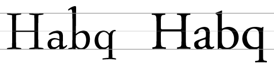
Use pangrams ︎︎︎ Pangrams are natural sounding sentences that happen to incorporate most letters of the alphabet. Once you’ve completed one or both cases, try your letters out with a pangram, to examine the spacing and problematic pairs, or ones you may not have considered.Watch your x-height ︎︎︎ The x-height is height of the lowercase x, that is generally used to mark the general height of lowercase letters. Making this taller will make a font appear “bigger” or more readable at smaller sizes. Additionally, since upper and lowercase letters will be mixed, the uppercase letters should be constructed with the x-height in mind. Note in the example below how the capital H’s relate to the x-height.
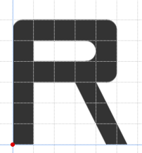
 “regular” R
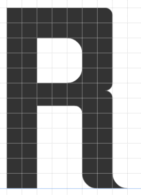
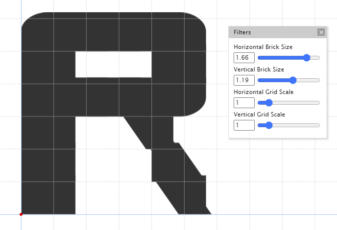 R with altered brick size
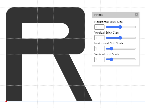
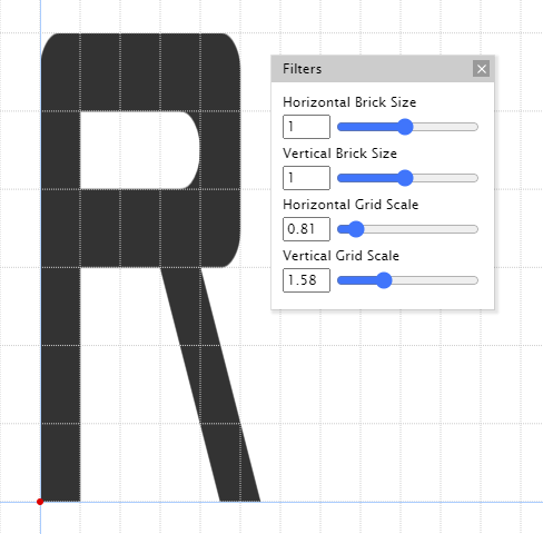 R with altered grid scale
Spacing/Kerning ︎︎︎ You will probably have short phrases in your “memes” so getting every spacing pair exactly right is not the most important thing. If the spacing is an issue in Illustrator, you can use kerning to do that. Simply place your mouse cursor between the problematic letters in questions and use ALT (Windows) or Option (Mac) + ︎︎︎ or ︎︎︎ to decrease or increase the space respectively.
︎Back to Design 1