Fall 2020 CUNY ︎︎︎ Queens College ︎︎︎ (ARTS241) Design 1
A clarification
My hope with the Custom “Memes” Project︎ was to explore the relationship between word and image and that it can be both the “lower culture” manifestation as a meme and a “higher culture” manifestation as a poster. Please explore this relationship further in your work.
Do not simply put the images in grayscale mode or desaturate them and call it a day. This was the case for a lot of the “memes” I saw. You have to adjust them a little bit to increase the contrast. This is because colors appear at different brightness levels when they become black and white. Follow this tutorial if you are not familiar with working with levels in Photoshop.
Make fonts bigger within the frame, and consider the composition︎︎︎
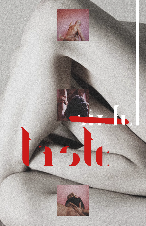
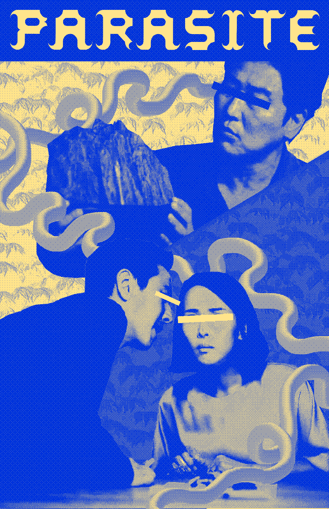
Consider bigger type, how type might be different sizes throughout the piece and why. These are lettering but some good posters from Piotr Szyhalski, also known as laborcamp, you can see more on his instagram.![]()
![]()
Consider other imagemaking methodologies︎︎︎“Memes”
A clarification
My hope with the Custom “Memes” Project︎ was to explore the relationship between word and image and that it can be both the “lower culture” manifestation as a meme and a “higher culture” manifestation as a poster. Please explore this relationship further in your work.Generalized Feedback on “memes”
Adjust levels on black & white photos︎︎︎Do not simply put the images in grayscale mode or desaturate them and call it a day. This was the case for a lot of the “memes” I saw. You have to adjust them a little bit to increase the contrast. This is because colors appear at different brightness levels when they become black and white. Follow this tutorial if you are not familiar with working with levels in Photoshop.
Make fonts bigger within the frame, and consider the composition︎︎︎
Consider bigger type, how type might be different sizes throughout the piece and why. These are lettering but some good posters from Piotr Szyhalski, also known as laborcamp, you can see more on his instagram.


Add more content︎︎︎
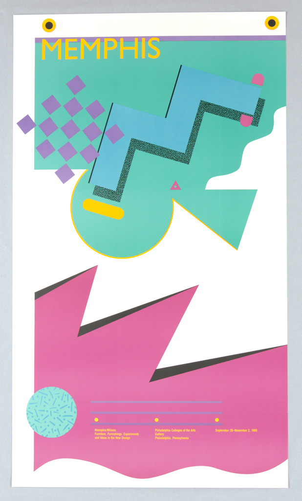
Decoration is not necessary, but please consider the possibility of decoration (pattern, scribbles, drawings, etc) and how it might enhance your memes, and make your imagery and compositions more complex. Here are some posters from the Memphis Group, known for what has been distilled to “the 80’s style” which is known for its use of decoration.
![]()
![]()
Decoration is not necessary, but please consider the possibility of decoration (pattern, scribbles, drawings, etc) and how it might enhance your memes, and make your imagery and compositions more complex. Here are some posters from the Memphis Group, known for what has been distilled to “the 80’s style” which is known for its use of decoration.

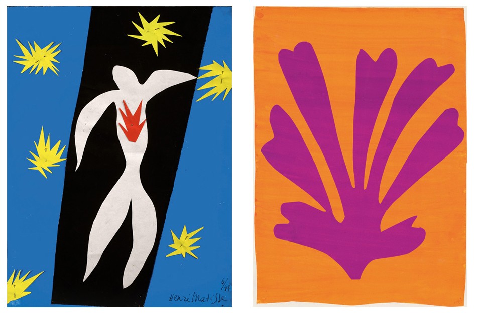
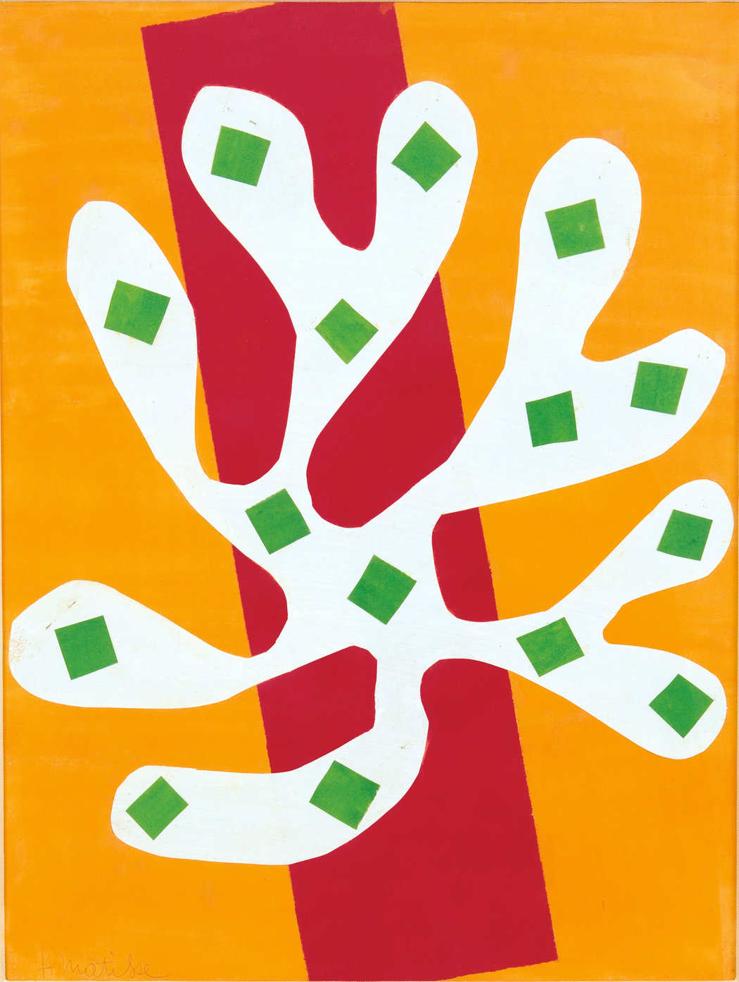
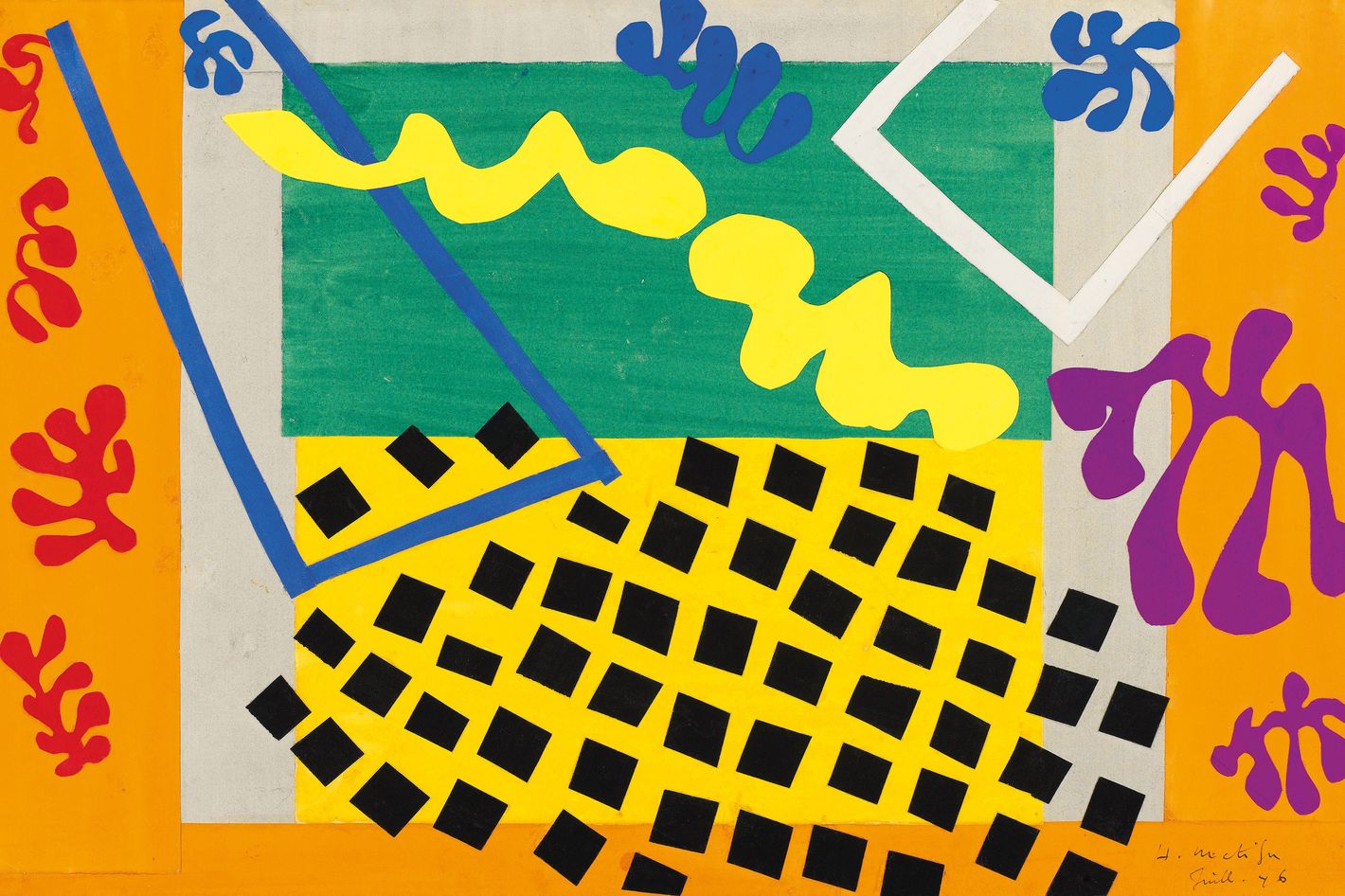
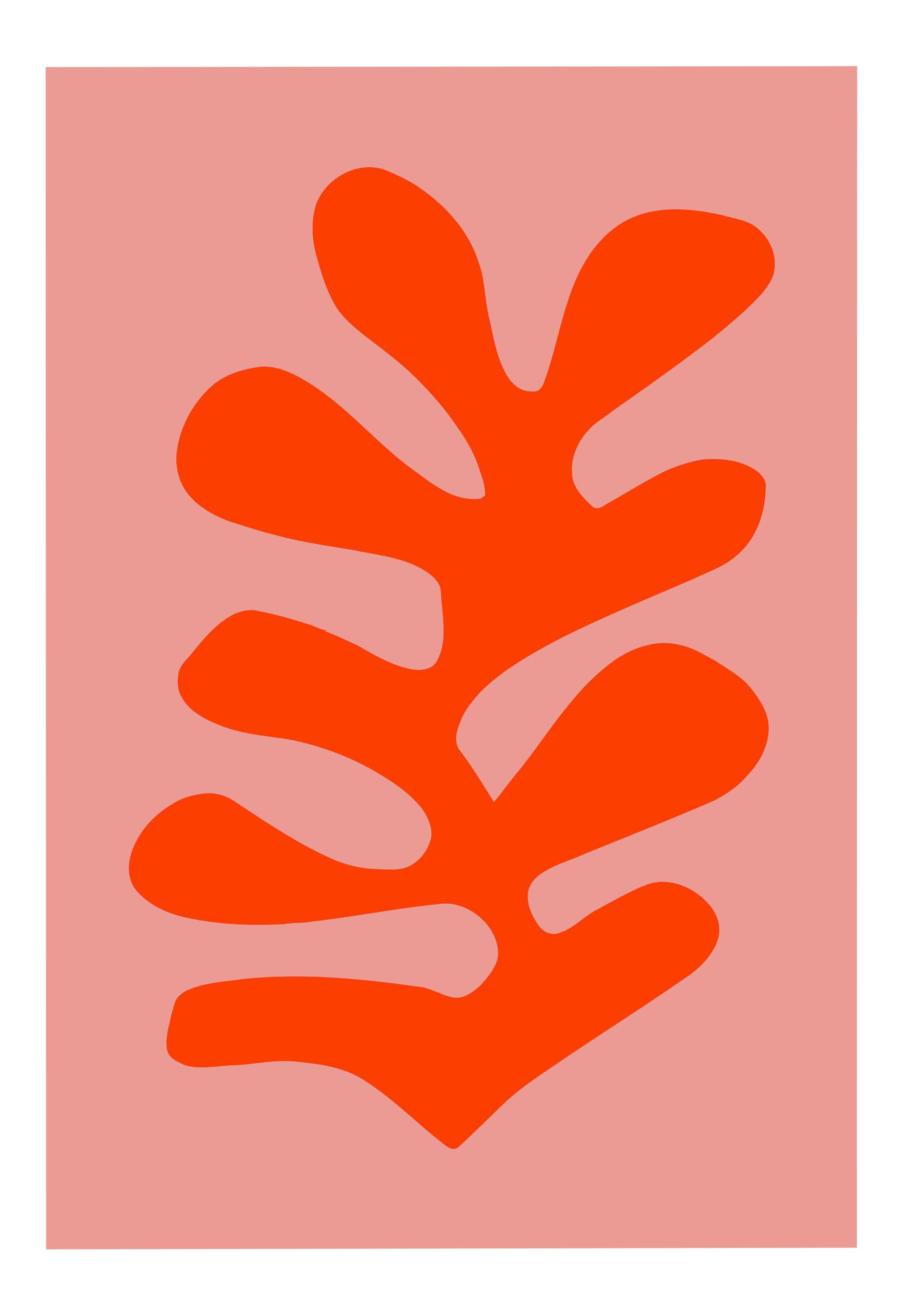
Try other ways of making images. Cut out, collage (digital or analogue), messing with an image while it is scanning, drawing over images, etc.Here are some posters by Henri Matisse from the 1940’s.
