Fall 2020 ︎︎︎ CUNY Queens College ︎︎︎(ARTS241) Design 1
Project: Observation + Ephemera

Background
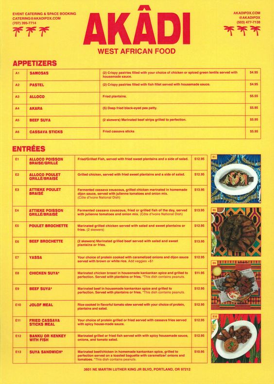
For this project, I want you to take a look around to whatever extent you can. It might through local restaurant menus in a folder drawer, in the Lower East Side, or in Williamsburg. Examine the storefronts, the vinyl type that is peeling, the stretched out type. Look at the “rules” that are being broken and why. Find something and then bring it back with you.The primary inspiration for this is Fisk Projects’s redesign of the menu for Akadi, a restaurant near their studio in Portland.

Objective
Take an existing piece of ephemera; and redesign that. Requirements
- Do some investigation to find a piece of graphic design whose origin you can’t determine. Attempt to find one that shows evidence of the underlying design system (ie type hierarchy, visual style, etc). Take a walk before it gets too cold, use Google Street View to find a street you used to live on, go through a drawer you keep menus, go through a box of the stuff you kept from someone you used to date.
- Redesign that piece of ephemera however you want, but consider the conventions you are adopting/going against, the underlying system and its effectiveness.
︎
The following fonts are not allowed Gill Sans, Futura, Helvetica, Gotham or system default fonts for any operating system.
︎
Final Submission
- an image, or a folder of of images of the piece you are redesigning. Make sure there images of each page of the document (so if it is a brochure or menu with several pages, make sure it is all documented)
- a Google Doc, or folder with similar files (.doc, .docx, .txt, .rtf, etc.) containing documentation of your thoughts in response to your initial ideas.
- a .PDF, with your redesign.
No Shuriken Mode Challenges
(Please note that, doing these do not guarantee a better grade or extra credit by any fixed or demonstrable amount, but if you’re doing or approaching these things, you’re probably doing well. The point is that, like not using shurikens in Shadow Dancer, it is more difficult, and increases your proximity to the material. All this being said don’t hurt yourself and consider your other assignments and mental and physical health. Additionally, if you are not feeling challenged by the class or an assignment, and these suggestions are not sufficient for you, please le me know.)- Create an entire brand guideline based on your redesign.
- Try to determine who made a particularly anonymous design, or determine how difficult it might be. Document this in a vlog or some kind of writing.
Considerations
- What is good and what is bad? ︎︎︎I see this largely as a project to look at design that you overlook. Why do you not think about it? Is it so transparent that it is just there, or do you dismiss it as not even design? Is it possible to determine who made it? Who might you have to ask?
Resources
Relevant Dates & Milestones
11/10/2020 ︎︎︎Introduction!
For homework, go on your investigative journey this week, virtual, in reality, or through memories, or whathaveyou. Take pictures of what you have observed. Or provide screenshots of what you might want to redesign. Identify what you like and don’t like about your potential choices. Provide 10 images.This is due on 11/17- 11/17/2020 ︎︎︎Initial Ideas For homework, start designing the new version of what you have found. Present 3 (three!) different visual directions. At least one should be digitized and not a physical sketch. This is due on 11/24.
11/24/2020 ︎︎︎Refinement
For homework, based on feedback you receive, and/or self-examination, start refining and finalizing your piece.-
Examine the demographics of the existing logo. Who is it for?
What age group, gender identification, race, ethnic background, etc.
Write this in a Google Doc, Word document, or text file. - Examine how you might want to change the demographic you are targeting for your redesign.
Does it skew younger? Will it use a different choice of typography? Why or why not? Add this to your Google Doc. - Use this information to design 10 new versions of the existing logo or sign.
-
Examine the hierarchy of the existing flyer, poster or menu.
How does it use different sizes of type to convey information?
How does it use color? Position?
Write these thoughts down in a Google Doc, Word document, or text file. How are the type choices for the flyer reflective of the brand or service? - For the type you will choose, or have chosen, research each typeface.
Examine the relationship of the history of the typeface and its uses in the past, and determine the appropriateness or inapproriateness of each one. Link to this research, and write more of your thoughts in your Google Doc, Word document, or text file.
- Redesign 5(five) new versions of your flyer, poster or menu.
12/01/2020︎︎︎Review
We’ll review some designs in advance of the critique. Complete your project for next week12/08/2020︎︎︎Critique!
If your piece is redesigning a logo or a sign you must do the following:
If your piece is packaging, a menu, or flyer you must do the following:
This is is due on 12/01
︎ Back to Design 1