Fall 2020
︎
SUNY Purchase ︎︎︎ (DES3510) Word & Image 3
GRid sigils

Background
For this project, you’ll use a limited grid to create a related set of symbols and a document which will display them.The goals of this project are manifold. In a practical sense, the intention is to get the class started with, what should be a high enough volume of content that you can de-couple yourself from intellectualizing things too much, and just make. The other practical goal is that you will apply some skills that are applicable to designing logos here as well as organizing those logo-adjacent outcomes in a document and start thinking about the system of that organization.
On a more conceptual level, I want y’all to consider experientially what Michael Beirut talks about in the above video, and what Moebius talks about in this video and hold both of these ideas together. The ideas being, first that, the actual visuals, while they should be considered and skillfully executed, do not “matter.” It is how the power of said symbol is applied through other ephemera, branding and marketing; your idea does not need to be a clever graphic design joke (not that there’s necessarily anything wrong with that). The second point of consideration; start from anywhere. Your experience, skill, and intuition will guide you even if the starting point felt artificial or random.
Requirements
-
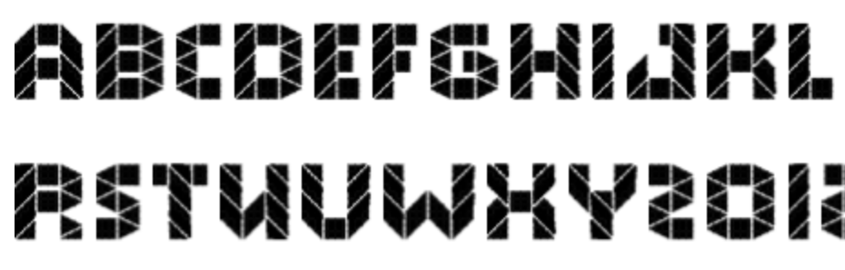
You must make 50 (separate and distinct) symbols
- Those symbols must be arranged and contextualized in a document. That document must be a .PDF
- See below examples, but the contextualizing .PDF should not simply be the symbols laid out. You can create a cover page, show your process, scrapped versions, a journal of how you felt throughout, an explanation of your grid, waterfalls of symbols in different scales, patterns of different symbols.
- The following typefaces are not allowed for your contextualizing document: Gill Sans, Futura, Helvetica, Gotham, or any default Windows system font or Mac system font.
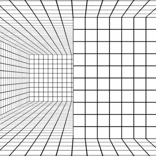
- Those symbols must be based on at minimum, a 5 ︎ 5 unit grid and at most 8 ︎ 8. (the grid units do not need to be square, if you have an issue with a non-square grid you want to talk with me about that’s fine).
- Please note these grids do not have a unit of measure attached. 5 ︎ 5 does not mean 5 inches, or centimeters. The symbols should be meant with a consideration of them being super small or large.
- Your document can include color, and your system of symbols can incorporate color, but the symbols themselves cannot rely on color as a determinant of distinctness (ie a humanoid symbol with a red shirt, and a humanoid symbol with a blue shirt are the same symbol by the criteria of this assignment).
Final Submission
-
50 distinct symbols saved as .PNG files, that are each at least 1000px ︎ 1000px and individually numbered.
-
A .PDF that organizes the symbols into a contextualizing document.
- A folder with all process sketches/photographs/scans saved as .JPG or .PNG files.
No Shuriken Mode Challenges
(Please note that, doing these do not guarantee a better grade or extra credit by any fixed or demonstrable amount, but if you’re doing or approaching these things, you’re probably doing well. The point is that, like not using shurikens in Shadow Dancer, it is more difficult, and increases your proximity to the material. All this being said don’t hurt yourself and consider your other assignments and mental and physical health. Additionally, if you are not feeling challenged by the class or an assignment, and these suggestions are not sufficient for you, please le me know.)- Make 100 symbols
- Keep going with Fontstruct and make a font that accompanies your symbols and complements or relates to the grid system used in your symbols aesthetically.
- Create some other kind of ephemera showing them in a context related to what you’re doing: shirts, totebags, coordinate with the class to make their Zoom background one of your symbols.
- Make a theme song for your symbols.
Considerations
- how do symbols relate to each other? ︎︎︎Some versions of symbols are based on writing an intention or idea that is translated to the “magic square” before it is aestheticized. This might be a helpful way of starting the process that is not representational. A common undergraduate design assignment is “document a collection” You might start by opening a junk drawer and “symbolizing” the objects therein.
- time ︎︎︎Complexity is not quality, and is not necessarily what I’m looking for. Start simple and then review your progress. Let the limitations of your grid determine the forms rather than trying to “squeeze” or force complexity into your grid. That being said, hopefully this goes without saying, but please do not simply arrange rectangles and triangles and ellipses.
-
distance/scale/readability︎︎︎The symbols should translate at a small scale and large. This is meant to be a “logo-adjacent” exercise, so consider the scale of a letterhead and if symbols were on a billboard. Take this into consideration for the complexity of the symbols as well as the composition of your .PDF. If you can’t print out a sample perhaps try viewing on your phone, or a TV.
-
you can totally re-use components of symbols ︎︎︎I mention Fontstruct as a possible starting place. A non-negligible part of type design is tasteful and sensitive copy and pasting. Look at what happens when shapes or components are flipped, rotated or “scaled” within the limitations of the grid.
- non-square grids/how individual grid units connect ︎︎︎ There are some examples below, but something that may help a “blockage” might be to consider how the individual grid units relate. Additionally, consider what happens when symbols are placed together. Does their apparent “meaning” change if they are next to each other, overlap. Do they connect? Are there multiple junctures for symbols to connect with each other.
- It’s not the time to be overthinking stuff ︎︎︎We’re still early on in the semester, this project is meant to see where everyone is at. Just start making and make something as powerful as you can but don’t get paralyzed and if you find yourself stuck or slowing down in the symbol-making phase or the document-making phase at the very least identify what’s going on there (anxiety from a specific program or pool of knowledge, unfamiliarity with a process, etc.)
Relevant Dates
08/31/2020 ︎︎︎Introduction!
09/07/2020︎︎︎Progress!
Submit at least 20 symbols for review.09/14/2020 ︎︎︎Critique!
09/21/2020 ︎︎︎ Re-submit!
Grading Criteria
- All assignment criteria/requirements are fulfilled
- Quality and consideration of your symbols.
- Quality and consideration of your document.
- Quality and thoughtfullness of language and concept that binds the symbols you made.
Process/Related Resources
- Here’s a short video using this tool. This is not meant to generate all your sigils for you, but as a good starting place or a way to not simply representatively or pictographically translate your ideas.
- Creating Iconic forms in Adobe Illustrator︎This is “raw” and unedited, and you should know how to do these things already. This was meant for another intro-er level class that I teach however, seeing someone else in Illustrator may be helpful. It was meant to show how few of the tools in Illustrator you can use to achieve “professional” results. It also highlights some thinking behind the “iconization” process of using Illustrator. If you find this helpful please let me know I’m going to probably do an updated and edited version. TBH there are probably 1000 better tutorials on Illustrator.
- Using Fontstruct︎
![]()
![]()
Fontstruct is an online app to make modular fonts. It’s super quick and fun (to me) and outputs a “real” .ttf file. It uses a grid and prebuilt “bricks” that could be useful for this project.
-
Using Tiled︎This is a last minute addition I thought to add, but this is a tool called Tiled︎ that is used for game design. If you generate some art quickly, for the individual grid units, this is a good way to just start arranging and organizing them.

Examples/Resources
NASA Graphic Standards Manual︎


NYC Transit Authority Graphic Standards Manual︎


Icons for 2014 Cranbrook Graduate Degree Exhibition


AIGA Dot Pictograms︎


ISOTYPE︎

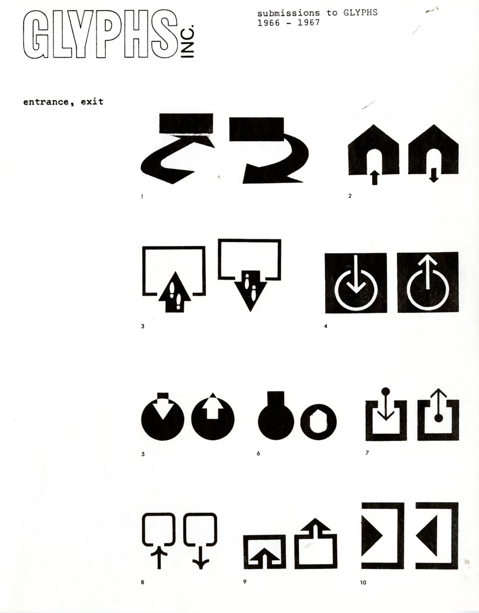
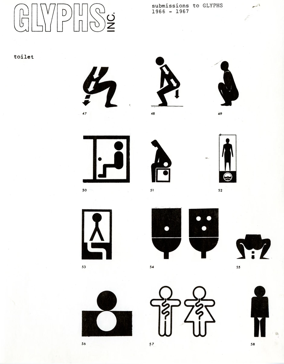
Glyphs Inc.︎

“Hobo Code”
Presenting this here because, it’s interesting. But also because it involves elusive and innaccurate sets of histories that aren’t as monolithic as graphic design. The notion of using a symbol as your name and representation of your direction and intention also relates to sigils. Also one of my favorite composers, Harry Partch, was a hobo at one point, so there’s a weird romanticism to it.
The Lesser Key of Solomon︎

Vodoun Veve︎


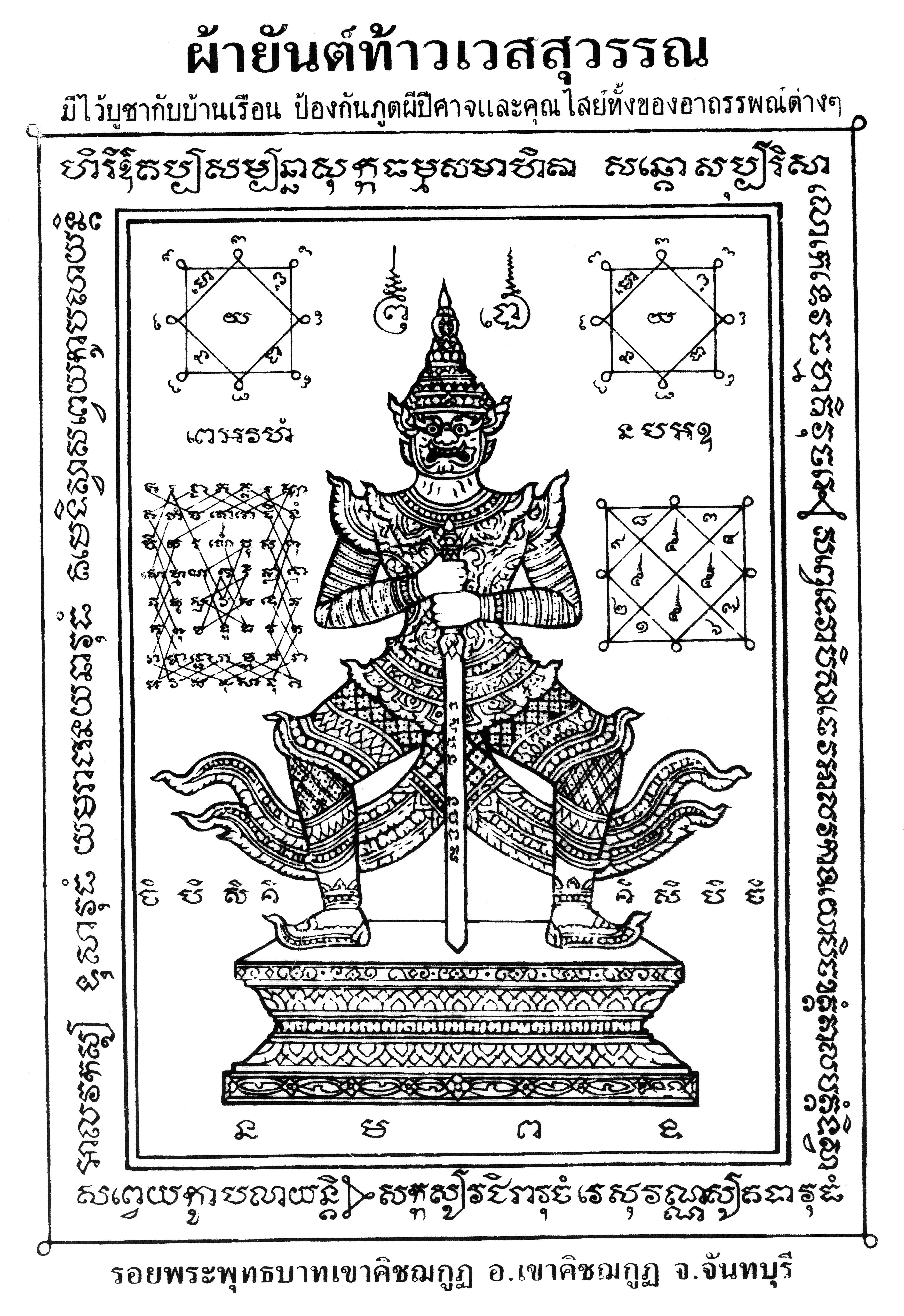
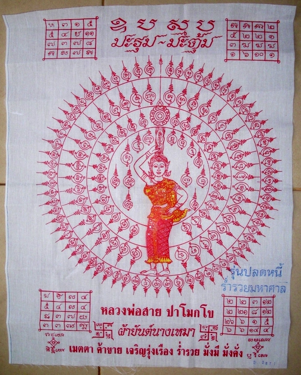
Pha Yant (Thai Spirit Cloths)︎

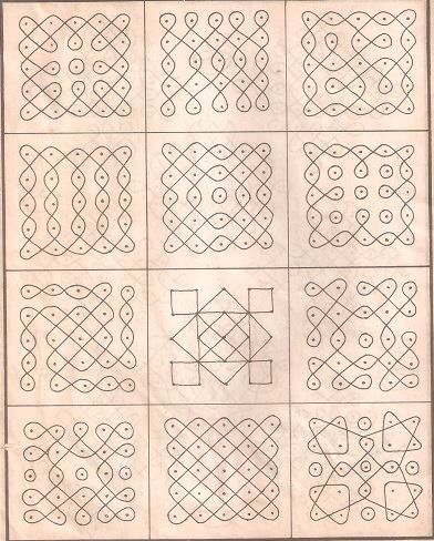
Kolam︎

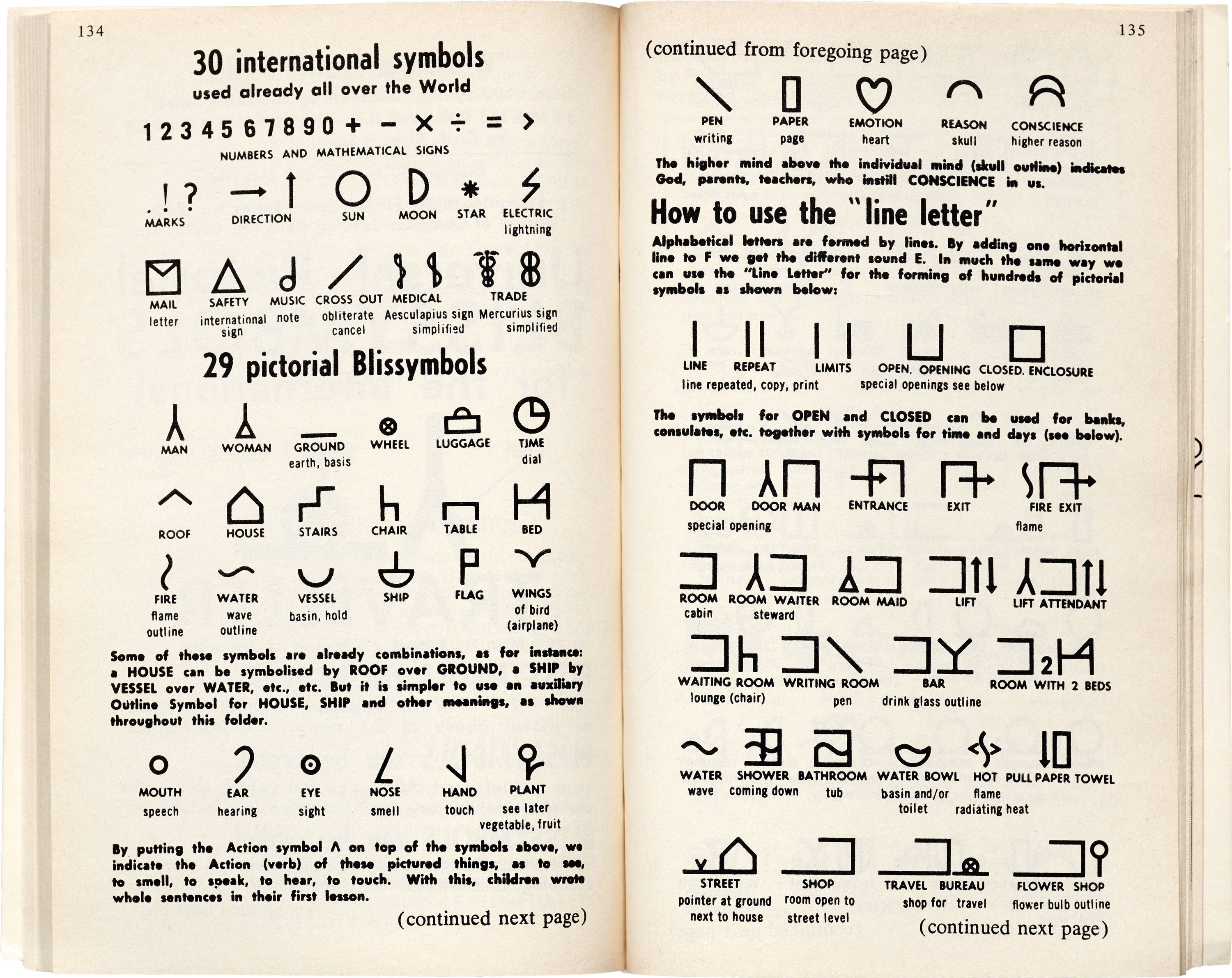
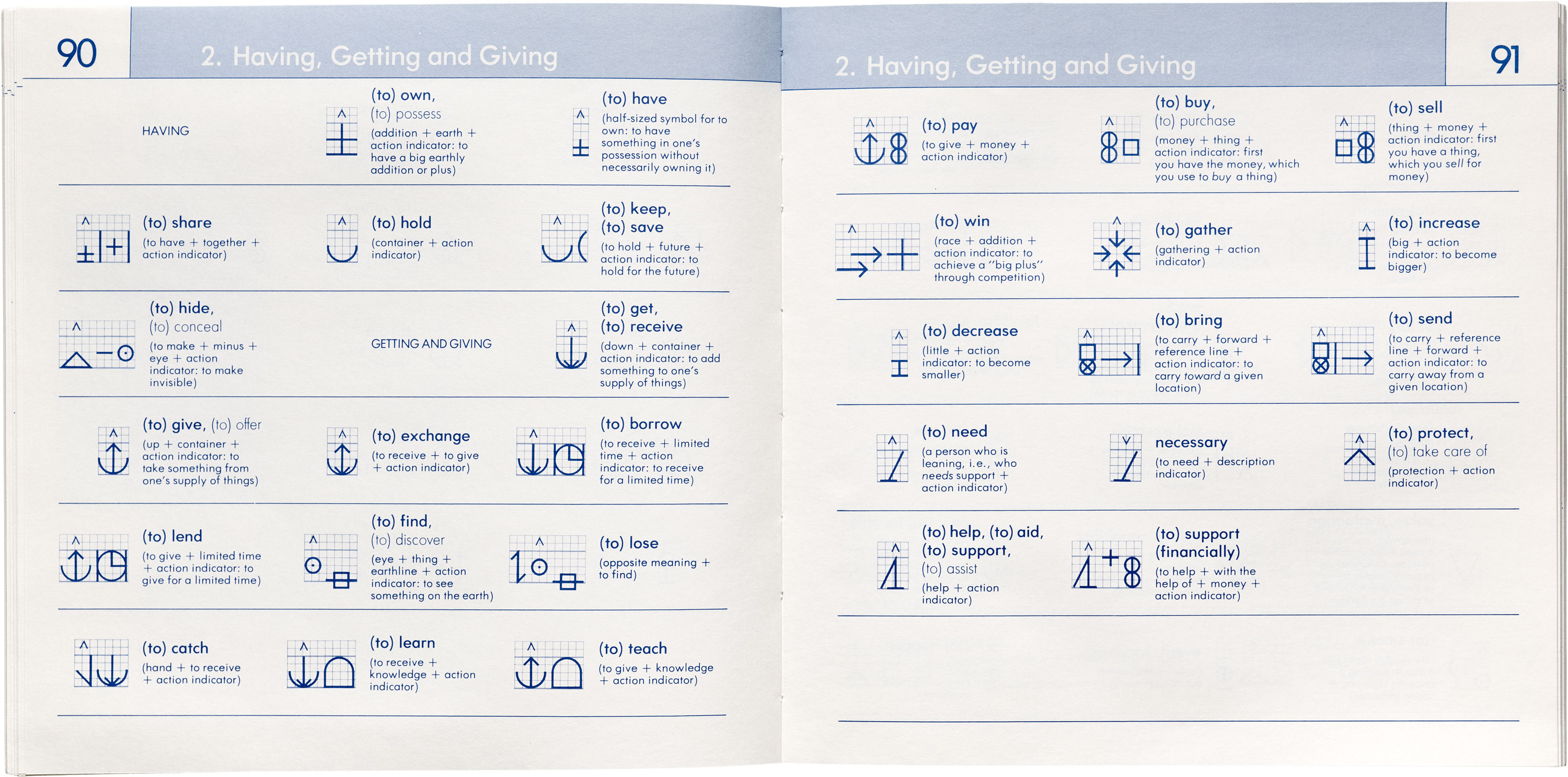
Blissymbols/Blissymbolics︎


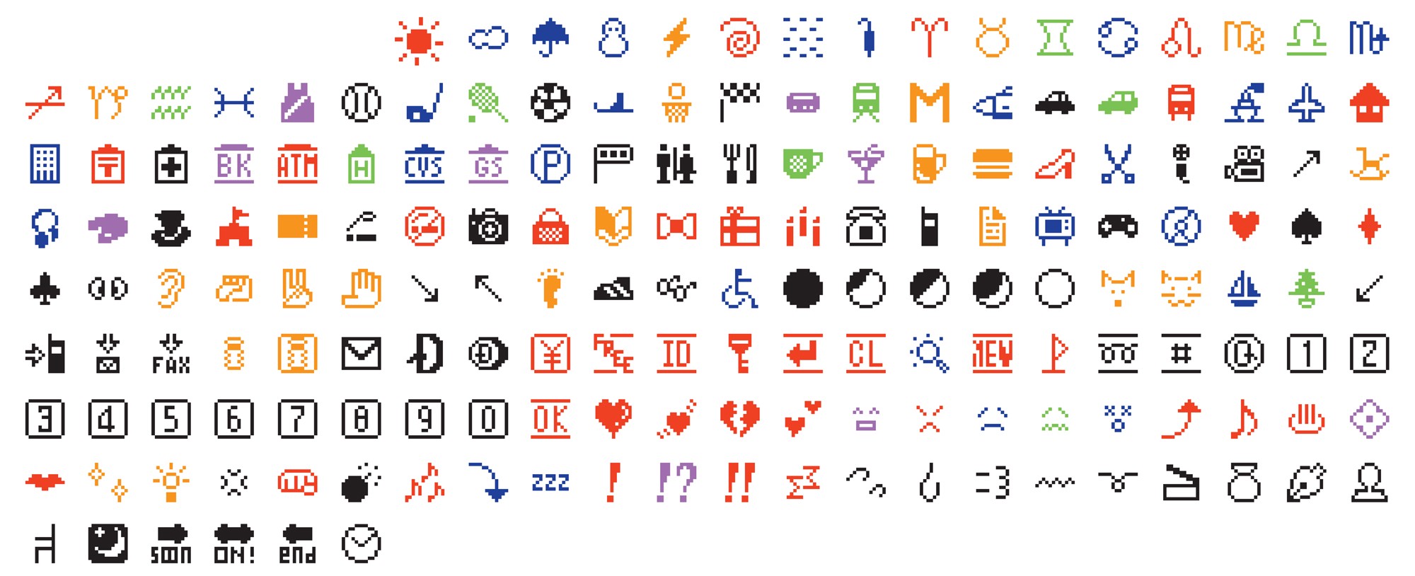
NTT Docomo Emojis︎
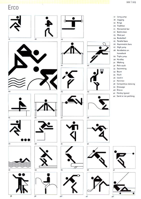
Otl Aicher’s Olympic pictograms︎

︎Back to Word & Image 3