Fall 2020 ︎︎︎ SUNY Purchase ︎︎︎ (DES3510) Word & Image 3
Project:
One semester performance (Grimoire piece)
(Long-term Brand pt.3)

Background
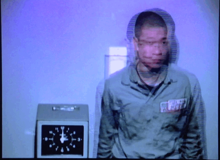
As with the other parts of this project, it takes the inspiration for its name from a performance art piece. This one being Tehching Hsieh’s “One Year Performance” also referred to as the “time clock piece.”
For one year, Hsieh photographed himself; every hour, next to a time clock. If you’re curious, this was in 1980 and was in fact the (direct) inspiration for at least one of those, “take a picture of myself everyday” projects.
Your actual enjoyment of the piece may (understandably) vary, but I remember loving it whenever I saw it originally (probably around this same time in your education). I use this piece not simply because I like it but to stand in for several ideas.
First, duration. This will be the longest piece for this class. As such you can’t really “fake it,” or at least not completely. As such, most viewers will not get to appreciate every component of your document. Make any place the viewer might find the piece powerful, or at least, help lead to a new second. On a more practical level, you will have to find ways to systemize things to make the document as consistent as it needs to be (which could be not at all). Lastly I think there’s just a transformative quality to endurance on the part of the performer/maker. Whether it is a long academic paper, a long hike, or a long meditative think, something happens along the way, and I’m hoping to induce some version of that something.
The second is to use everything available to you. In Hsieh’s piece, every element: the uniform, the clock, the way his hair “animates” in the photographs, the textural quality of all the photos together has some kind of power. Not necessarily meaning (ie Hsieh doesn’t encourage some of the more political reads of his piece) but power, or effect. This is not unlike a Jackie Chan fight scene, which might seem to take place in a relatively non-descript warehouse but as the choreography plays out, every object in the room gets embued with potential. (Here’s another Jackie Chan centric video if you’re interested)
Lastly, the term grimoire is used purposefully, besides the fact that it just sounds cool. Grimoires are magic(k)al books meant to help give you the tools to disperse your intention throughout the world, much like a branding guideline might help the marketing influence of a company. While that analogy doesn’t totally work grimoires were around before the term graphic design was coined, and as such, while they might contain visuals and type interesing to graphic designers, they don’t necessarily subscribe to the same conventions of a branding guidelines. As such I’m not asking you to directly oppose convention; I am asking that you consider them in your aesthetic decision making and look at other sources besides graphic design proper.
Objective
Design a document for your brand. This will encompass a “brand guideline” and a “process” book. Requirements
- Your final .PDF must be at least 100 pages. (note something like a website or some other medium I may not be thinking of, is both allowed and encouraged. We may need to talk through details, but you should still consider 100 distinct “compositional moments” that are clear.)
- Your final .PDF must measure at least 5.5 in. 8.5 inches (half-letter).
- If your document has other components (ie posters, multiple smaller books, etc) please include them as clearly as possible in separate .PDF’s
- Include all process documentation as a part of your book. This includes, but is not limited to: emails, text messages, sketches, scans, napkin ideas, early iterations, journaling, etc.
-
Brand guideline which includes the following (to be clear this is the same list from the Stochastic Company project):
- Brand messaging
- Philosophy behind brand voice
- A fictional company history
- Example audience demographics
- Writing examples based on brand voice
- The logo
- The logo’s visual “derivation” / spacing geometric considerations
- The logo’s considerations for use (spacing, color, size, etc.)
- The logo displayed at various sizes
- Color system
If your system includes distinct colors please include hexadecimal, CMYK, and Pantone color where and if applicable.
This should be, but is not limited to:
- A color scheme.
- A system of primary, secondary, and tertiary colors.
- Another system by which color could be organized (ie algorithmically, dynamically, etc.)
- Typographic system
This should be, but is not limited to: - Your chosen fonts/typefaces displayed clearly
- Rules for application of said fonts/typefaces
- Writing that explains the decision making behind your typographic choices
- Options for free or system default fonts(consider both Mac and Windows here)
- Rules for spacing, hierarchy, and application of said fonts/typefaces
- Examples of ephemera and system in use
This could be but is not limited to:
- The actual product packaging if applicable
- Ads on subway/bus stops or billboards
- Letterheads
- Business cards
- Merchandise
(tote bags, hats, shirts, cups, pens)
- Screen-based media
- Website mockups
- Branded social media
(tik tok, IG stories vs posts, twitter) - Animation/ads
︎
The following fonts are not allowed for your typographic system, or in use for your brand guideline: Gill Sans, Futura, Helvetica, Gotham. System default fonts are okay for free options for your typographic system but should not be your main choices.
︎
Final Submission
- a .PDF of your final document(again, if you want to do a website or work with some other medium that is totally cool, just please let me know so that we can make sure it is both an equivalent amount of “work” and that the terms are clear for what you would need to complete)
No Shuriken Mode Challenges
(Please note that, doing these do not guarantee a better grade or extra credit by any fixed or demonstrable amount, but if you’re doing or approaching these things, you’re probably doing well. The point is that, like not using shurikens in Shadow Dancer, it is more difficult, and increases your proximity to the material. All this being said don’t hurt yourself and consider your other assignments and mental and physical health. Additionally, if you are not feeling challenged by the class or an assignment, and these suggestions are not sufficient for you, please le me know.)- Print your book through a service like blurb. Try to account for turnaround times in terms of grading, and also let me know; I will purchase a copy.
- Barter with a student in New Media for some other design service so they can code a website for you.
- Vlog your design process.
Considerations
- You’ve already done a version of this ︎︎︎ I’m not sure how spooky creating a 100 page document will be for you but keep in mind you’ve already done a version of it with the Stochastic Company project. That was kind of the point. Use what you learned from there; what worked what didn’t work, what took longer, what you found harder to achieve, and use that to inform this project. If you haven’t examined your feedback from that project, I’d consider doing so, or even doing so again.
- “Stretching” ︎︎︎In a live performance, sometimes things go wrong. Someone’s mic dies, a costume changes takes a few seconds too long, a guitar string breaks. To fill the time people often have to improvisationally “stretch.” The most minimal brand guideline will be, maybe 5 pages? A big poster? And perhaps that is practical, but consider this an unpractical experiment. What would you want to say to a lonely junior graphic designer tasked with crafting a web banner for your for brand? How would you reward someone for reading the entire document? How minimally could fill a page to make it interesting or create curiousity in the viewer to look at the next section? Please also, hopefully this goes without saying, but please don’t take it to mean that you should make the type incomprehensibly big simply to take up space.
- Look at things that are not graphic design ︎︎︎One of the things I want to stress with this project, not just because you have to fill 100 pages, but because we are in the Art + Design department is that not everything has to be “meaningful” to be content. If you have a cool idea for a pattern that incorporates your logo; use it. If you have a mascot for your project, and you have an idea for a comic where they go through an existential crisis; draw it. There are examples below, but unlock yourself from just the designing of graphics and your feelings about the histories and expectations there to create other forms, and draw from other histories.
Relevant Dates
(with suggested progress milestones)
11/02/2020 ︎︎︎Introduction!
This week, research other documents you might want to use as inspiration, or a starting point. Create your Indesign document and either populate it with undesigned content that you might already have (copy/writing), or think about what content you might want to accomodate (images/words/diagrams) with lorem ipsum text. Consider what you might be lacking (ie product mockups) .11/09/2020 ︎︎︎Start/be started
Start working on your document in earnest. Think about typography and color choices. Start generating imagery for potential product mockups (web pages, bus stop ads, etc). Think about how might achieve the 100 page minimum: patterns, pullout posters, informational graphics, etc.-
11/16/2020 ︎︎︎ Continue
Start filling out your document with what you can. Explain your typographic choices in more detail, show posters with the system in use, explain why it is importnat to not use a grid when designing for your brand and explain why. Export a version for review. 11/23/2020 ︎︎︎Review 1
Assess where you are. How good do you think your work is, how does that line up with the feedback you received? Are you ahead or behind (not just based on your current page count)? Determine what needs the most work and tackle that first. Remove any major issues you have in your document.
11/30/2020︎︎︎Review 2
Tighten up what you already have, make sure all the copy is proofread and as close to error free as you can get. Any big problems should be out of the way by now.12/07/2020︎︎︎Critique(s)!
Submit your final for critique. Note that critique will spill over into the following week possibly, or I am at least accounting for some version of this. You are allowed to work on your piece after this but please, make a new version if you update it.
Examples
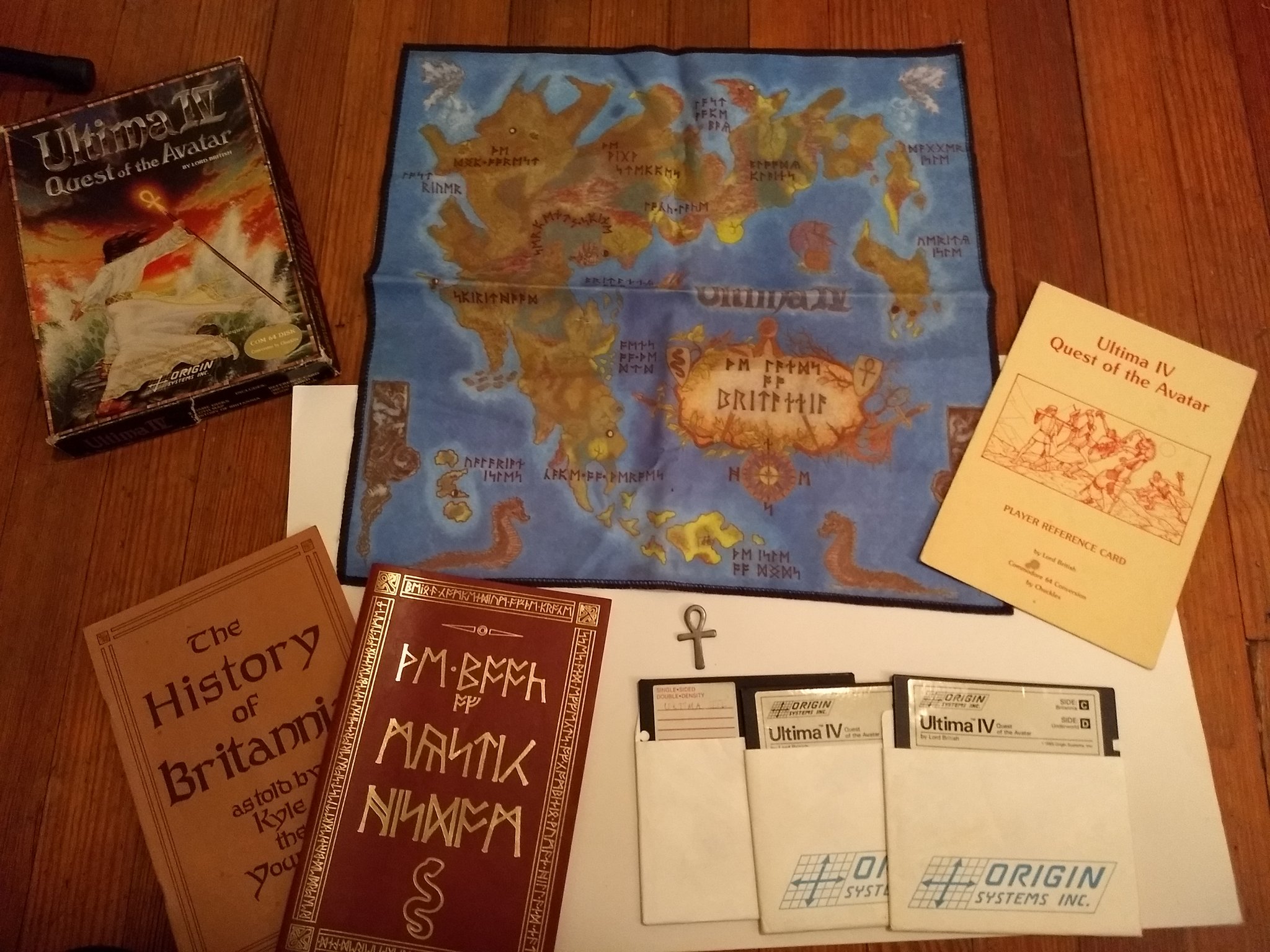
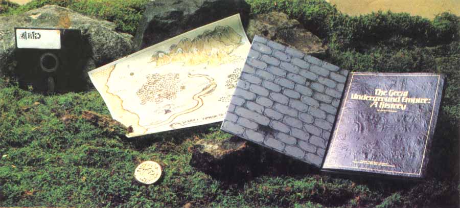
“Feelies” ︎︎︎Old computer games had graphics that were not great, and in the case of the early Zork games, no graphics at all. As such, many companies included what are colloquially referred to as “feelies” to compensate for this lack of graphical immersion. These included maps of the setting for the game, books with more lore or backstory or objects like, coins and crystals. Below are some from the Ultima series (from Twitter) and below that are photographs from Infocom, makers of the Zork series, you can find more scans of those feelies here.


Codex Seraphanius ︎︎︎This is a book with an “imaginary writing system” that was meant to simulate what it feels like for children to see “grown up writing.” Besides that it features man fantasical illustrations that demonstrate absurd processes. There are similar mysterious books like ABook from the Sky and the Voynich Manuscript if you are interested. Additionally you can view a .PDF of the Codex Saraphanius here.


︎Back to Word & Image 3