Fall 2020 ︎︎︎ SUNY Purchase ︎︎︎ (DES3510) Word & Image 3
Spiel: Logos & Layouts (introduction)
Introduction
So occasionally, I will do these, they will approximate lectures. I’m specifically using the term spiel, because it sounds more fun. Additionally, when you interact with a game (play) you are interacting with a system even if you’re on your own. That is to say, I imagine these being more interactive. Both in terms of people talking and me reacting to things I’m seeing in the class. I’m aware that I haven’t introduced some technical information related to logo design and layout. This was a purposeful decision. We’ll backfill some of this technical information, and add granularity as we go forward. These are not meant to be purely technical lectures; they’re meant to help your overall approach and possibly consider your place as a design professional.
I’m also using the term spiel; the German word for play, because I am going to be somewhat clear about my own opinions, this feels to me; antithetical to something called a “lecture” in an attempt to help you seek out your own influences and opinions and bring them back to critique, discussions.
First, let’s keep this Michael Beirut video in mind.
It’s not nothing though
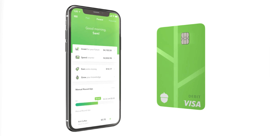
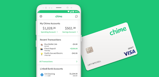
This is also to say that you should be keeping the values, ideas and concepts that are part of a brand in mind, and look at other similar brands within the sphere, if it is applicable. This is closer to marketing, but it can be helpful to “position” your brand. Know what visual signifiers constitute your brand, but also know where you might be able to “disrupt” the norm or expectations or target a different demographic. For example, if you’re doing a banking app
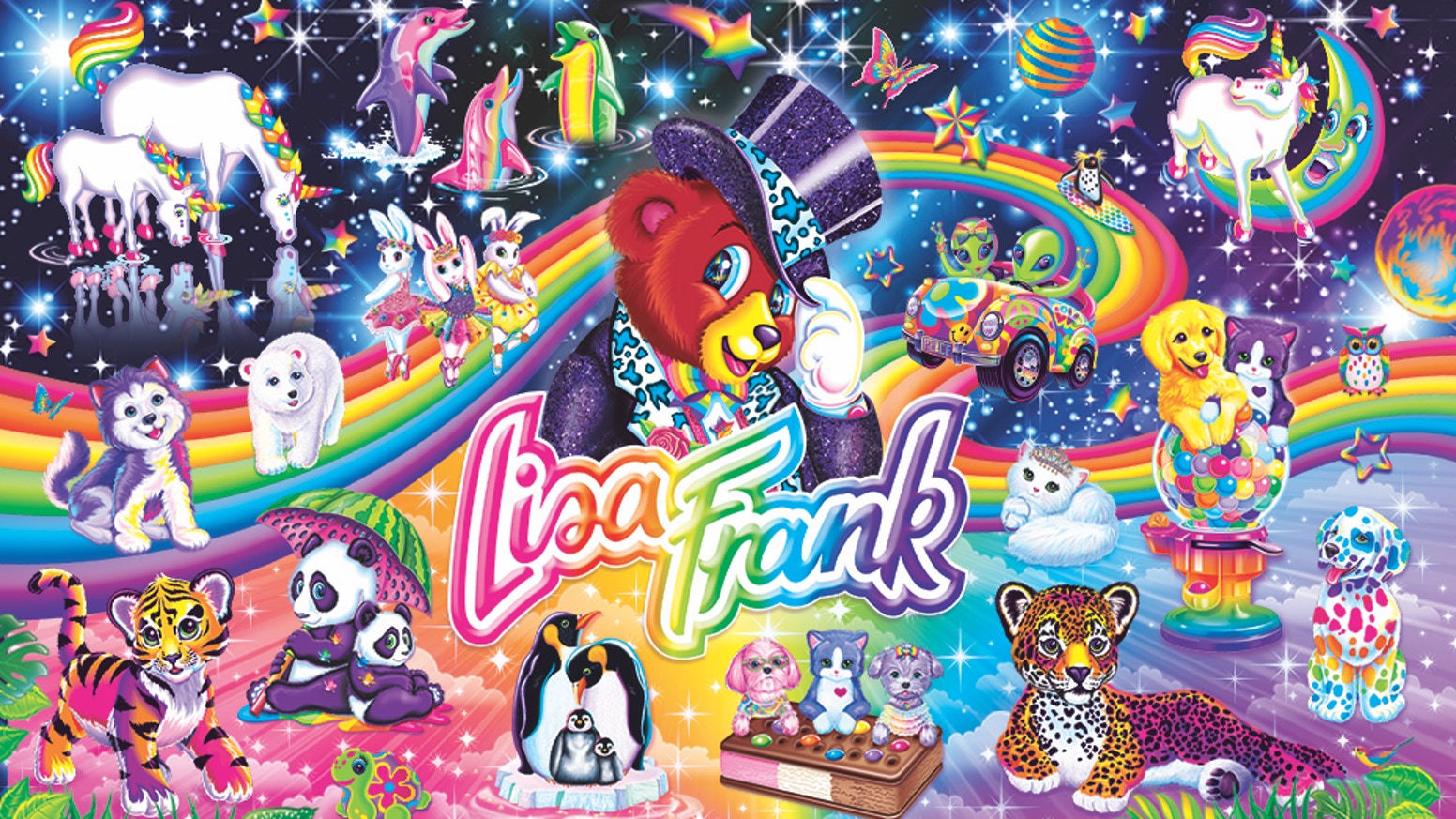
do you want to use green or blue with a sans serif, or do you want to try some Lisa Frank type thing to totally change things up? How clearly will that read as “a banking app”? Who will that appeal to?


Logotypes versus logomarks
Here’s a hopefully obvious thing we should get to. Typically I will say “logos” to encompass both a logotype and a logomark. The mark is the symbol itself, and the logotype is the (usually custom) typographic treatment of the name of the brand.
You should consider both; separately and together as well as differelock-ups or compositions, for different scenarios (material, scale, etc.).


Time to get “freaky”
You will probably here me say, or directly tell you, “it’s time to get freaky” typographically. While you may get hired to do something where they end up going with Futura, Helvetica, Gotham or Circular, and you will probably be applauded for doing so; even if you prefer these options for their ubiquity, or whatever the case is, at least explore “freakier” options to understand experientially why you are into those other typefaces. Additionally, as James Edmondson points out below their ubiquity leads to a homogenization of visual culture.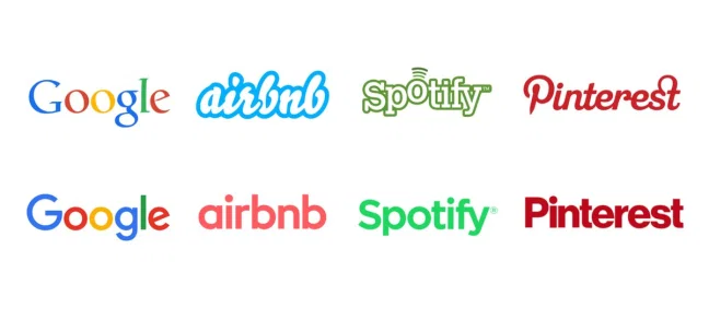
Consider the meta game(s)
In gaming, there’s a concept called, the meta game. This is the strategy of how you pick or play a character/ champion/ team/ deck based on what other people are playing. I’m mentioning this here because outside forces can determine a brand’s aesthetic. These forces could be financial, cultural, or temporal. For example, UPS’s rebranding in 2003 might seem confusing in retrospect, but these 3D-esque logos were in fact, en vogue at the time. Subsequently, “flat” design became popular which gives the latter redesign a little more context. The ultimate point being, people often point out Paul Rand’s design as being “the best” in a vacuum, but we are not in a vacuum.Another factor in this meta game, is cultural influence. A design studio may be tasked with making a brand appear “higher end” so that the company can charge more for the product or a company like Target may hire a design firm like 2x4 to do design for one of their collections that gives them some “heat” or cultural influence, based on the reputation of the design firm.

Consider the power of “bullshit”
You may here me refer to the term “bullshitting” periodically. You may choose to interpret this as a negative, since bullshit is a naughty word, but I don’t totally mean it this way. What I’m typically referring to is the gentle art of using context to guide the viewer or user. This can be “free” through talking. I would say the master of this is Marcel Duchamp.Another example in popular culture would be Jean-luc Picard in Star Trek: The Next Generation. This version of bullshit would probably be better described as “diplomacy”, Picard was known for being the captain that could basically use talking to solve problems.
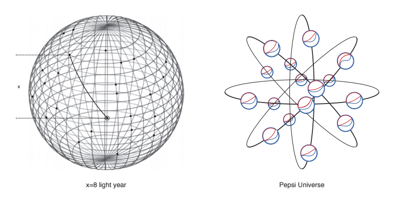
In design, you may work at a studio where marketing people are helping to do some of this for you. This is not a writing class, so while I may encourage and am willing to help you with writing, I will not hold it against you (gradewise) if your writing isn’t strong. The primary example where design actually comes into play in this context is your brand guidelines. While I will highlight more typical examples you will probably come across, such as IMG Academy’s︎ or more classical examples like the NYC Transit Authority Visual Standards Guide︎ I’d encourage you to also consider atypical examples like the great lengths the Arnell group went to justify a relatively simple new version of the Pepsi logo︎
One weird (spacing) trick
We’ll get deeper into the technical aspects of laying documents out for your brand guidelines, but generally, one thing you can do that will probably help you immensely is to be super cognizant of spacing. Look at all the spacing between different elements in your design, and observe how different or similar the spacing is. If all this feels foreign or confusing or difficult to you, just take a unit of space, say 1/2 of an inch. Use that as a guide. Use this as your space throughout your document. If you need a bigger space multiply it by 1.5 (.75 inches). If you need a smaller space, just divide it by two (quarter of an inch). Do this to create visual harmony throughout your document. And if you’re concerned about your document, generally add more space. An exercise
Of course you may not want this “visual harmony” throughout your piece. That being said, there should be a some form of consistency throughout. Here’s an exercise that you can do to understand or learn about your preferences and see how they are getting expressed in your work.- Read up to page 72 of Grid Systems︎ (This sounds like a lot but every page is half-English and half-German and has pretty large image-based examples. Also I’d suggest downloading that .pdf just to have but also so you can view it in spreads)
- Look at your own work and think about your application of those principles, or lack thereof.
-
Look at the
NYC Transit Authority Visual Standards Guide︎ and look at its application of these principles.
- Look at an issue of Emigre (maybe an early one like this︎) and think about its application of these principles or lack thereof. Also, just so its known high resolution scans of issues of Emigre are just viewable right now for free.
Further resources
-
Kel Lauren (which seems like a good channel anyway) talks pretty indepth about her idea, the marketing direction, and then proceeds to actually design the packaging and a website.
-
Eric Sin on tiktok︎Not sure how this ended up on my for you page, but sometimes he has super incisive analysis and discussion of logos and design, especially considering the context.
-
the Futur Academy︎I kinda cautiously recommend their other channel (the futur) which is more about the fiscal side of things, but this is mostly pretty practical tutorials and critique of submitted work.
-
Aaron Draplin Skillshare course on logo design︎
Jessica Hische Skillshare course on logotypes︎I haven’t watched the Jessica Hische one TBH but leaving these here in case you have Skillshare or want to take a look. Aaron Draplin frames the logo design as making a family crest so that may be helpful for you, possibly.
︎Back to Word & Image 3