Fall 2021 ︎︎︎ CUNY Queens ︎︎︎ (DESN241) Design 1
Spiel: Hierarchy
Introduction

What is hierarchy?
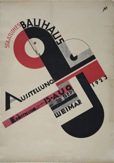
Hierarchy, in the context of the designing of graphics is the term for the system by which you determine the importance of information. That’s really it. The means by which you achieve this can be varied. The first thing you have to do is determine the hierarchy.


- Should the title be bigger than the focal image?
-
Is the title the focal element?
-
Which star(s) get top billing?
-
Is the director bankable enough to be mentioned larger than the matter on the bottom?
There are also phenomenological questions:
- Is the text big enough to read?
-
How close would the average reader need to be in order to read the title vs the executive producer?
There are also cultural conventions to consider:
- What constitutes a contemporary movie poster?
-
Is this poster meant to subvert those expectations?
-
Is this movie trying to use those tropes to appear more “professional”?
How can it be achieved in graphic design?
This image very quickly summarizes this notion. However a lot of this content relates to phenomenological and cultural notions that are beyond the scope of this discussion.
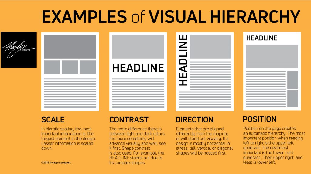
Scale

Contrast,
Direction
Position

How do you apply this in your work?
For this project, your first step after finding the ephemera to work with, is to interpret what the hierarchy of a given piece is. Please take your image, determine all the content, and annotate the image and attempt to extrapolate the hierarchy from it.︎Back to Design 1