︎Back to Design 1
Fall 2021 ︎
CUNY Queens ︎(DESN241) Design 1
spiel: typographic technologies
Background
So this is a spiel, or what I’ll use to approximate lectures. This one is to help you understand some underlying technologies that influence typography. This is meant to help you think about the Shapely Letters project.
The important things to keep in mind are:
-
Type is made by people; type designers and require a significant amount of planning, conception and production.
- Type is more than a dropdown menu. There are other places to get type, other ways to think about type and you don’t have to treat selecting a font or typeface as a character select screen
![]() do this once you know the frame data.
do this once you know the frame data.- This is a primer it is not meant to replace historically relevant material you may talk and learn about in Type 1 and 2.
Written Language
Before printing was widespread, communication relied on written language. The forms of writing influence the shapes that are produced.
This is an example of cuneiform, one of the earliest forms of writing on Earth, from Mesopotamia. It is as you can probably tell carved into surface in such a manner as to produce the triangular, tapering forms.
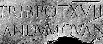
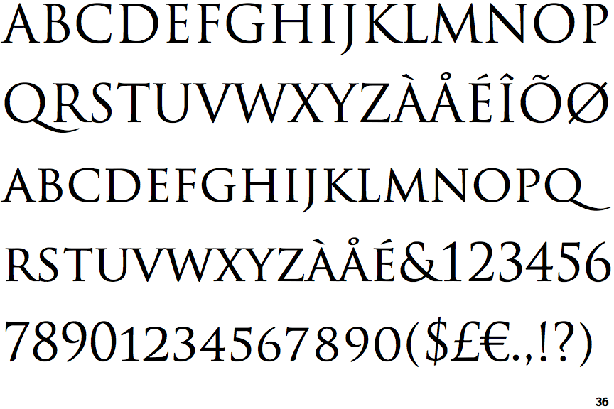
This is the Trajan inscription which is one of the earliest and best examples of what are now called “capital” or “uppercase” letters in the Latin alphabet. It was literally inscribed or carved into the surface of the stone, leading to the very straight lines and sharp serifs and terminations. The typeface “Trajan” is based upon this. Trajan is commonly used in movie posters.With the proliferation of literacy, brush and pen-based lettering became more common. Brushes produce the smoother tapering and expanding types of strokes you see in both Japanese calligraphy and more contemporary “wedding calligraphy”
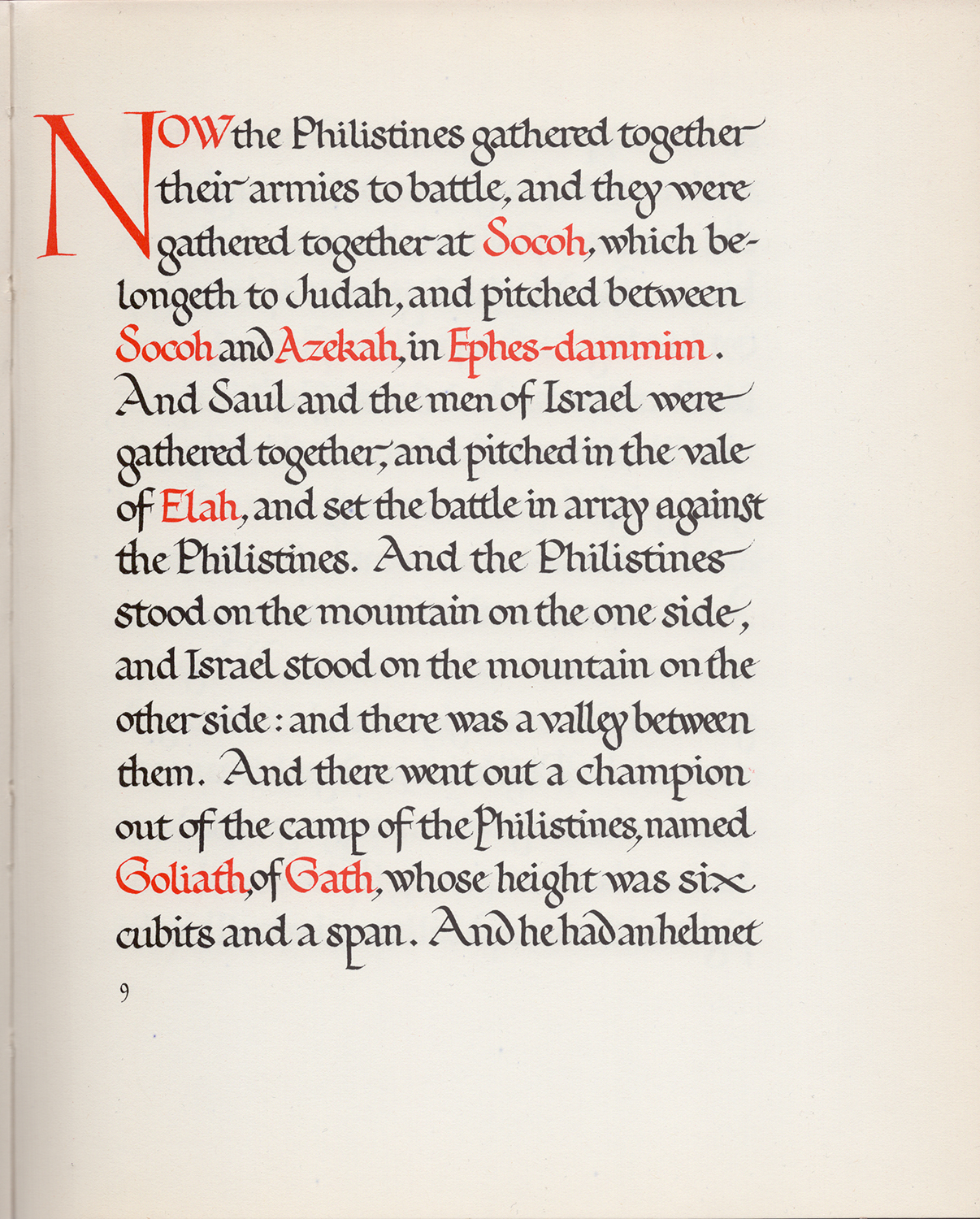
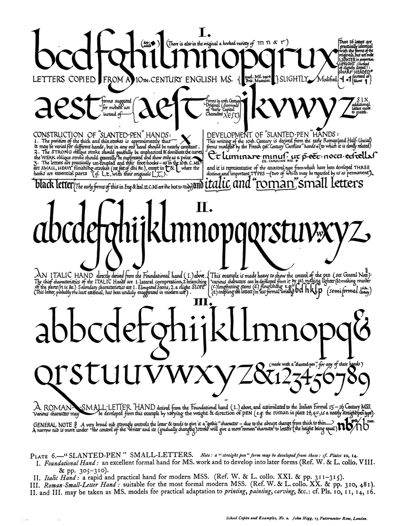
Broad-nib pens (a flat or folded piece of metal you dip in ink) produce the even, readable textures we see in medieval manuscripts.
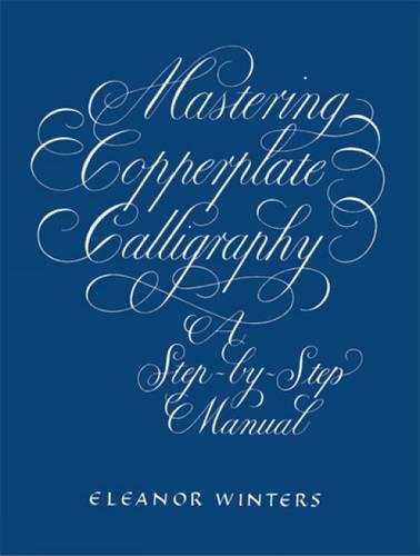
On the other hand, pointed nib pens (a pointed piece of metal that expands and contracts with pressure) produces the very decorative tapering and sharp forms we associate with Copperplate Calligraphy
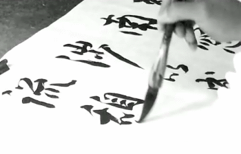
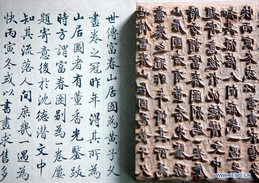
Another great leap forward in type technology was printed type. This was originally invented in China seen below. This was done with carved wooden blocks that could be re-used. Guttenberg, in the 15th century used movable pieces of cast metal to create individual letters in the second example below.
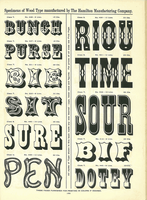
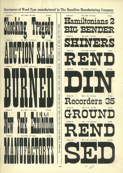
Variations in this technology like wood rather than metal type can produce interesting stylistic results. Because wood type makes it harder to achieve the fine detail associated with smaller metal type; it is often associated, in the west, with larger more bombastic type used for posters in the 19th century.
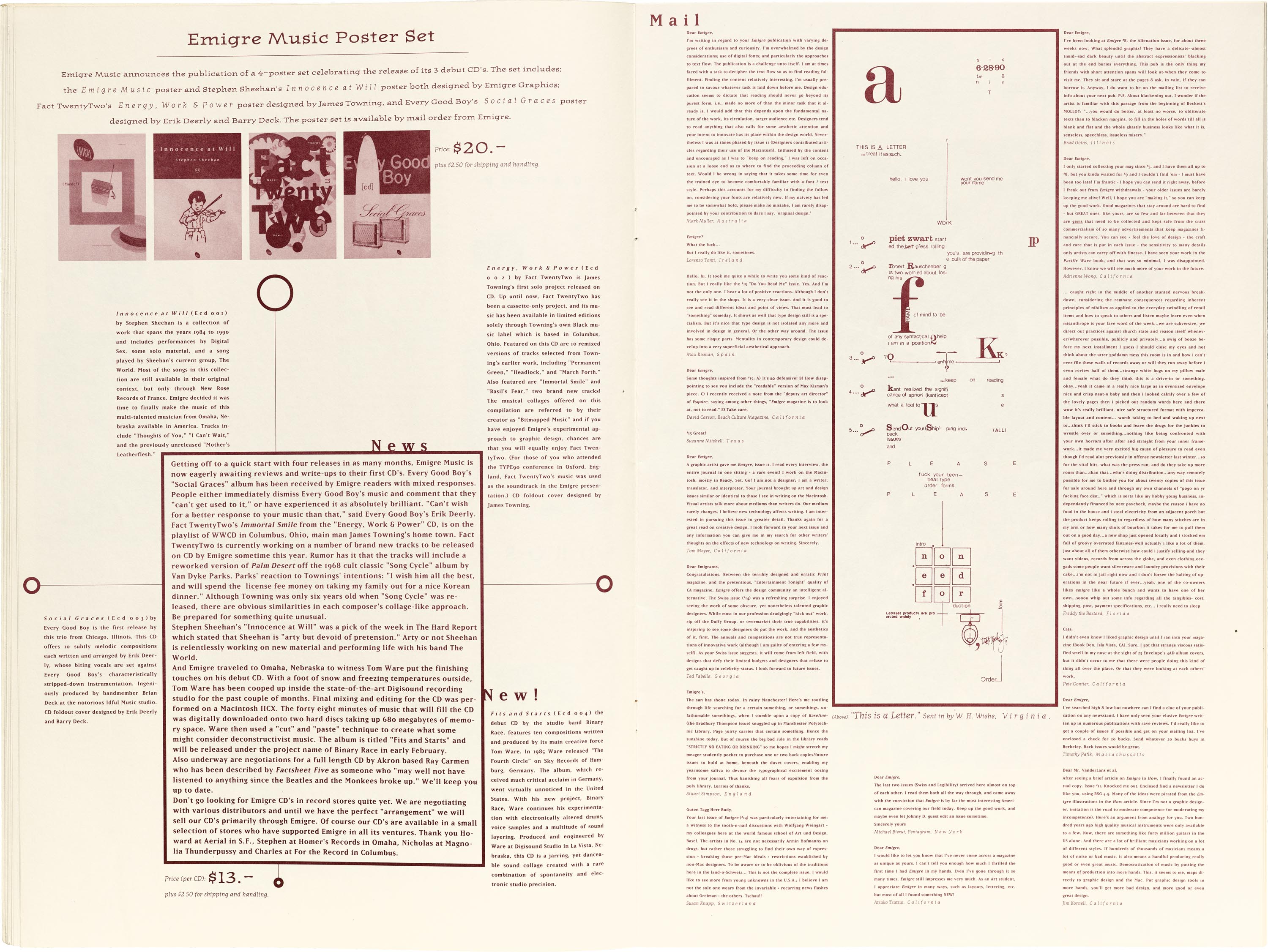
The advancement of computers in the 1980’s led to programs like Fontographer that allowed designers to create digital type for the first time. One of the proponents of this technology was Emigre, who produced both a magazine and typefaces. Not being bound by metal type allowed designers to play with more radical compositions and type designs.
A couple other examples of note here are Jon Wozencroft and Neville Brody’s Fuse magazine from the early 1990’s where they invited designers to create fonts based on a theme of that issue. The fonts were included on a disc with the magazine.
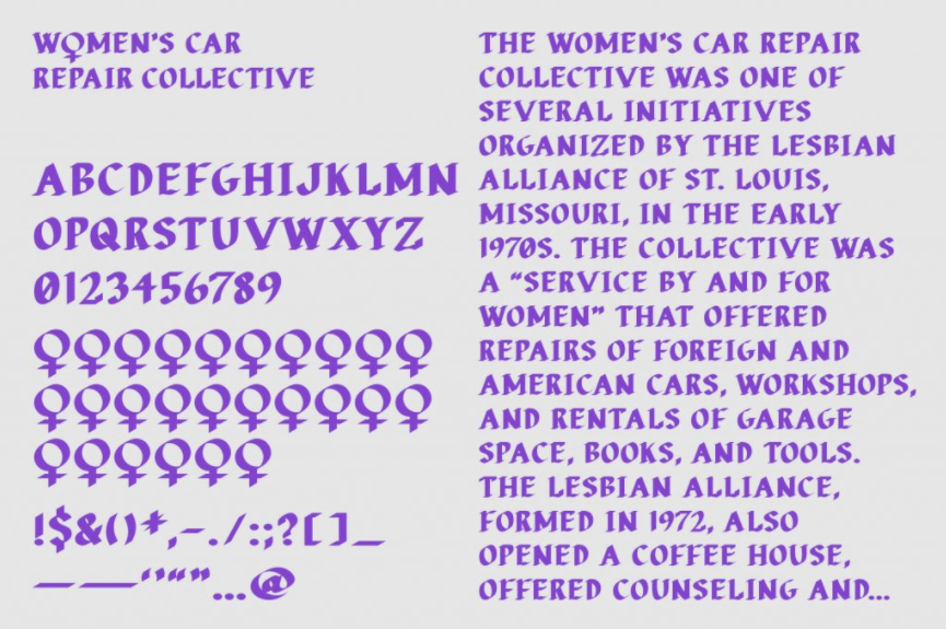
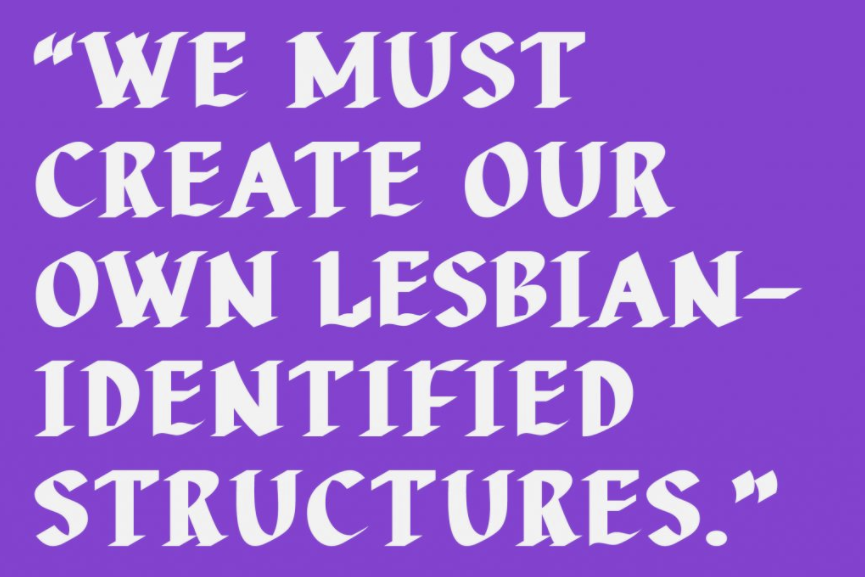
A more recent example here is Nat Pyper’s Women’s Car Collective font from 2020 based on printed examples of a lesbian car repair collective from the 1970’s
︎Back to Design 1
 do this once you know the frame data.