Fall 2021
︎︎︎
CUNY Queens College ︎︎︎ (DESN241) Design 1
Supplemental photoshop techniques
Background
These are some supplemental Photoshop-based techniques for methods to treat your images to give them texture and help your photographs merge with your type or in general just make things more finalized, or if you are potentially stuck.Generalized advice
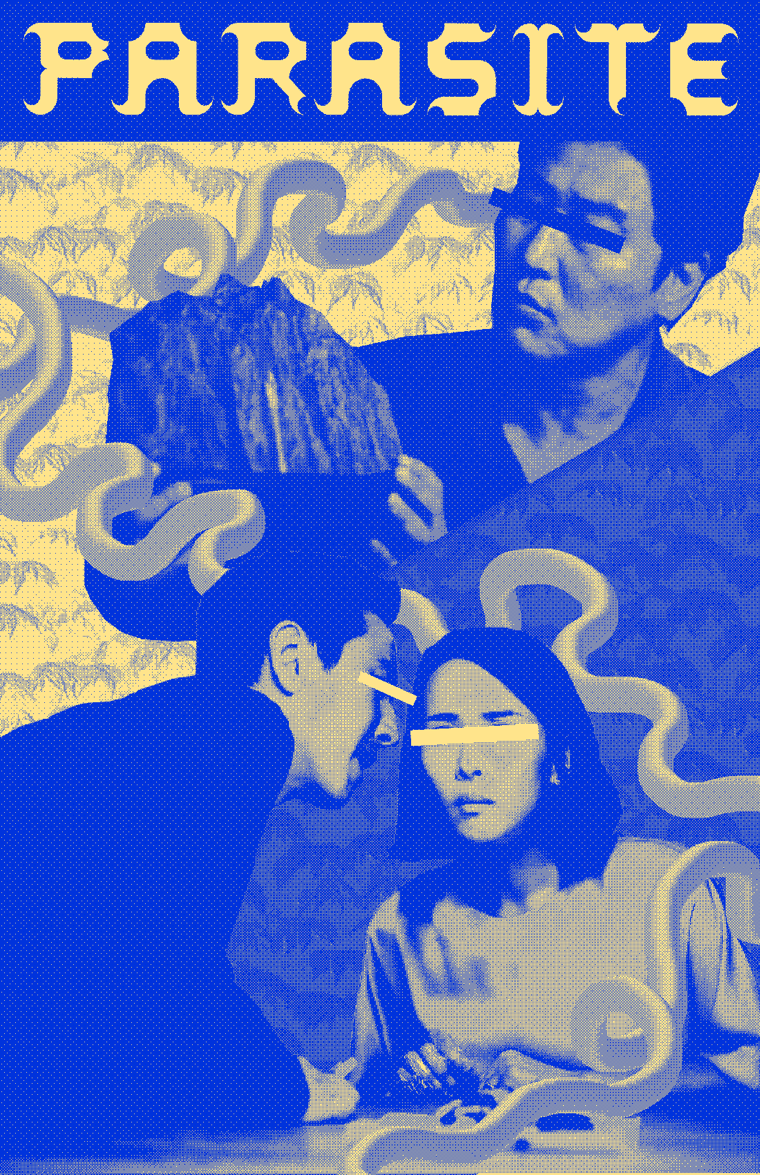
Adjust levels on black & white photos︎︎︎Do not simply put the images in grayscale mode or desaturate them and call it a day. This was the case for a lot of the “memes” I saw. You have to adjust them a little bit to increase the contrast. This is because colors appear at different brightness levels when they become black and white. Follow this tutorial if you are not familiar with working with levels in Photoshop.
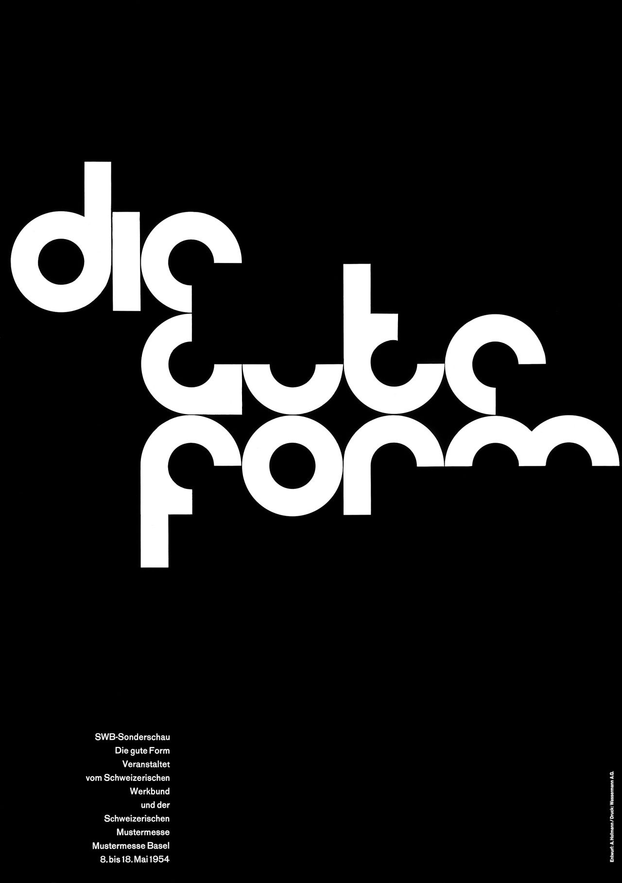
Make fonts bigger within the frame, and consider the composition︎︎︎
Consider bigger type, how type might be different sizes throughout the piece and why. These are lettering but some good posters from Piotr Szyhalski, also known as laborcamp, you can see more on his instagram.


Add more content︎︎︎
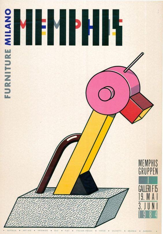
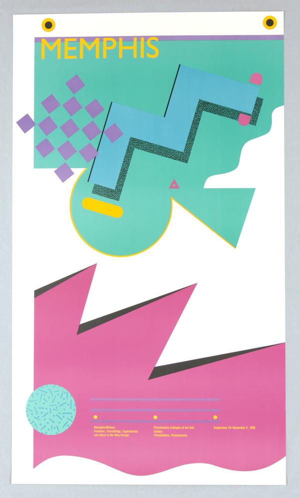
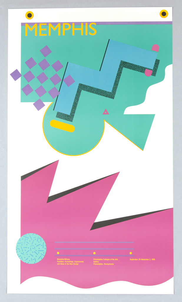
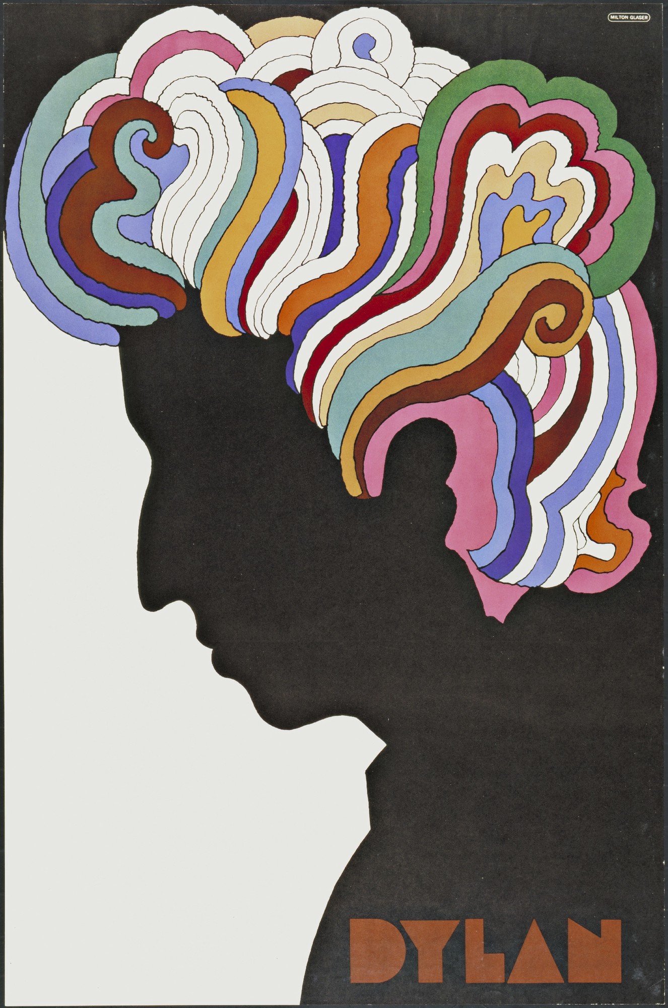
Decoration is not necessary, but please consider the possibility of decoration (pattern, scribbles, drawings, etc) and how it might enhance your memes, and make your imagery and compositions more complex. Here are some posters from the Memphis Group, known for what has been distilled to “the 80’s style” which is known for its use of decoration.
Decoration is not necessary, but please consider the possibility of decoration (pattern, scribbles, drawings, etc) and how it might enhance your memes, and make your imagery and compositions more complex. Here are some posters from the Memphis Group, known for what has been distilled to “the 80’s style” which is known for its use of decoration.

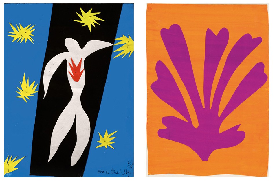
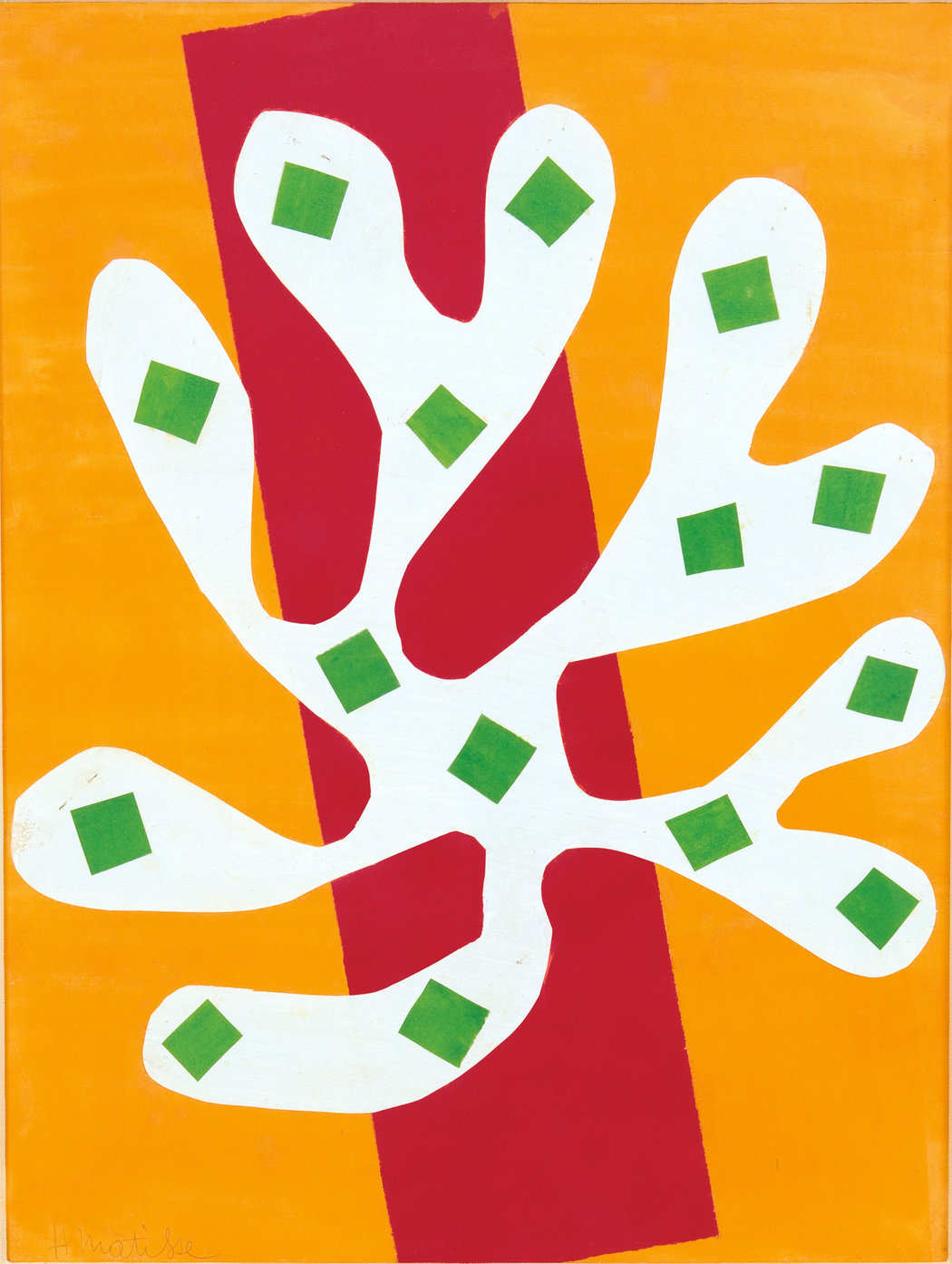
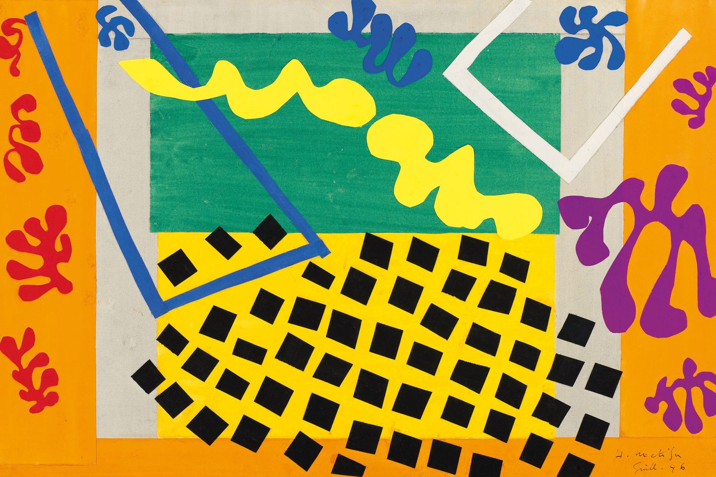
Try other ways of making images. Cut out, collage (digital or analogue), messing with an image while it is scanning, drawing over images, etc.Here are some posters by Henri Matisse from the 1940’s.


︎
These are just suggestions, please use your curiosity and creativity to look for other options for filtering images and text.
︎
︎
These are just suggestions, please use your curiosity and creativity to look for other options for filtering images and text.
︎
Bitmapping images ︎︎︎ This is one technique that I think is especially useful if you have low resolution photographs you want to make “bigger” besides simply looking “cool.”
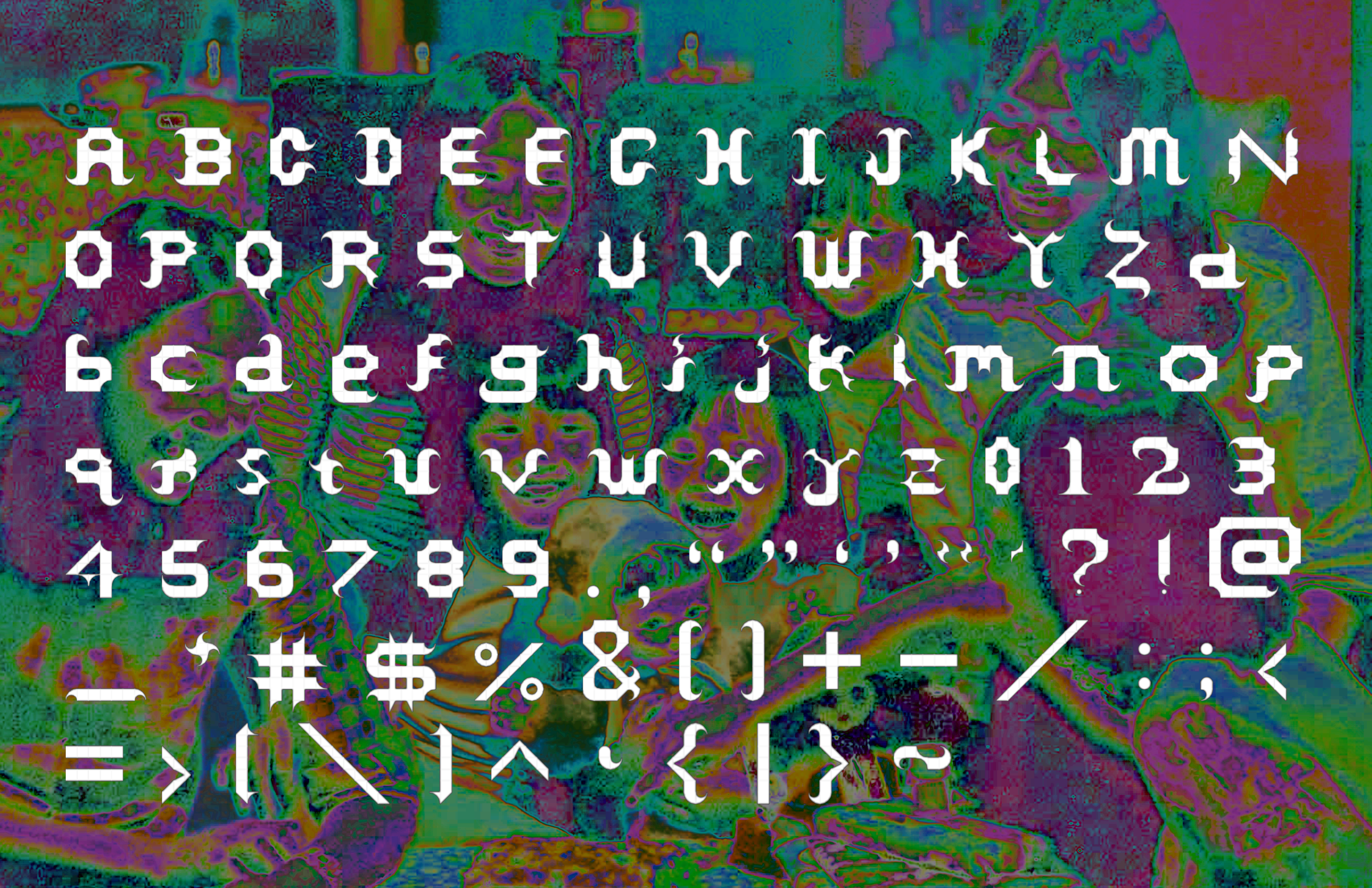
Texturing/distressing fonts ︎︎︎ If you’re not into the blockiness of Fontstruct, this is an option for you. Also might help images not appear so flat, especially if you started in Illustrator.
Halftone patterns ︎︎︎ another option for changing the texture of text and breaking up potential blockiness in Fontstruct.
Applying layer styles ︎︎︎ Here’s one “cool” thing you can do with the “Bevel & Emboss” layer style. There are a whole plethora of layer styles to explore.
Blending modes ︎︎︎ Blending modes effect how different layers talk to each other, when they are on top of or below each other. Here’s one effect you can achieve through the use of blending modes.
Collage ︎︎︎ An option you have with your images, as I’m assuming they will probably not simple
Examples
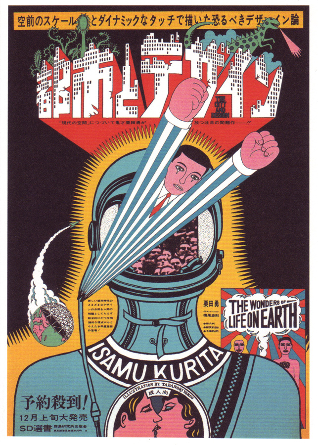
Design-related︎︎︎
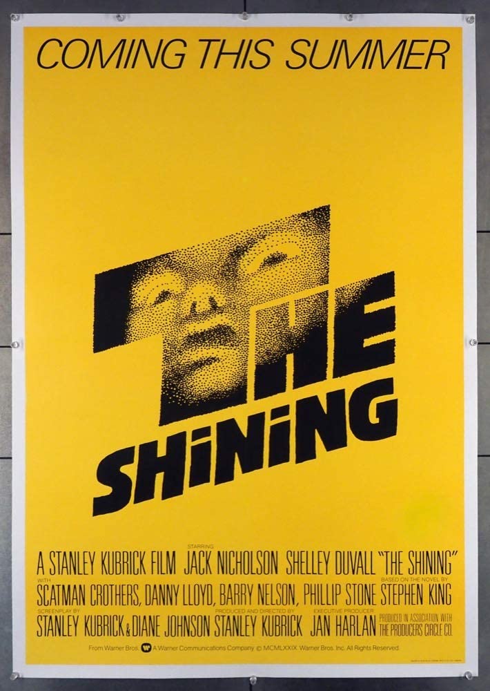
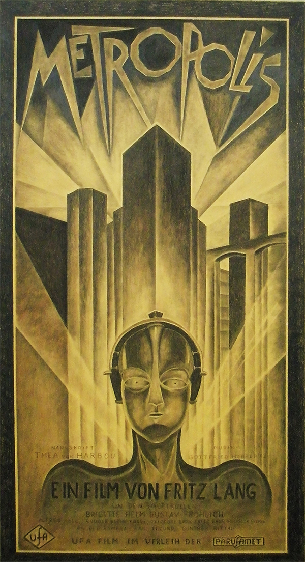
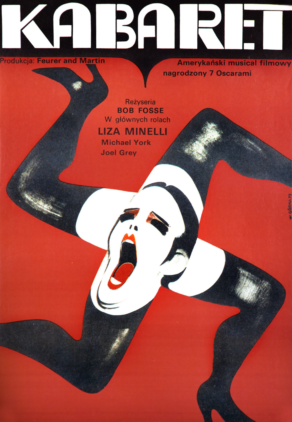
Film ︎︎︎

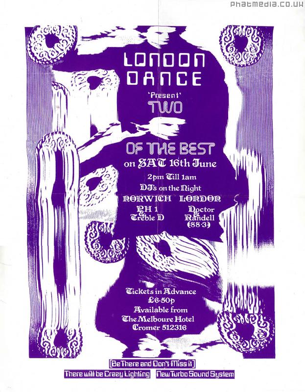
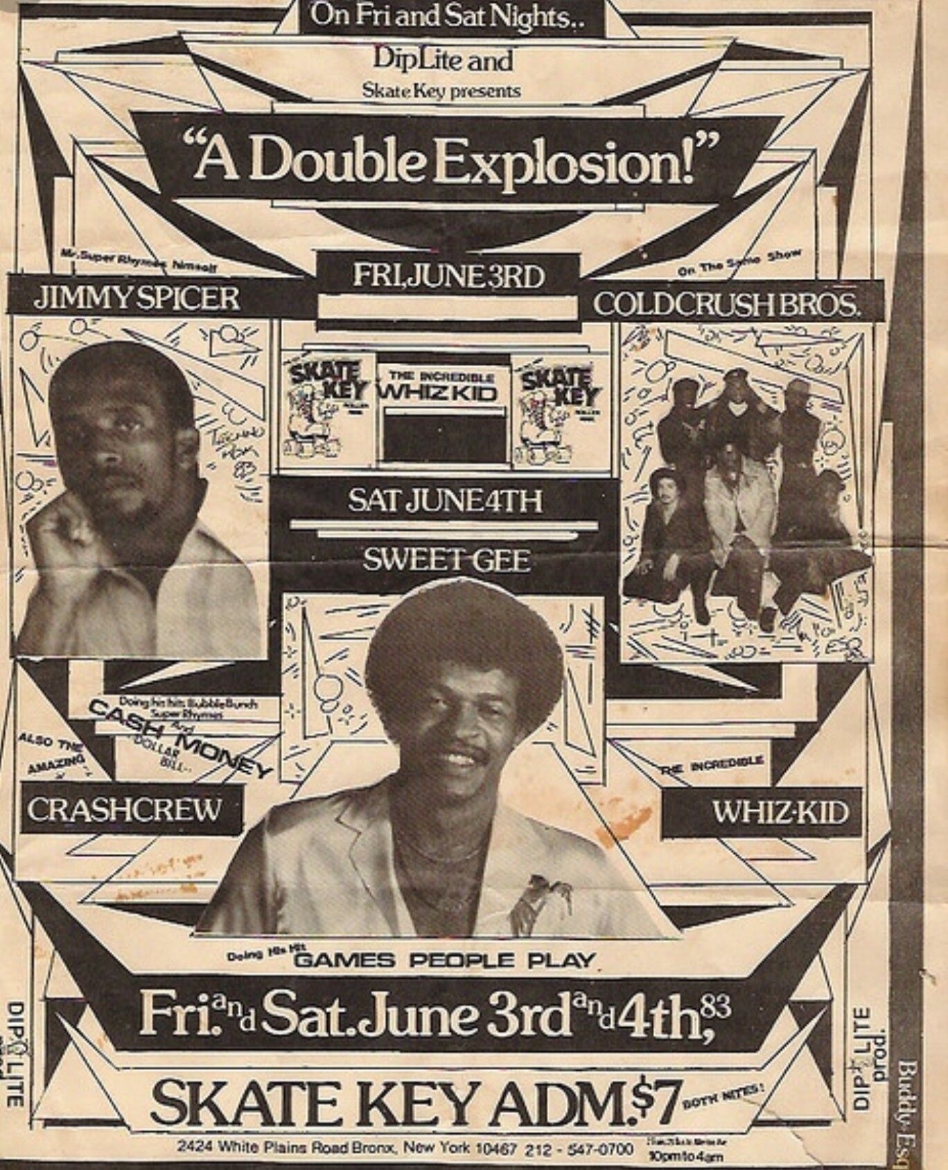
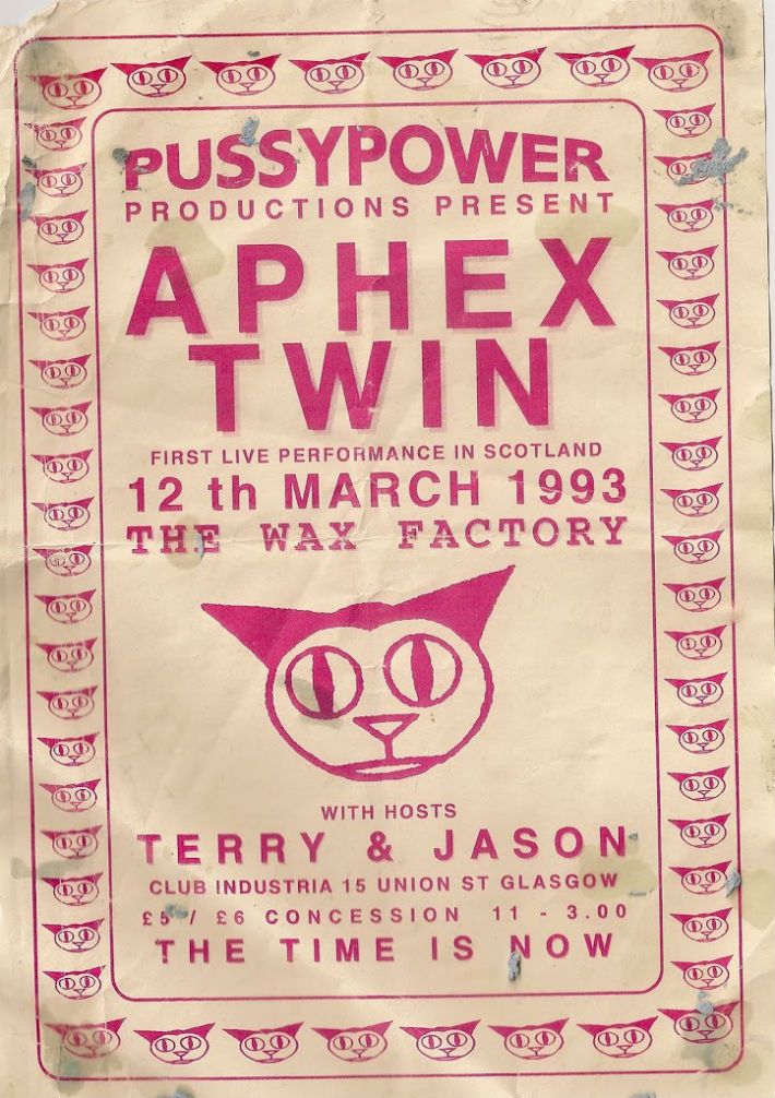
Music/Concerts ︎︎︎

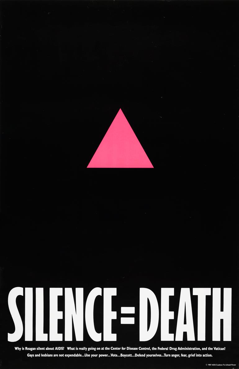
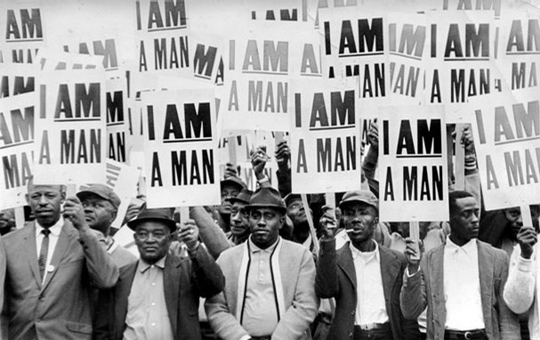
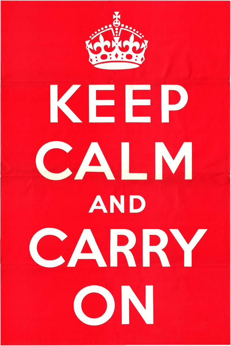
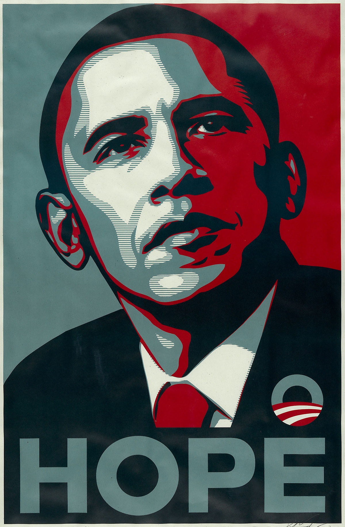
Politics ︎︎︎