CUNY Queens ︎ (ARTS241) Design 1
Knitting Circle:
Knitting Circle:
document “Flow”
Background
When you create a document; a zine, book, or style guide, you’re doing several things. You’re organizing the actual content, creating some kind of typographic system, you’re creating a system of negative space and image size and relative scale. The other factor is time. You’re creating something that can both be flipped through quickly, or closely studied academically, or both.Think of your document like a user interface, how is the user navigating it, and why? Would Anthony Bourdain’s cookbook be typeset the same as Claire Saffitz’s?


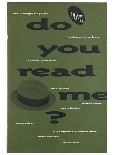
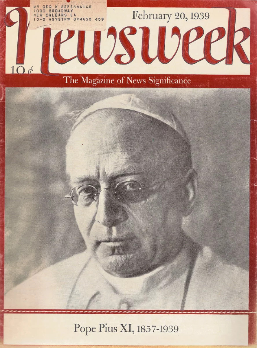
Would Emigre magazine be typeset the same as Newsweek?
What would be different about a C++ programming manual, versus a book of short stories?
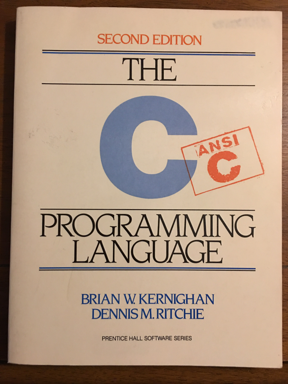 (I know this is C, don’t @ me)
Besides “it depends” the answers here also relate to the “flow” or rhythm of the document.
What is “flow”?
You’ve created a composition before. Through typography, imagery, or information. When you create a document like your zine, you are creating many compositions over time. How those compositions interact with eachother and change (or don’t change) over time is the flow of you’re document. This is why we’ve discussed grids. While not the only solution, grids give an immediate sense of order and organization. They are also adaptable. While you might use 2 columns for one set of content, you might need 4 columns later for a grid of smaller imagery; that is a relatively trivial task in InDesign to set up.
There’s also a “painterly” and less objective component to this. Does the content you are designing get boring after the third chapter? Do you want to show 200 photographs both in detail and as thumbnails? These are the kinds of situations you’ll encounter that will not have a definitive yes or no answer, you’ll have to create something, assess it, and decide what to do from there.
I don’t have a good text on this, as many of them are concerned with the “nuts & bolts” of negative space, character styles, choosing typefaces; this is intended to get you to think about things beyond those nuts and/or bolts. This is the metagame, so to speak, of designing longer documents.
An example from another discipline
In the movie High Fidelity, John Cusack attempts to explain the “rules” of making a mixtape. He does give some indication that you start high energy, but not too high energy, and make sure you manage the flow from there. While he does say “there are a lot of rules” he also indicates that through practice (partially through his relationship with his partner) that he’s intrinsically understood this process. Flipthroughs of different books
Documentation of books to look through
- Letterform Archive︎
(They just made this free for everyone, which is kind of incredible) - Barlowe’s Guide to Extraterrestrials︎(I mentioned this in class previously, this is a decent example of using a familiar and relatively static structure to present unfamiliar content)
-
Boy’s Don’t Cry︎(A .pdf of the book flipped through above. You have to download this because it is huuuge. I also recommend viewing it in Acrobat such that you can see 2 pages at a time)
- Betty Crocker’s Picture Cook Book︎ (you have to create an account and log in in order to “borrow” this, but it is free, and thus worth it for you to do)
︎Back to Design 1