CUNY Queens College︎(ARTS241) Design 1
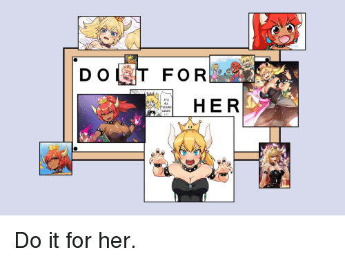
“Do it for Her” Poster
“Do it for Her” Poster
![]()
![]()


Background
In The Simpsons Season 6, Episode 13 “And Maggie Makes Three”︎ Homer takes a sign placed at his workstation, at the nuclear power plant where he works, which says “Don’t forget, you’re here forever” and alters it so that it says “Do it for her” by obscuring it with pictures of Maggie, his daughter. Overview
Why did I choose this moment? Homer is the archetypal “worker” with the archetypal “evil” and psychically corrosive and ethically dubious job (a nuclear power plant) and an archetypically evil boss. Mr. Burns gives Homer the “demotivational plaque” to assert his place above Homer in the hierarchy of their workplace. Homer’s creative act is thus subversive and authorial. That is to say, Homer does not create this piece because he is obligated to because of a client relationship, he does it out of necessity; he can’t function without this intervention. Additionally, Homer is not an artist or designer, he functions as a kind of outsider artist. Most importantly, he does this out of love and (to me at least) the result is quite powerful; more than a lot of design and art I see on a regular basis. Another factor is that the image has become a template for memes, which indicates that it has a greater relevance in the cultural zeitgeist.


- Scale ︎ If you think about a movie poster, it is meant to attract your attention from far away (big title/big picture of Will Smith’s head) and then have more details at a smaller size once you are closer (release date would be smaller, and then director yet smaller). One thing you can consider is tiling the imagery if you want to make a bigger print.
- Printing Time ︎ Reserve at least 0.5 to 1 day for printing. This is as important, if not more important as the actual image generation. I would strongly advise not using this lab for printing as the paper is quite thin and there is no good place to trim down your poster. Do one of the following: the Klapper printing lab, Staples, or your own printer.
- Paper Choice ︎If you have the luxury, get some nice paper. If you can’t in time for the critique get a paper sample pack from a place like Mohawk or French Paper and see what you like. You can also use different paper to create a different background color.
- Make sure your document is CMYK︎CMYK is a subtractive color model, while RGB is additive. We’ll talk a little bit more about the “math” related to this when we discuss blending modes, in general printing is CMYK and RGB is for screens.
Requirements
- On the date the project is due (02/11/2020), you must submit a digital version of your poster (via your Google Drive/Dropbox)
- You must have your poster printed for the critique on 02/11/2020
- Your poster must be at the very least a minimum of 11"︎17"
- Your poster must contain typography or lettering of some kind
(absolute minimum, 1 word) - Your poster must contain imagery of some kind. That imagery must either be self-generated (by you) or be intervened into in some way.
“No Shuriken Mode” Challenges
- Create a triptych or polyptych of related posters exploring the topic of your focus for the project. (If you want to go see stuff like this in real life you should go to the Cloisters)
![]()
![]()
![]()
- Use a tool like Fontstruct to make your own typeface.
- Create an “evidence wall” (“multimedia” collection of smaller images), and install it for the final critique, if ya got the time to do that.
![]()
![]()
- Create a risograph print at the Printing Lab and print a copy of your poster for each person in the class. (I want to do a riso workshop soon, but I don’t think it can overlap with class time)
A two-color risograph from Edouard Baribeaud from his 2013 series Au Pavillion des Lauriers![]() A poster from Secret Riso Club
A poster from Secret Riso Club
![]() (spread from Trapper Keeper #4, this looks like 3 colors to me. I think they’re using blue + yellow to get green)
(spread from Trapper Keeper #4, this looks like 3 colors to me. I think they’re using blue + yellow to get green)
![]()


 (spread from
Relevant dates
02/04/2020 ︎ In-progress check-in on state of your poster(s)02/11/2020 ︎ Critique of final posters
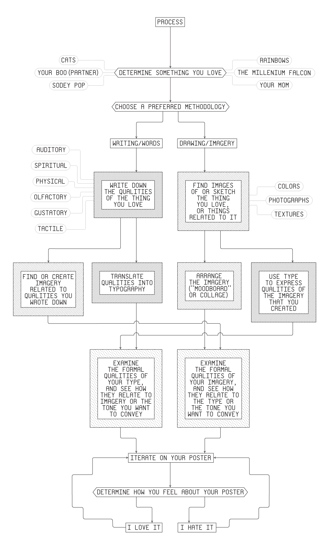
Process (starting)
Examples