Enter the (DOT) Matrix
Background
Creating typefaces can be intimidating and arcane. The goal here is to create a kind of, microcosm of this process that helps to demystify it. Lettering in a dot matrix form is also a (potentially) fun “puzzle” for understanding the minimum “resolution” for readability. Some Examples
The visual language of “cracktros,” demoscene animations, and ASCII text.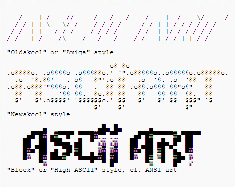
The pixelated “fonts” and lettering created for older video game systems like the NES, SNES, and Sega Genesis with lower resolution.
LED signs used in stock tickers, food carts and Jenny Holzer’s artwork.
(technological limitations of LED lights, also providing contexts in Fine Art and commercial applications)
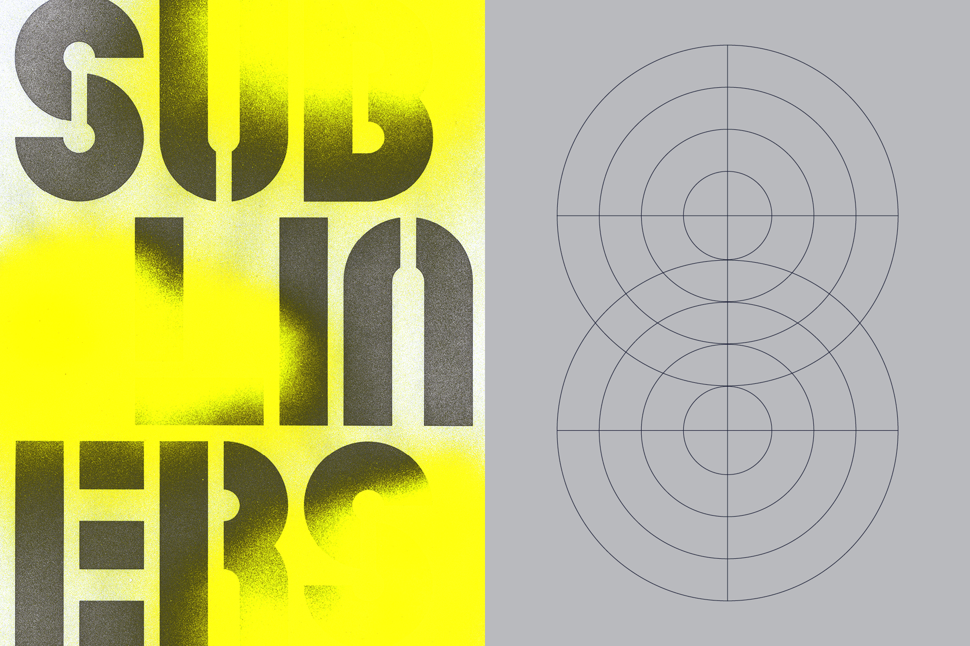
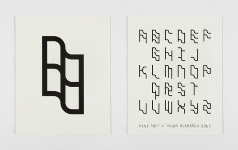
Typefaces contemporary and old
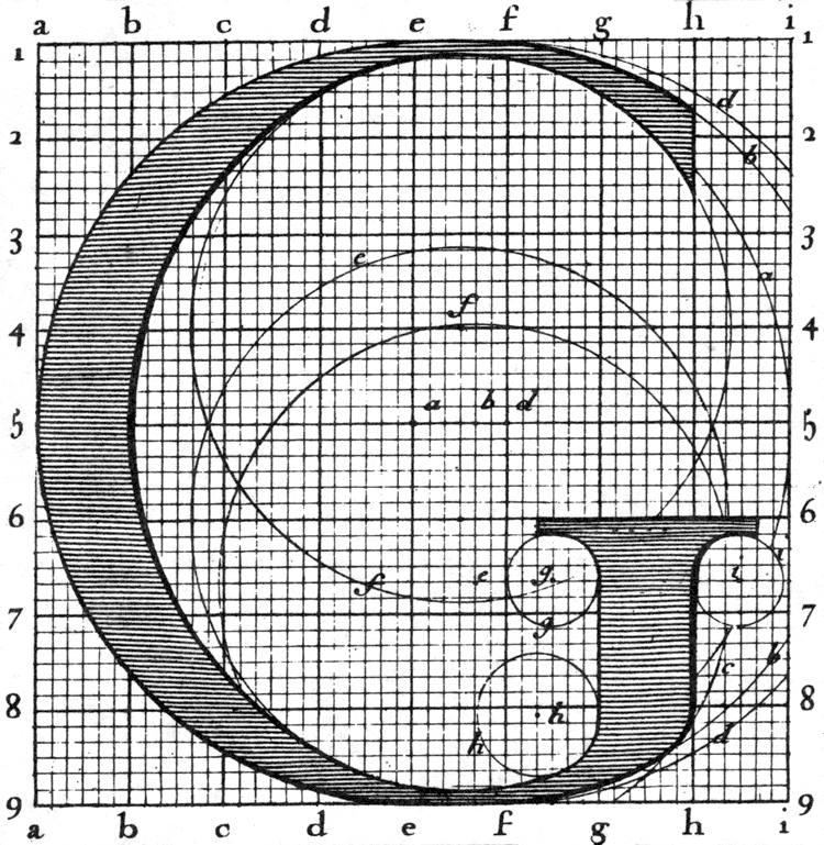
(mostly historical and contemporary context and also Roman do roi to show an “extremely fine” matrix)
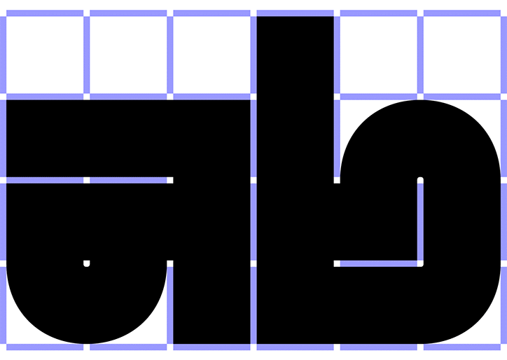
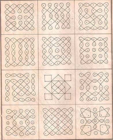
(alternative ways to connect grid points)


Commercial applications like these handjet printers.
Not rectangular grid examples


Objective
Make a “Dot-Matrix” typeface, a specimen, and 5 “applications.”Requirements
-
Create an uppercase (A-Z), lowercase (a-z), numerals (0-9), and punctuation
(basically everything you can see on the keyboard) - Print out a sheet showing every character you created
- Create 5 different “applications” posters, set type, whathaveyou.
- You must export the fontstruction as a .TTF file, you must export your specimen and applications as .pdf files.
- You must print out your applications for critique.
No Shuriken Mode Challenge(s)
-
Add characters from another language
-
Add diacritics for other language support
-
Add a set of emojis
-
Create an alternative weight or variation