Spring 2024 ︎︎︎ Purchase College, SUNY ︎︎︎ (DES3440) Typographic Investigations
Enter the (DOT) Matrix
Background
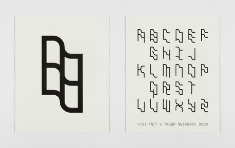
Creating typefaces can be intimidating, arcane, and requires sustained effort, focussed on increasingly granular concerns. The goal here is to create a kind of, microcosm of this process that helps to demystify it. In this case we’ll use a subset of shapes to create our typeface, to understand letters as a system.
Some Examples

Josef Albers, Kombinations-Schrift, Bauhaus Lettering Set, 1926-31. Milk glass and painted wood. (from Moma.org)


Objective
- Understanding typefaces as an interlinked system.
-
Gain greater facility with the entire system of creating a typeface without using specifically Glyphs or Fontforge.
Final Submission
A folder containing the following:-
A .pdf showing the initial word or phrase used to guide your design process
-
A .pdf showing all glyphs that you have created + the shapes utilized.
-
5 applications of your lettering
(these should be at least 11︎17 in. posters but know this the absolute minimum and that they can be anything. A video, a booklet, etc.) -
A sub-folder containing all process work
- (Extra Credit) Convert your case of letters into a working font file in Glyphs or Fontforge. (if you do this include the file)
Requirements
- The letters in one case of the Latin alphabet (ie A-Z, or a-z).
- 11︎17 in. posters are the absolute minimum, “I have satisfied the terms of the assignment” deliverables for the applications.
- You must show the glyphs you created and their corresponding unicode character (ie uppercase A, etc.)
Considerations
-
What is the minimum you’d need to express all the letters in the latin alphabet?
- Do not simply connect a bunch of squares/circles or use them as a grid! The point is to understand how your shapes can connect and create a cohesive visual system.
- Your guiding word or phrase can be anything. A word or phrase that you like, or think has interesting letters, the name of your lover, your mother, etc. This is in lieu of a pangram
-
An application should, at least be an 11︎17 in. poster, but is intentionally vague in order to facilitate creativity. I expect that you will go beyond this.
Grading
-
20% ︎︎︎Deliverables (as in, is everything submitted)
-
20% ︎︎︎ Concept (and its relationship to guiding phrase)
-
20% ︎︎︎ Process
-
40% ︎︎︎Final Work for Critique
01/30/2024 In-class exercise!
Cut out a bunch of shapes in paper and start to use them to create letters, pin-up scans of your work so it can be discussed at the end of class.Relevant Dates
- 01/30/2024 ︎︎︎Introduction & Pinup of initial sketches & discussion of initial word choices
-
02/13/2024 ︎︎︎Check-in
- 02/20/2024 ︎︎︎ (no class)
-
02/27/2024 ︎︎︎ Final Critique & Writing Assignment
︎Back to Typographic Investigations

