Discussion:
Composition & Gestalt
Introduction
We’re talking about these ideas for two reasons: so that you have ideas you can relate to your own work and how to assess it, and so that you have aesthetic concepts with which to frame your thoughts on the work of your peers for critique. I very much do not want to administer tests or quizzes, but if critique and related discussions are super quiet, I’ll need some method to determine everyone’s understanding of these concepts. These are concepts that should make or should have made their way into your vocabulary by osmosis (that is to say paying attention in class and critiques), but I am presenting them here for reference as well as some options that should help you depending on how you best learn.
Gestalt Psychology
The term Gestalt is German and roughly means “form.” It was a form of psychology that was meant to function in opposition to earlier schools of thought which meant to understand perception at its most “atomic” level. Gestalt Psychology (not to be confused with Gestalt Therapy) meant to look at the patterns created through things perceptually grouped together. These theories were circulating Germany roughly coincidentally with the Bauhaus school. The Bauhaus ended because of World War II (the work produced there was deemed too “foreign”), leading many of its teachers to emigrate to, and subsequently influence arts education in America. I think this is why many of these ideas are still discussed today in a design context (though slightly modified), but to be honest many of them are relatively self-evident, I’m trying to introduce some common terminology. Here’s the ideas as they apply to design, you may see other ones that relate to the original psychological applications:- Continuity︎
The eye tends to see lines as continuous (the right image) rather than as a series of interlocking shapes (see the left image)![]()


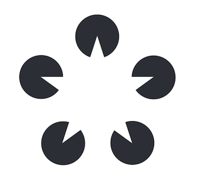
Our eye will “fill-in” negative spaces in order to “close” shapes.
-
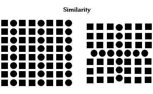
Similarity ︎
Formally similar objects (in this case by shape), will tend to be viewed as a unified whole.
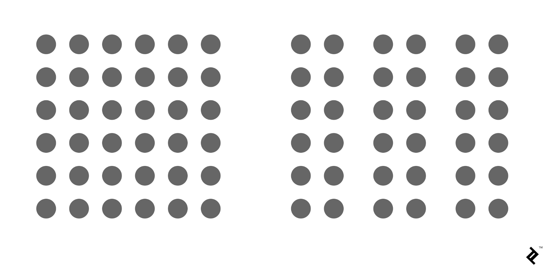
- Proximity ︎ Objects in proximity to each other tend to be perceived as unified wholes.
- Symmetry ︎Symmetrical objects tend to be grouped together as whole by the eye.


- Figure & Ground ︎
Our eye separates objects into figures (foreground) and ground (background). Color, perception, and other tools can be used to play with these perceptions. For example, in the below image what do you see?
![]()
![]()

Compositional Principles
Balance and Weight. That’s really it. This is more about sensitivizing yourself to when these are used, how, and to what intended effect.Balance is divided, most basically between symmetrical and asymmetrical. If you’re familiar with Wes Anderson, he makes great use of symmetry and one point perspectiving in his shot construction. The screenshot below is from Moonrise Kingdom.

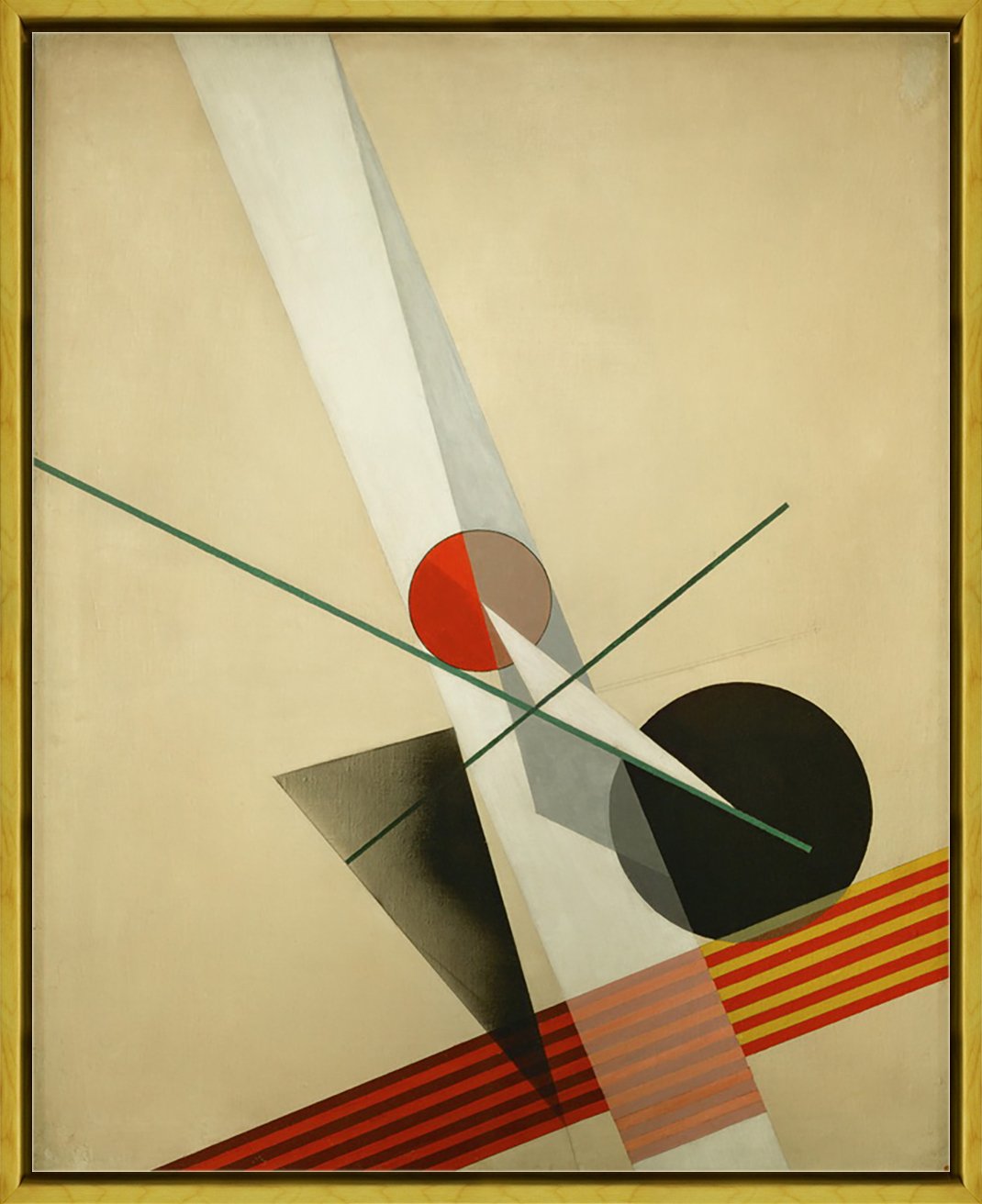
Composition A XXI by Lazlo Maholy-Nagy, 1925

Let’s talk about some things
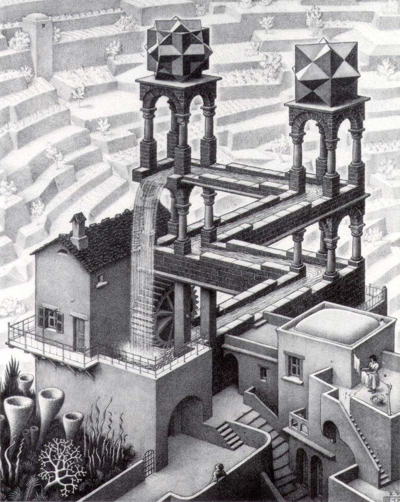
Waterfall by M.C. Escher 1961, lithograph, 15 ︎ 12 in.
![]()
The Satin Tuning Fork by Yves Tanguy. 1940. Oil on canvas. 39︎32 in.
![]()
Yakuza Films: One Movement of Postwar Japanese Cinema by Tadanori Yokoo. 1968. Silkscreen. 43︎31in.
![]()
The Satin Tuning Fork by Yves Tanguy. 1940. Oil on canvas. 39︎32 in.

Yakuza Films: One Movement of Postwar Japanese Cinema by Tadanori Yokoo. 1968. Silkscreen. 43︎31in.

Further Reading/Viewing
- Gestalt Principles from TipTut (via YouTube)︎
-
Basic Compositional Theory from TipTut (via YouTube)︎
-
Design Principles: Compositional, Symmetrical And Asymmetrical Balance
(from Smashing Magazine)︎ - “More Than Parallel Lines: Thoughts on Gestalt, Albers, and the Bauhaus” by Karen Koehler (from Intersecting Colors: Josef Albers and his Contemporaries)︎