Spring 2021 ︎︎︎ SUNY Purchase ︎︎︎(DES3440) Typographic Investigations
Foundational Hand (Calligraphy, pt.2)
A Few Things to Keep in Mind (calligraphy-wise)
-
Give yourself the freedom to be bad as you start out.
-
Be very deliberate about maintaining your pen angle.
-
Be diligent about setting up the lines (this gets slightly more complex with descenders and ascenders).
History
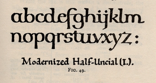
What has become known as “Foundational Hand”was invented by Edward Johnston. This hand uses largely the same proportions for the majuscules, except the strokes are terminated, often in a way that is closer to a serif. This will make the “font” or combination of majuscule and miniscule more consistent when drawn together. I stress this again to note that what we call “uppercase” and “lowercase” letters were not originally part of what would be the same “font” and were eventually linked through the eventual standardization of grammar.Earlier on, Johnston advocated for a half-uncial hand that involved holding the pen flatter.
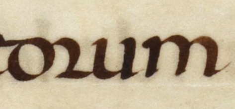
Eventually, based on a 10th Century manuscript called the Ramsey Splatter (pictured below) Johnston developed what became known as foundational hand.


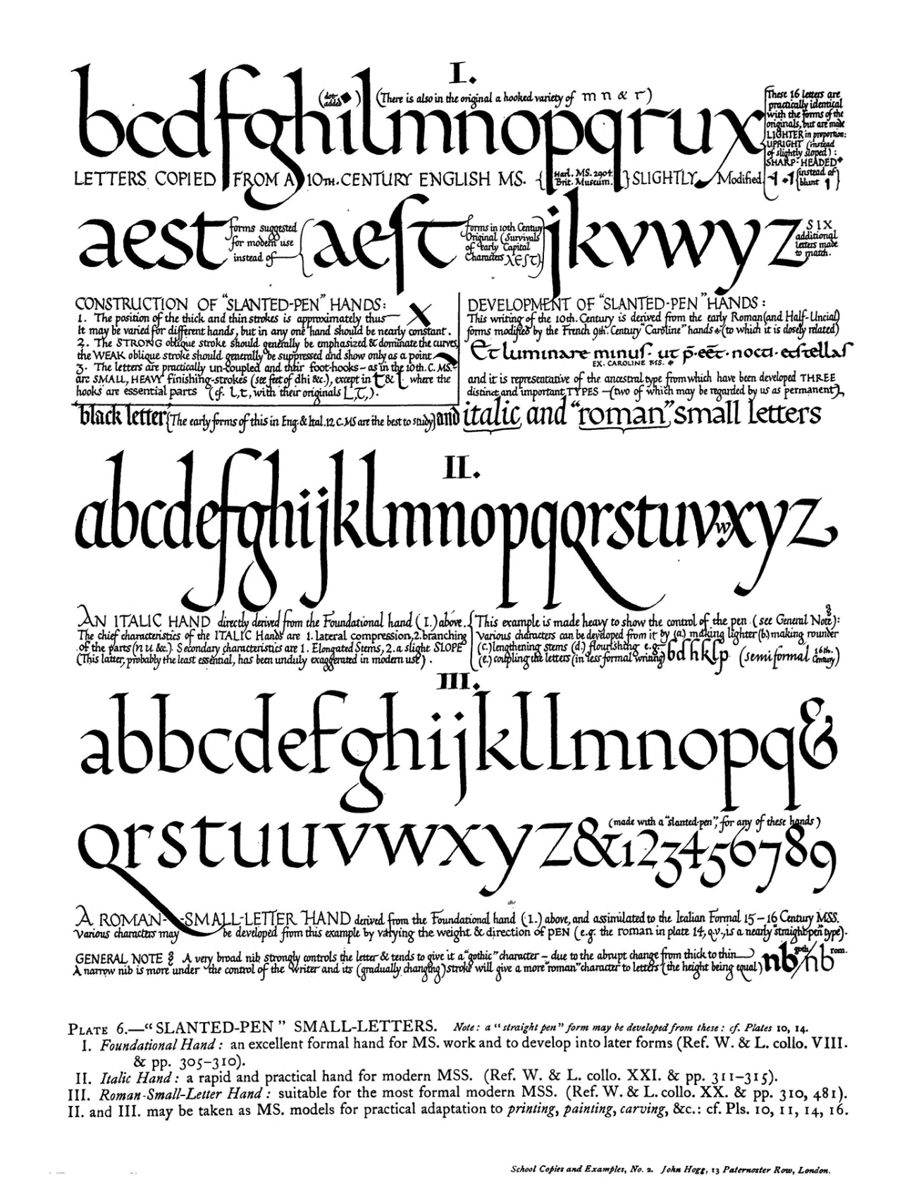
To note the amount of variation possible, here’s another example of Johnston characterized as Foundational Hand. Note the spacing and leading here as well.
Guides that I like, we’ll be using
We’ll be using majuscule example for the height reference, 2 for the descender, 5 nib widths for the x height, 2 for the ascender/cap height.(majuscule)


HW (03/09)
-
Create 3 pages of pangrams for the Foundational Hand. Max sure to mix majuscules and miniscules.
-
In Birdfont or Glyphs, work on “angular letters”
A, V, Y, W, M, N, Z
-
Prepare any questions you have in either program for a longer form tech-talk next week (03/16)
︎Back to Typographic Investigations