Spring 2021 ︎︎︎ SUNY Purchase ︎︎︎ (DES3440) Typographic Investigations
Enter the (DOT) Matrix
Background
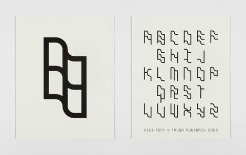
Creating fonts can be intimidating and arcane and time consuming. The goal here is to create a kind of, microcosm of this process that helps to demystify it and simplify it to a certain degree. You’ll also export a version of your font so that will give you an immediate hit before we embark on a longer process. Lettering in a dot matrix form is also a (potentially) fun “puzzle” for understanding the minimum “resolution” for readability. Some Examples
The visual language of “cracktros,” demoscene animations, and ASCII text (not dissimilar to the pixelated content below but these are often heavily mediated and stylized and ASCII lettering is “built on top of” an existing system).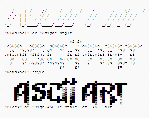
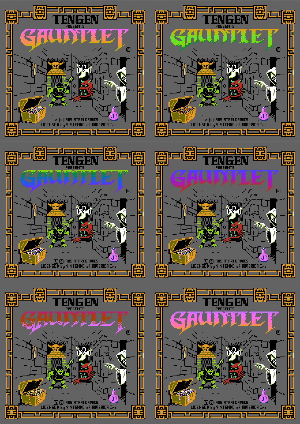
The pixelated “fonts” and lettering created for older video game systems like the NES, SNES, and Sega Genesis with lower resolution (These were often tools created out of necessity; they didn’t have an actual font, and heavily limited by the individual systems or console)
LED signs used in stock tickers, food carts and Jenny Holzer’s artwork.
(technological limitations of LED lights, also providing contexts in Fine Art and commercial applications)
Typefaces contemporary and old
(mostly historical and contemporary context and also Roman do roi to show an “extremely fine” matrix)
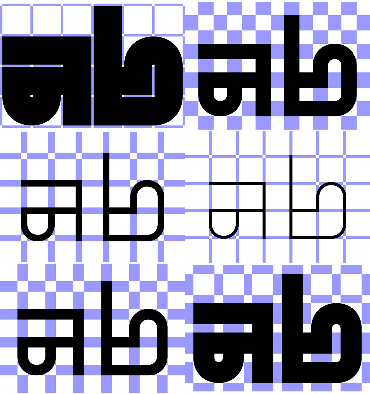
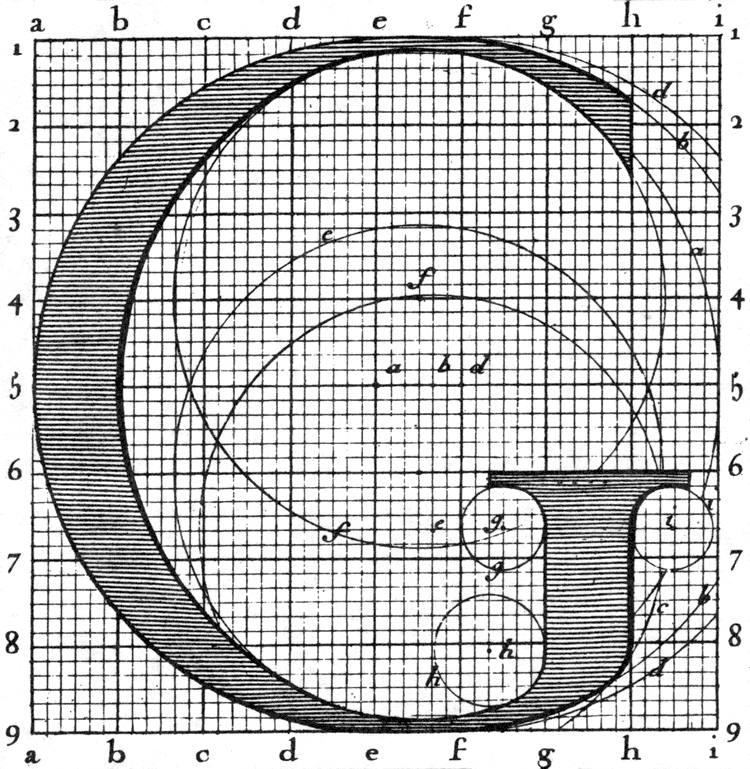
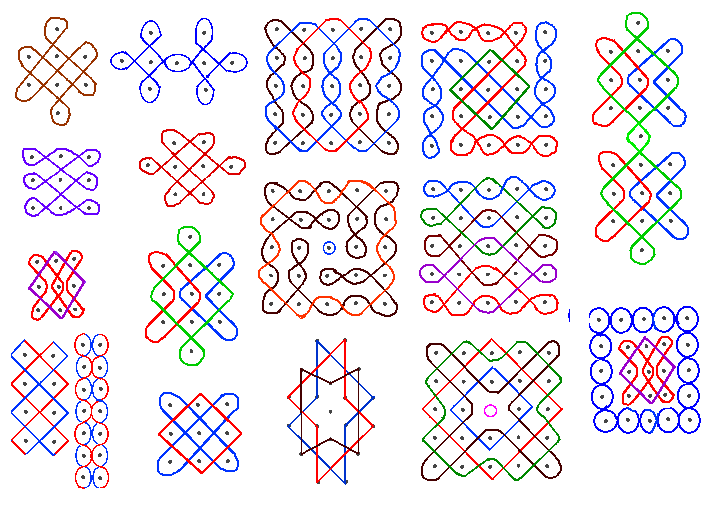
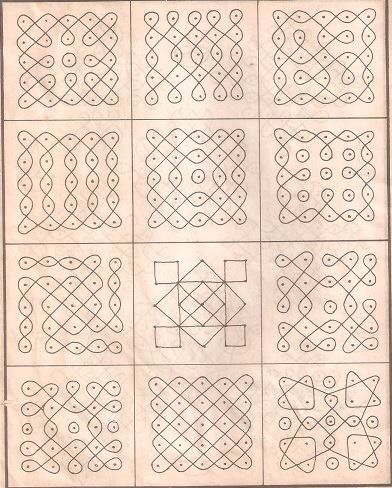
(alternative ways to connect grid points)


Commercial applications like these handjet printers.
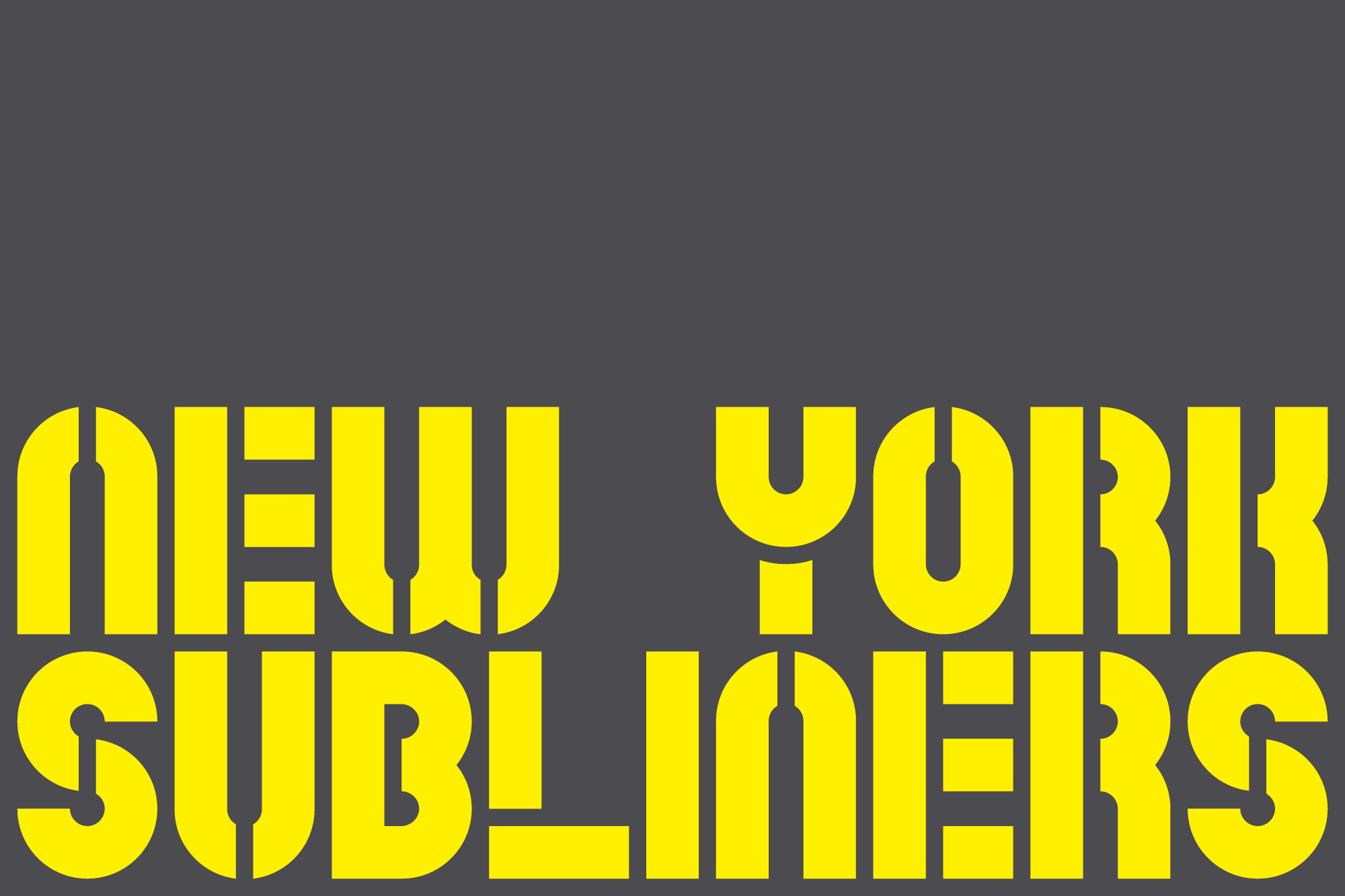
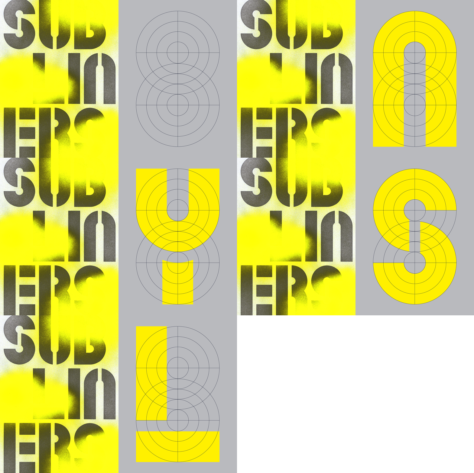
Non-rectangular grid examples


Objective
Make a “Dot-Matrix” typeface, a specimen, and 5 “applications.” The recommended way is to use Fontstruct, though if you have an idea that might require Glyphs or Illustrator you are welcome to do that. We will not be learning Glyphs though there are great tutorials out there. You must however output a font file. For Adobe Illustrator you’ll need a tool called FontsSelf; which is not free.
It is recommended that the applications be posters however that is also not a requirement; you can make an animated .GIF, an .MP4, etc.
Final Submission
- A .TTF file containing:
An uppercase (A-Z), lowercase (a-z), numerals (0-9), and punctuation (basically everything you can see on the keyboard) - A .PDF “specimen” showing every character.
- Create 5 different “applications” posters, set type, whathaveyou. If they are flat images export a .PDF or appropriate high-resolution image (.PNG’s are okay for example). This is welcome to be a .GIF or .MP4, etc.
Relevant Dates
02/02/2021 ︎︎︎ Introduction
02/09/2021 ︎︎︎ Check-in
For this class, have your progress uploaded to the spreadsheet for this project. Have at least one case of your font and one poster done.02/16/2020 ︎︎︎ Final critique!
No Shuriken Mode Challenges
(Please note that, doing these do not guarantee a better grade or extra credit by any fixed or demonstrable amount, but if you’re doing or approaching these things, you’re probably doing well. The point is that, like not using shurikens in Shadow Dancer, it is more difficult, and increases your proximity to the material. All this being said don’t hurt yourself and consider your other assignments and mental and physical health. Additionally, if you are not feeling challenged by the class or an assignment, and these suggestions are not sufficient for you, please le me know.)-
Add characters from another language
-
Add diacritics for other language support
-
Add a set of emojis
-
Create an alternative weight or variation
- Create an animation where you convert the type to shape layers which you animate.
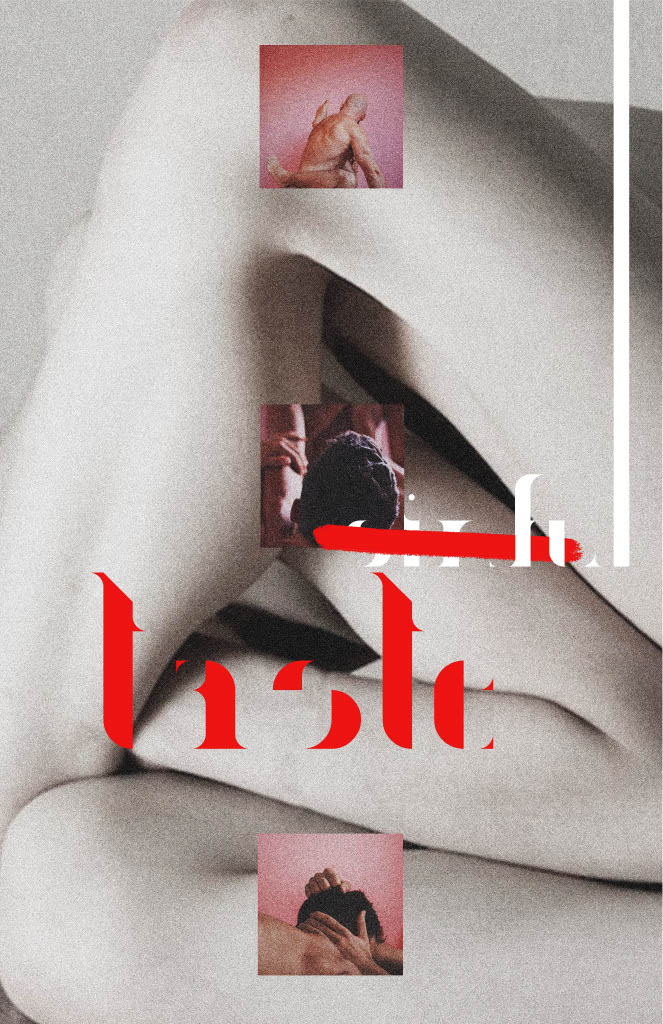
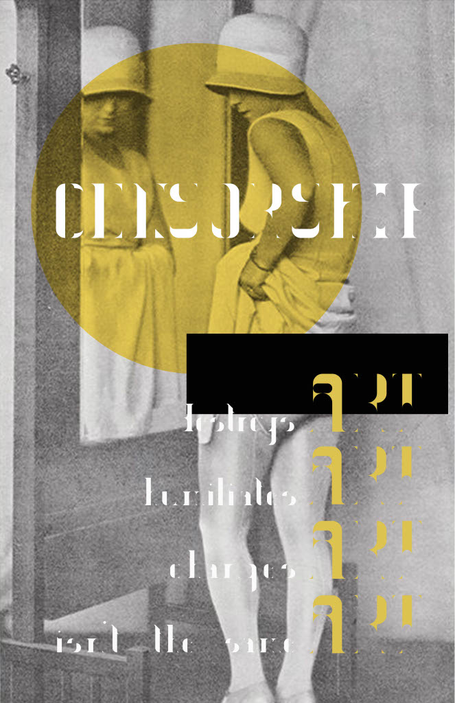
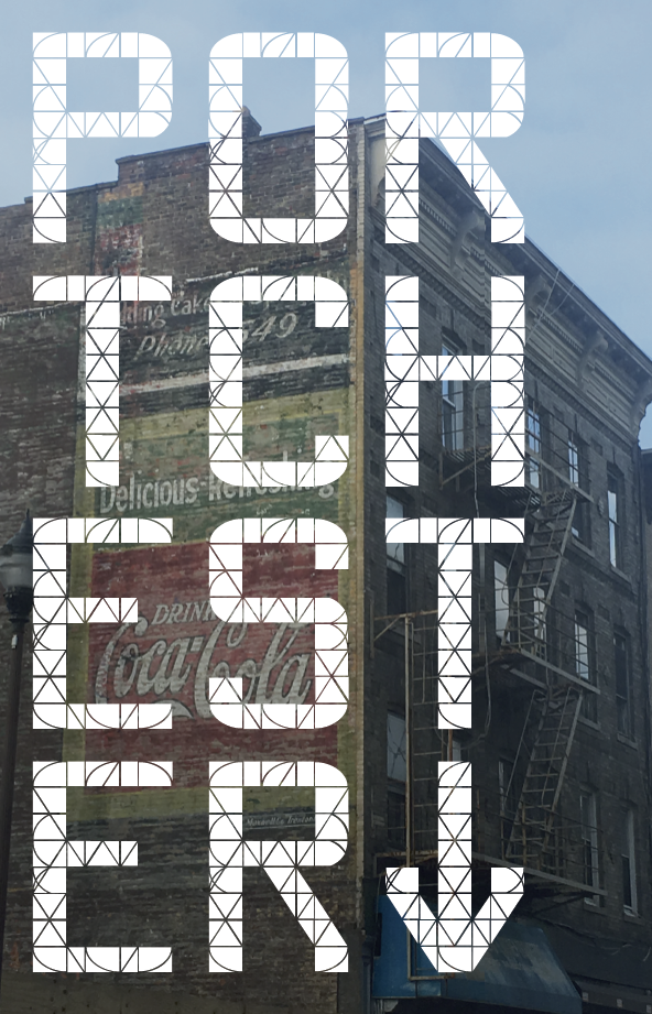
Past student work examples



︎Back to Typographic Investigations