Spring 2021
︎
SUNY Purchase ︎(DES3440) Typographic Investigations
Project #3:
Face time
Project #3:
Face time
![]()
![]()
![]()


Background
Okay, so here’s the project, you have to make a font. That’s really it. Along the way you’ll get more familiarity with the process, look at other students’ work and we’ll of course be talking about historical models, examples, etc. Please note this class is called Typographic Investigations and not Typographic Absolute Demonstration of Existing Mastery. Please be ready to share half-baked ideas, sketches, overtly “bad” work or things you think are “ugly” or better yet, to reframe your conception of what is ugly or not.
Objective
Create a font with (at least) two cases, featuring (at minimum) the Latin alphabet.Goals
- Reflect that you are/have been paying attention to the formal and technical components necessary for type design and that you can (potentially) apply our calligraphic explorations.
- Gain greater familiarity with critiquing, discussing, and observing type.
Final Submission
- .otf/.tff of your font file(s)
- The font must contain, at absolute minimum:
- A-Z (uppercase)
- a-z (lowercase)
- .,;:’”?! (punctuation)
- 3 “applications” (poster, animation, projection, etc.)
- I will not set specific terms for this other than that they need to be, at absolute minimum, 11in.︎17in. posters. Please note that you are welcome to apply these in other work you may be doing (other poster work, your senior project paper, etc).
- Please also consider, pairing with other, existing typefaces, your calligraphy and display versus text.
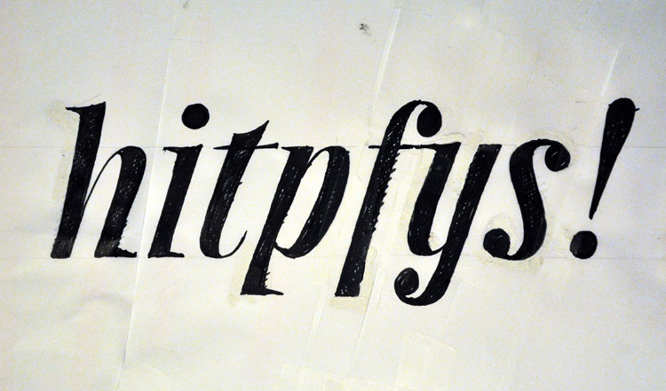
- 11in.︎17in. .PDF showing 2 pangrams of your choice
- 11in.︎17in. .PDF out showing the complete character set.
- a folder containing all process work, your progress, intial drawings, iterations, etc.
Dates
04/13/2021︎Introduction
-
04/20/2021 ︎Initial Ideas
Individual meetings in which we talk about your initial directions. Please be ready with some initial drawings, be they “digital” or “analog.” Have at least 3 letters drawn that represent 3 possible directions. 04/27/2021 ︎Progress pt.1
By this point, you should you should have 10 - 15 letters for a single case developed for your chosen direction.-
05/04/2021︎Progress pt.2
By this point, you should have started your second case. 05/11/2021︎Critiques pt.1
05/18/2021︎Critiques pt.2
Considerations
- Completeness ︎Although you should aim to make your applications appear as resolved as possible, don’t feel you need to have a complete typeface (ie bold, italic, etc), be ready to show your work in progress.
- Time︎This is meant for a number of reasons. Firstly, this project intersects with when Senior Projects may start to get hairy. It’s also meant to apply to the idea that you have to sustain small amounts of effort over a given time.
- Form as a function of freakiness︎ Don’t hesitate to do some carefully explored bubble letters, some reverse stress type thing, or other alternative forms.
- Paths of acceptable lesser resistance︎There’s nothing wrong with taking your calligraphy, scanning it and expanding from there.
“No Shuriken Mode” Suggestions
(the basic point here is “add more stuff” but also every bullet here has a parenthetical “or start”)- Create a cohesive and considered upper and lower case
- Create an italic/slanted/oblique version
- Add alternative weights (lighter/heavier, etc)
- Add diacritics (é, è, ë, ę, ē, etc.)
- Add ligatures (ff,fl, etc.)
- Add another character set (Cyrillic, Honguel, etc)
Student work examples
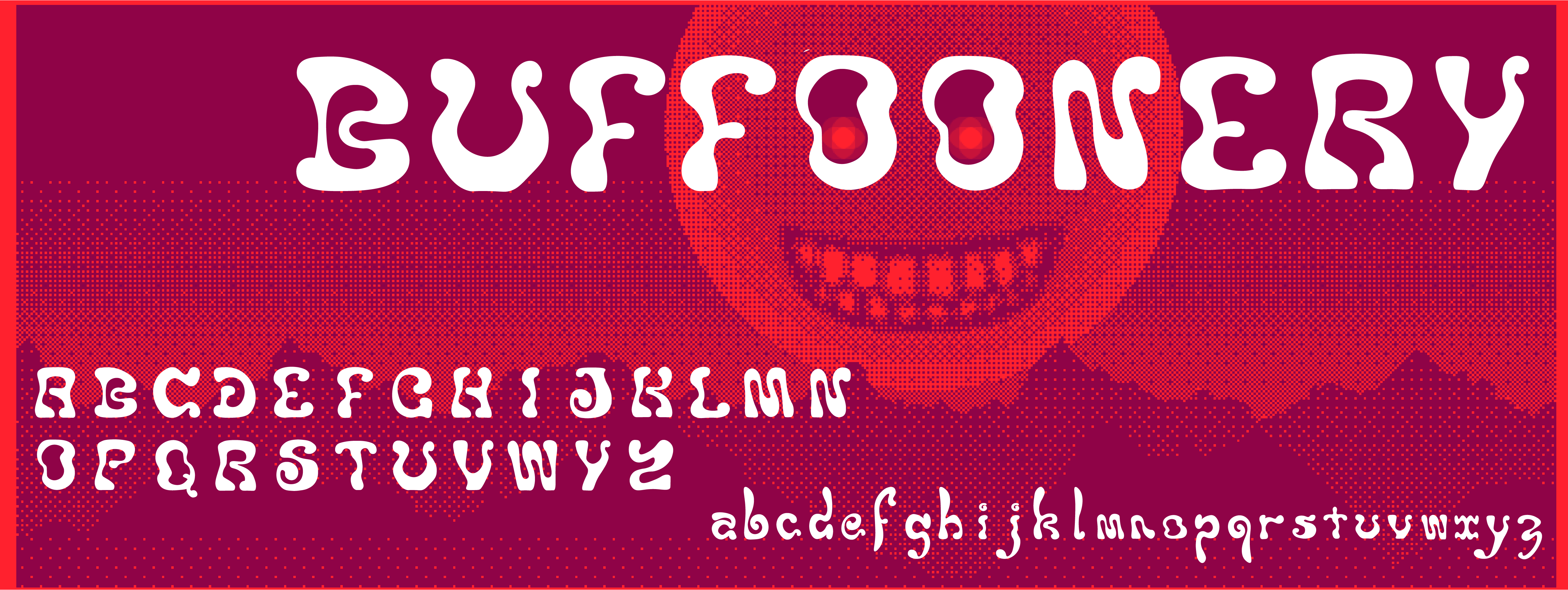
(please click to expand examples and also know that the work doesn’t necessarily reflect the exact terms of the current iteration of the project)Buffoonery by Jordan Huynh


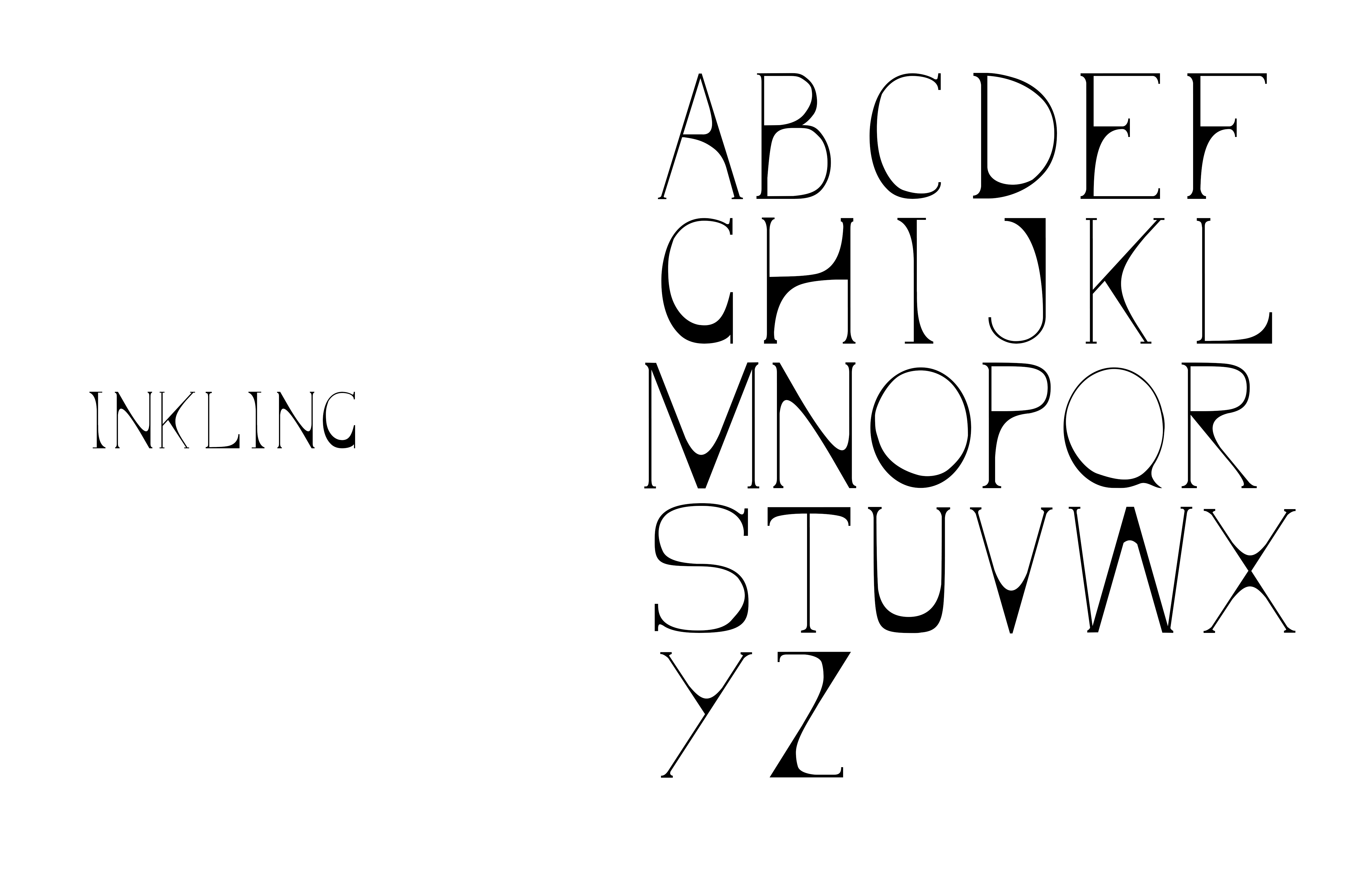
Serifing by Malachai Marzolf


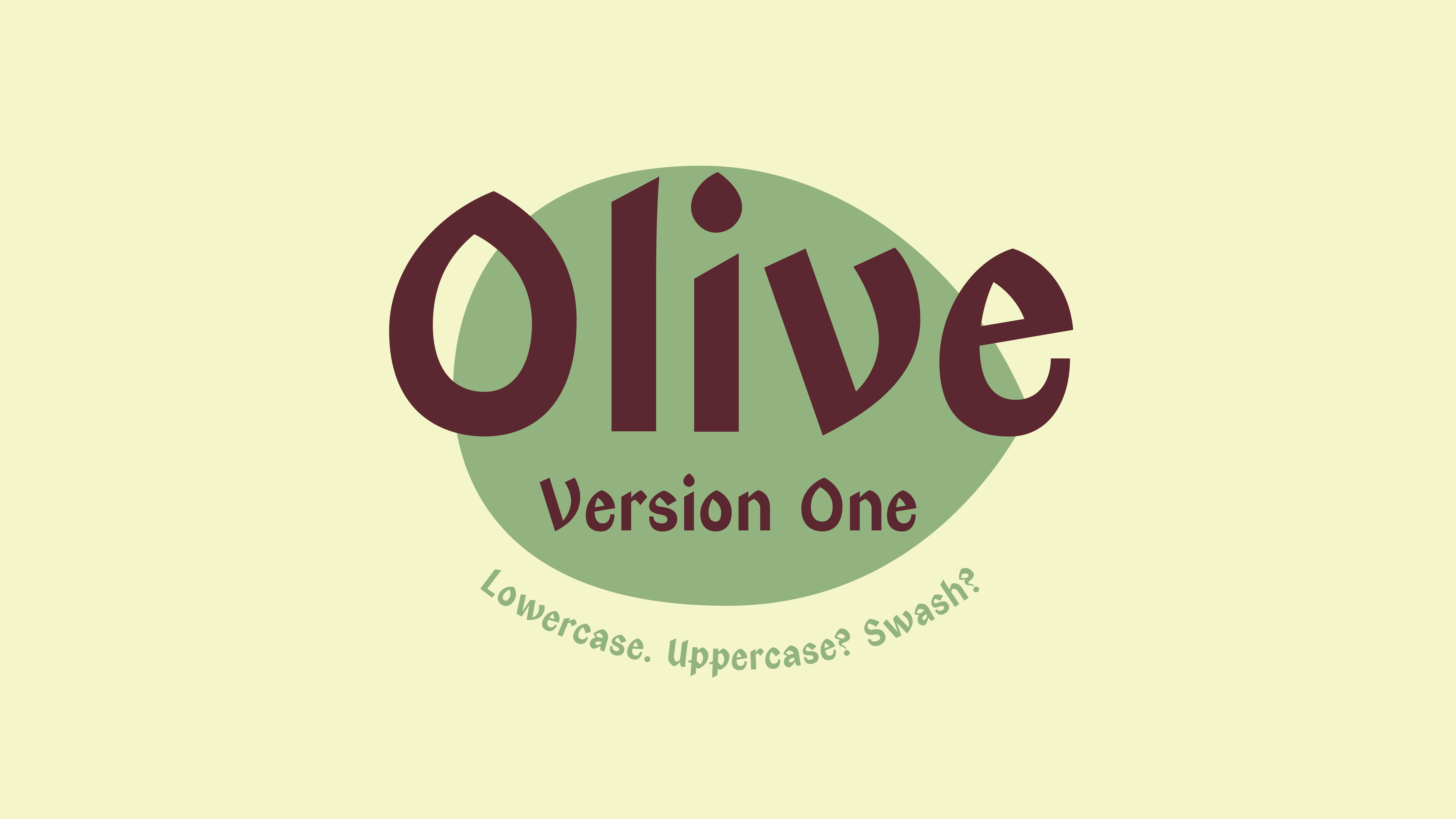
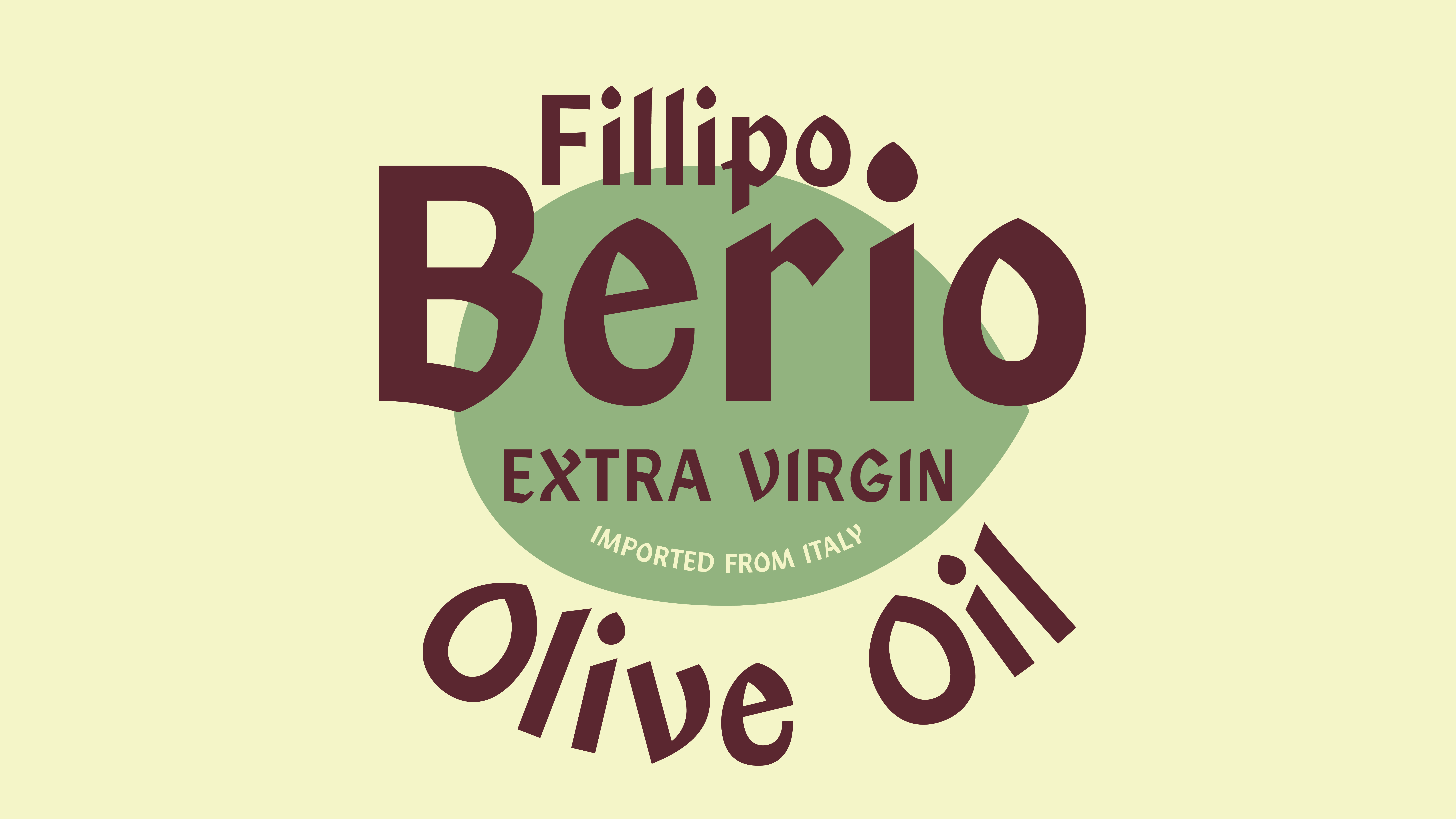
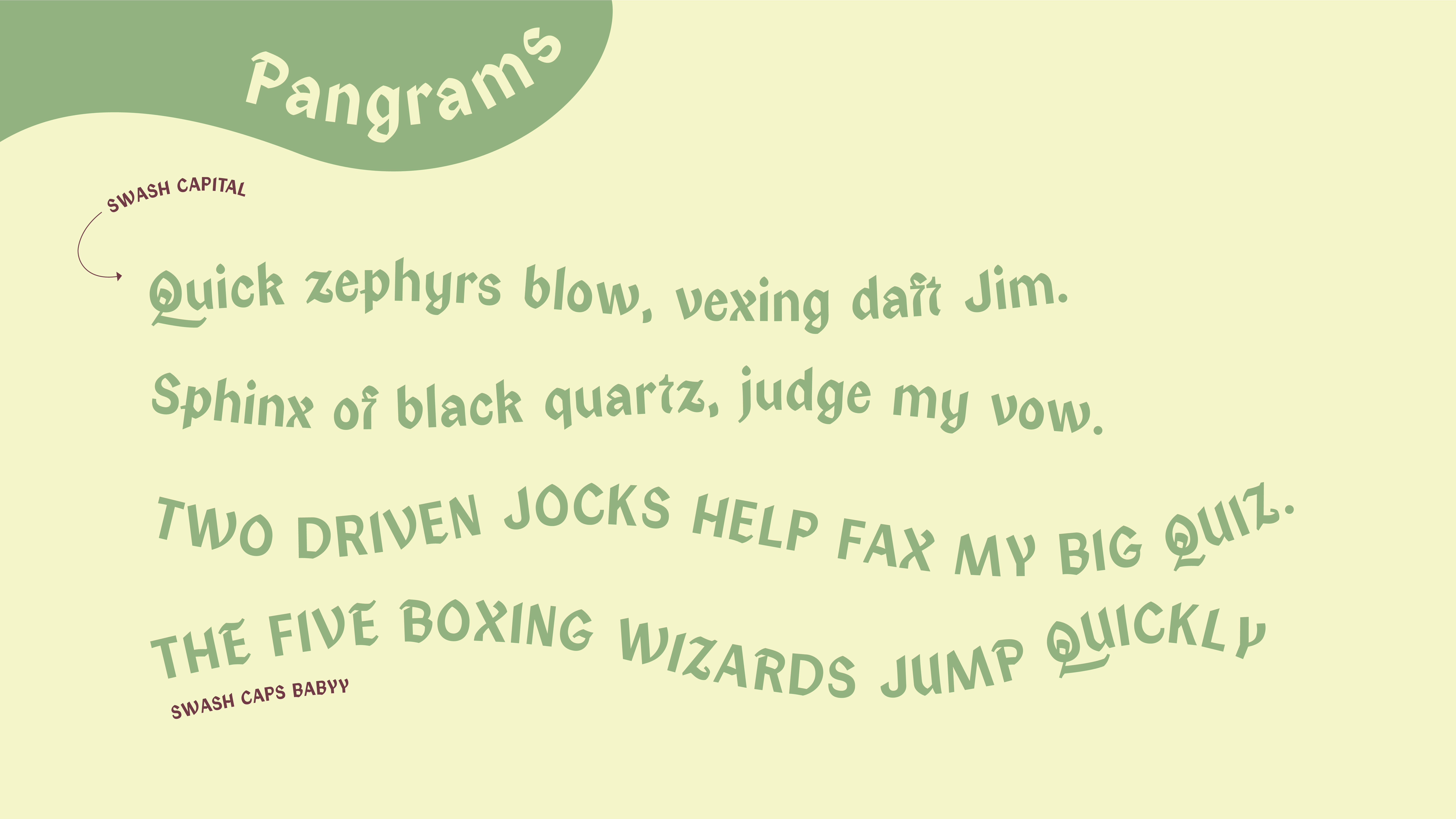
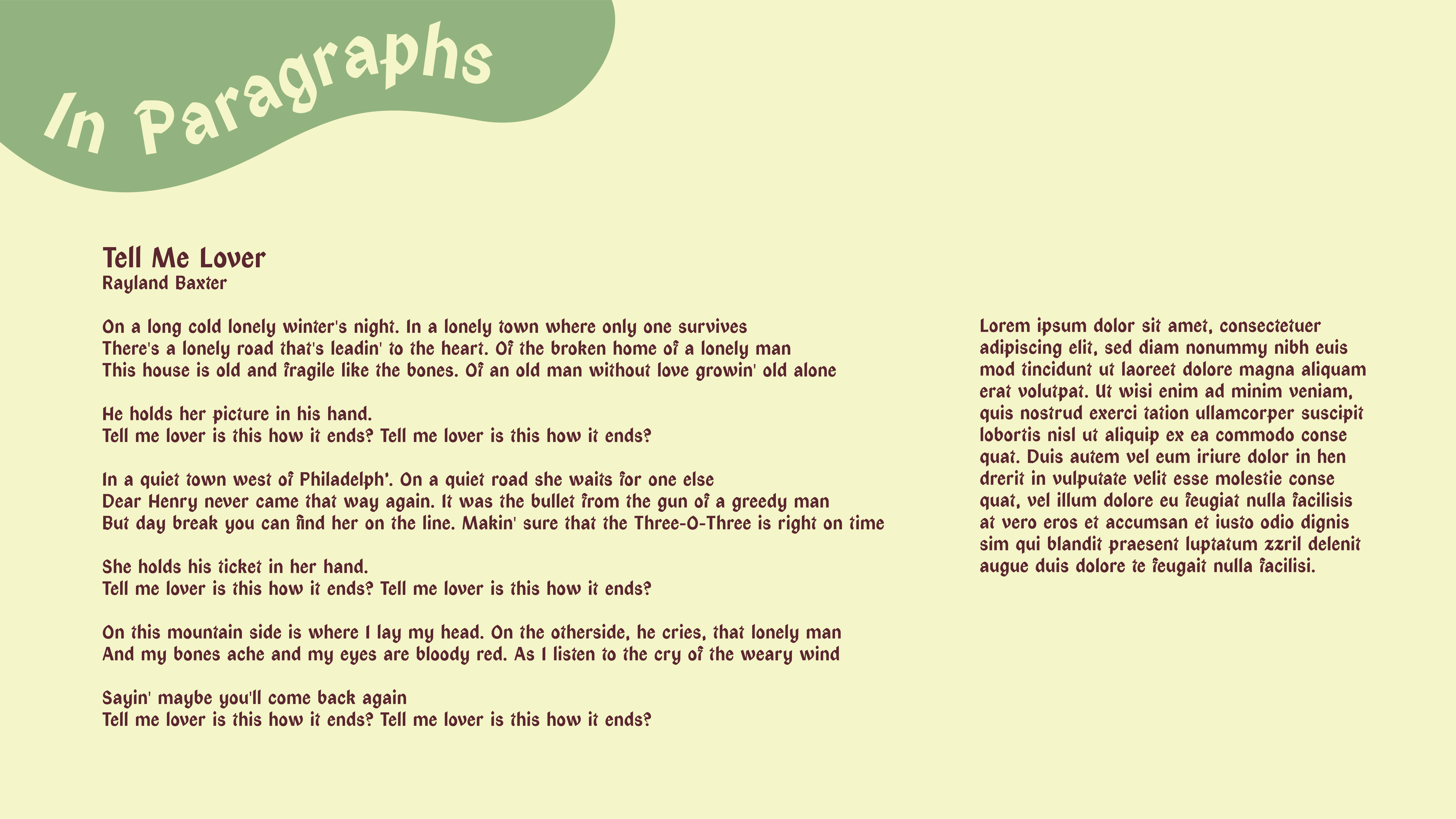
Olive by Gwen Corbett

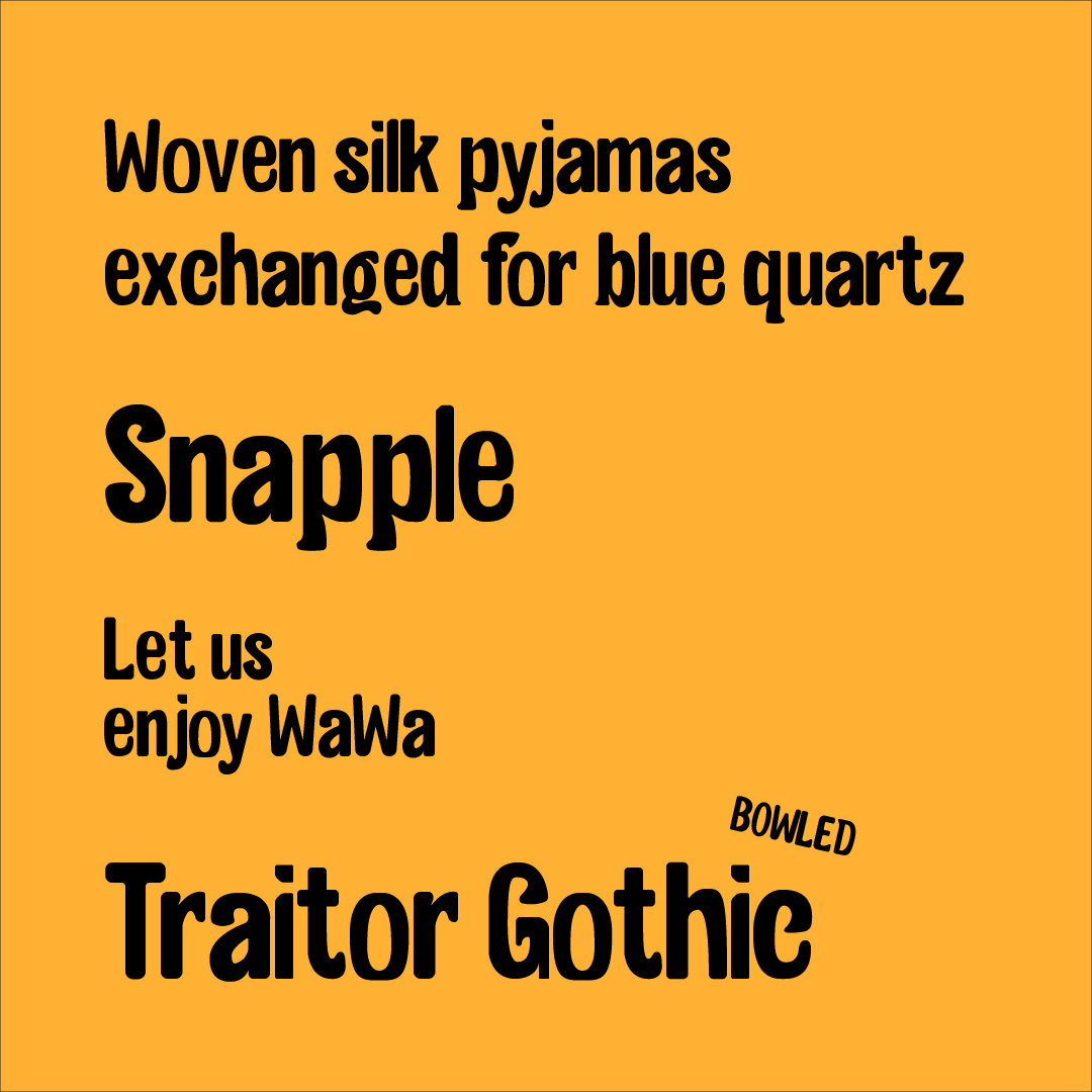
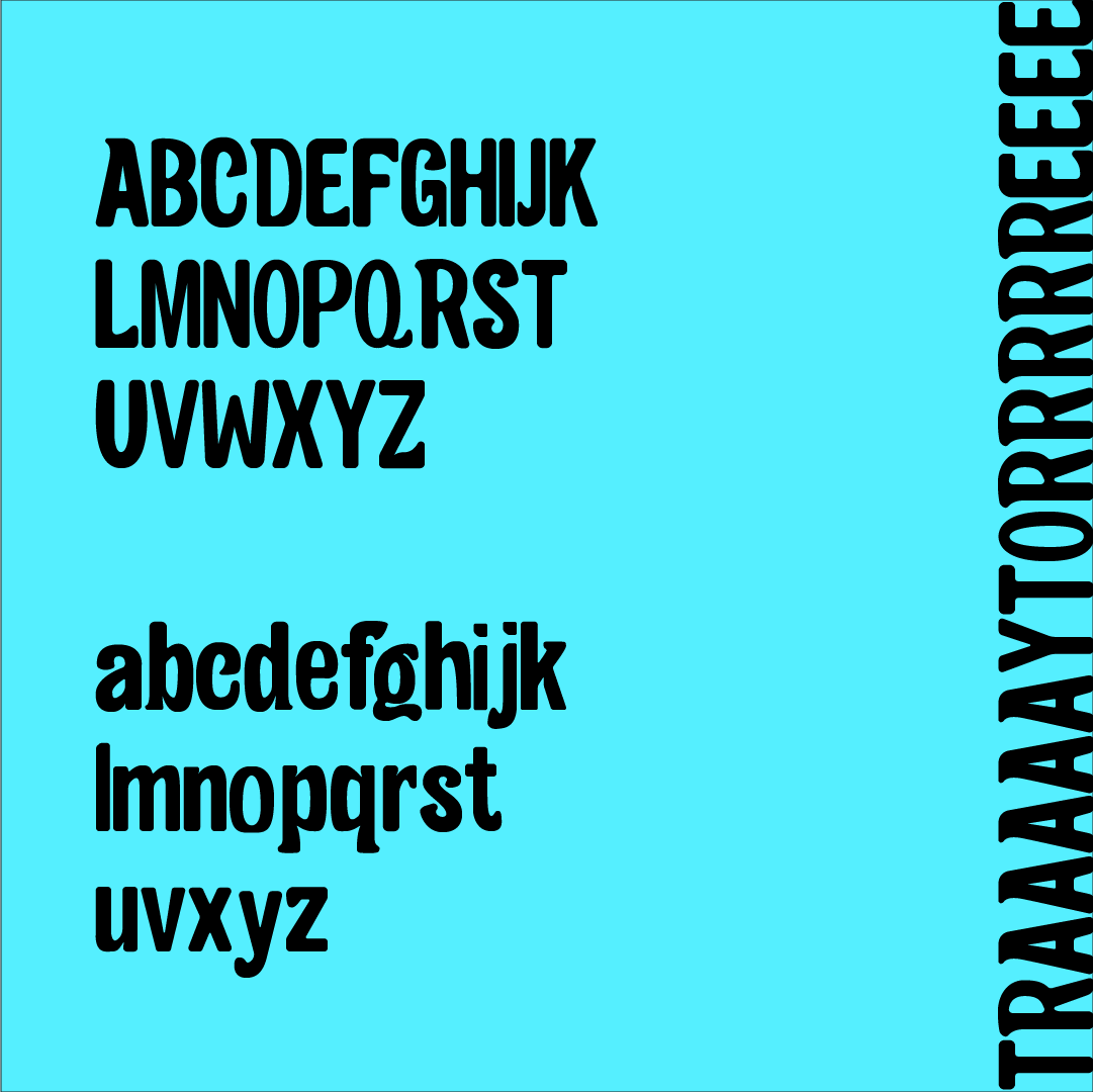
Limey/Traitor Gothic by John Bradford


︎Back to Typographic Investigations