Spring 2021 ︎︎︎ SUNY Purchase (DES3440) ︎︎︎ Typographic Investigations
Roman Capitals, (Calligraphy pt.0)
Background (Historical)
The type of calligraphy that we will be starting with is called “monoline roman capitals.” They are based on the proportions of the inscription of the Trajan column. You may also here these referred to as “square capitals” as the proportions of the letters are based on a square.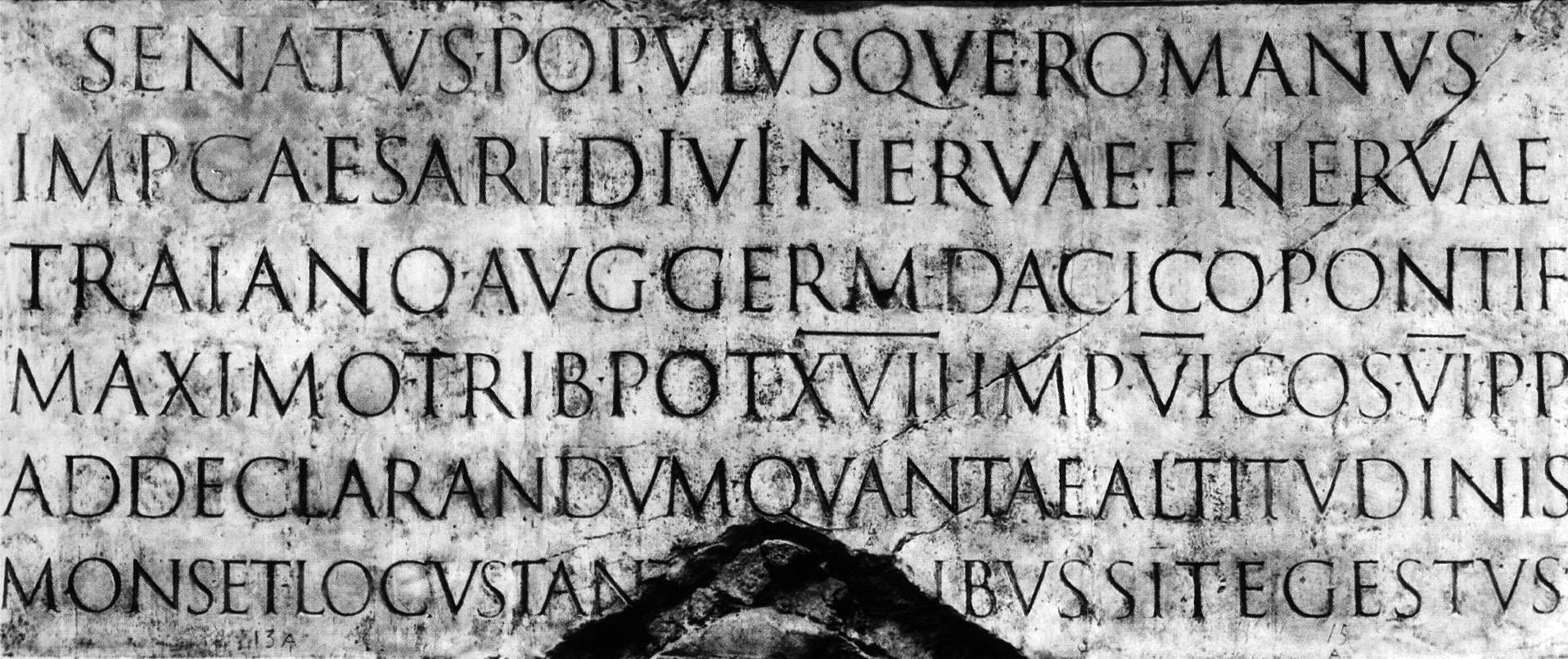
This inscription is also what the contemporary digital typeface Trajan (in Adobe Fonts) is based upon. Trajan, for cultural context is used quite often in movie posters.

One thing you may notice, is that Trajan does not have a “proper” lowercase (the digital font has slightly smaller characters for the lowercase. This is important for some historical context. All this has been relatively recently standardized. “Lowercase” letters and “italics” were not all part of the same font or family as they are today; the letters were adapted to what we recognize as “lowercase” as they were adapted from handwritten cursive forms.
Getting ready
When you are getting ready for a calligraphy session:- Stretch your hands and fingers out
-
Be prepared to give your self 15 - 20 minutes to get into the flow
-
Make sure to give yourself additional time to warm up.
-
Be very deliberate and disciplined about creating the lines (these will be based on the width of the pen)
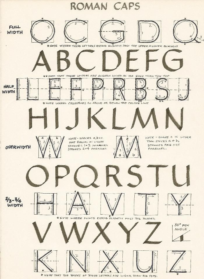
Monoline Roman Capitals
![]()
Serifed Romans
If you’re feelin’ spicy/that you’re getting this you can also challenge yourself with serifed roman letters. These are a bit more difficult to do, and easier if you are using a brush and drawing quite large. Just be careful about twisting your wrist/arm if you do this.︎Back to Typographic Investigations