Spring 2021
︎
SUNY Purchase ︎ (DES3440)Typographic Investigations
spiel: Stressing out
Background
As you are working on your final font and related ephemera, or at least thinking about it, there are different ways that you can approach your design decisions. Today we’ll look at it from the perspective of contrast and stress. Contrast is the amount of difference in width of the different strokes in your letters, and stress is the apparent angle those strokes appear to be tilted at.A note on freakiness
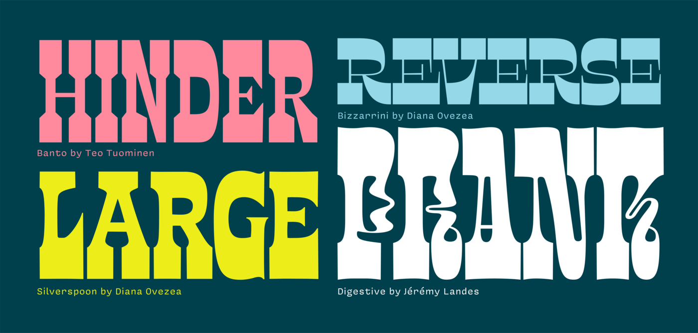
The below image is from Elliott Earls’s contributions to the Emigre Type Foundry. I love Elliott, he’s a friend (which I’m saying not as a flex, but that many of these people are still around today), but he may not be the best model for your first font. I’m citing this this work as a tendency with new type designers to do something freaky. The note here is that there is no qualitative assessment of freakiness; being “boring” is okay and being “freaky” is okay.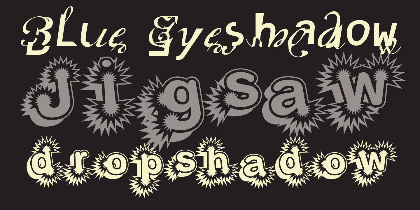
Noordzij Cube
This is a model which shows different stress and contrast for the lowercase. This is an animated 3D model, you may come across other versions in your design travels.
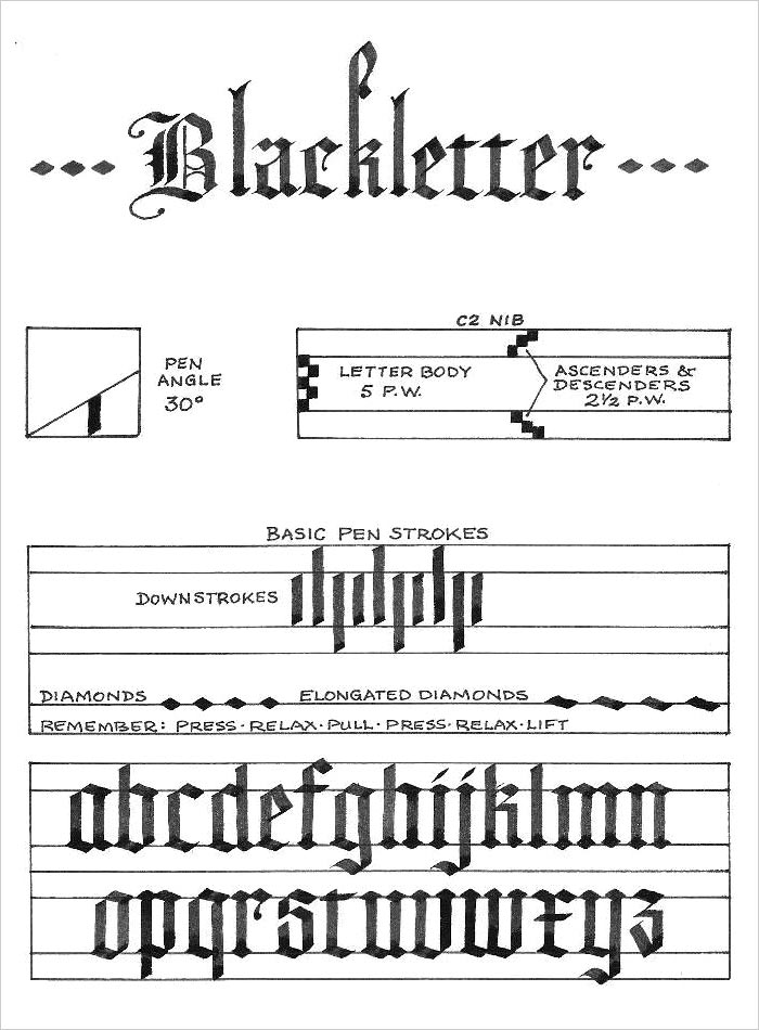
Historical examples
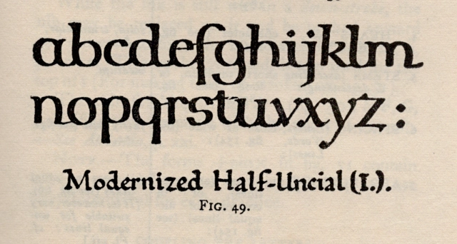
Below are examples of broad-edge hand lettering at roughly 30° and one that is largely horizontal (90°). These are, and are based on, historical models. Thus, utilizing these forms can be a communication with these other time periods. They should not be a limitation for what forms can be, but a sprinboard for what you can do.
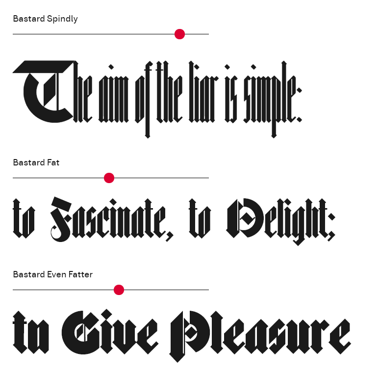
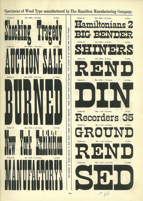
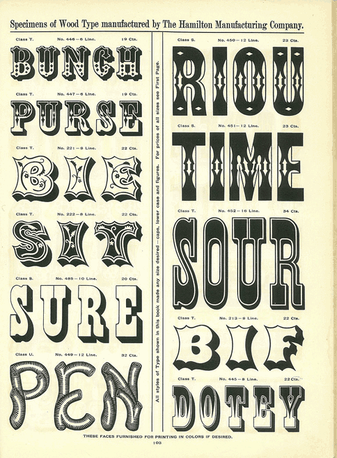
Reversing Stress
You can, of course keep angling your pen to achieve reverse stress lettering with a broadedge pen, but reverse stress is typically associated with the larger forms of wood type. These actual letters were physically bigger and used for very “loud” advertising. Here are examples of specimen from Hoefler & Co.

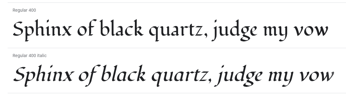
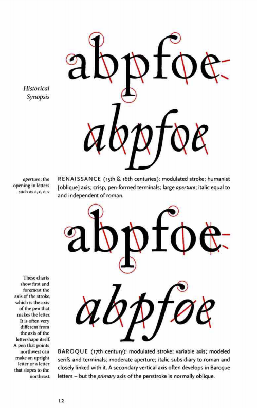
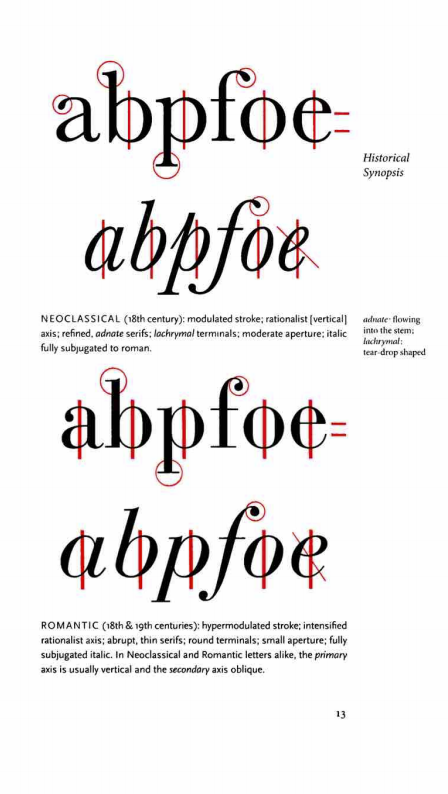
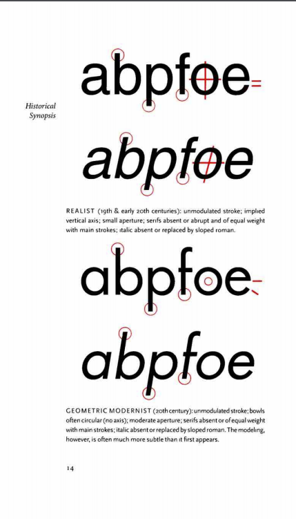
Bringhurst’s “stressful” model of typographic history
Robert Bringhurt’s Elements of Typographic Style (available in the class resources)︎ outlines a history of the evolution of metal type and looks at the evolution of the apparent stress and contrast of the fonts shown. He very roughly maps that from the renaissance to the twentieth century, type largely becomes more vertically stressed, with higher contrast, and eventually geometric sans appear with little contrast and less residue of calligraphy.

Conclusion
I end on Bringhurst’s example because as I think we are in a great time for type design as there are less restrictions on your choices, more and more afforadable tools, and more resources.︎Back to Typographic Investigations