Spring 2021
︎
SUNY Purchase ︎ (DES3440)Typographic Investigations
spiel:
Part of this class is learning what is probably a new piece of software and a new set of skills and sensitivities. In that process, being “creative” may feel more difficult. You will be asked to do work in this vein (“being creative”) and thus, I’m presenting work to both “inspire” and show you things that are out there. spiel:
“Conceptual” typefaces
Fonts, typefaces, and letters are just shapes. We’ll be talking more about the historical context for those shapes, but in this example we’ll largely be looking at fonts and work that use letters as substrates for ideas.
All that being said, fonts and letters are intrinsically clusters of visual decision making. These decisions don’t have necessarily be visually interesting, but these are ones for which the concept or surrounding set of decisions enhance the understanding of the piece.
Mallory by Tobias Frere-Jones︎
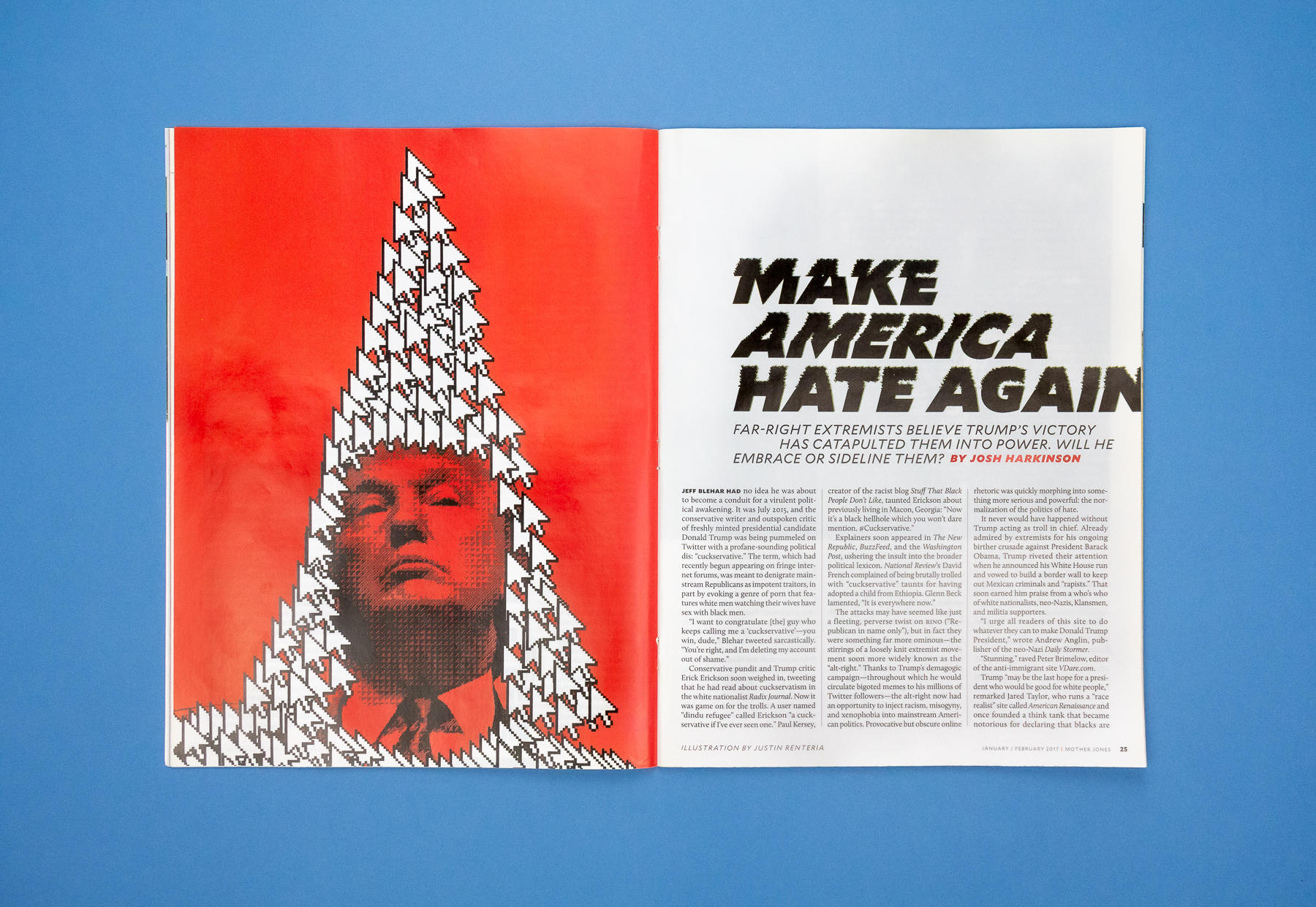


Mallory is Tobias Frere-Jones’ typeface that aesthetically explores his dual citizenship in Great Britain and the US. Of the forms and their relationship to that lineage Frere-Jones writes:
Mallory carefully balances its British and American lineage. The British influence is visible in the formal precision of capitals like ‘C, G, S’ as well as the splayed leg of the ‘R’. American influences are revealed in the gestural lowercase, its vivid personality constrained within its smaller shapes.
Gerry︎

Gerry’s shapes are based on the outlines of congressional districts and is meant to raise awareness about the practice of gerrymandering; reshaping congressional districts to influence political party distribution and thus the voting outcomes. I present this first because while I find the letterforms interesting, the idea, to my mind divorces it slightly from criticality. Note that it is free to download from the website linked above.
Prozac by Jonathan Barnbrook︎

You’re probably familiar with Jonathan Barnbrook from his other work like Bastard and Mason through Emigre (Mason Sans is available through Adobe Fonts) which helped to define the “90’s” aesthetic of design. Prozac attempts to simplify the alphabet into 6 shapes that are transformed in various ways to produce all the letters. Barnbrook defines this typeface as a “utopian experiment.” The name is from the eponymous antidepressant, and apparently is meant to capture the “pharmaceutical aesthetic” of the letterforms.
The related website is no longer live, but the linked video demonstrates the typeface which was designed with various faces in such a way as to defeat OCR, the technology that automatically reads type. You can find an arcive of the website through the wayback machine. Through that archive I was able to find the the typeface itself and put it into my collection of fonts.
Dead History by P.Scott Makela︎
Dead History is a heavy hitter that is one of the symbolic “moments” of the 90’s era of typography. Because of the nature of technology (software like Fontographer being released) a lot of type design of this era is largely “editing” of existing fonts. Dead History represents a symbolic moment of the “end” of previous versions of type design. I don’t know how much it gets talked about but it also calls to mind the kind of poetic erudition you see in a good sample in a hip hop song. Dead History merges (Linotype’s) Centennial and V.A.G. Rounded. Note that the font was entirely redrawn by Zuzana Licko of Emigre.
Fuse by Neville Brody & John Wozencroft︎
![]()
![]()
![]()
(This links to a whole talk, we can watch the whole dingus if you want). 


This was not dissimilar to a kind of prototypical version of Futurefonts. Brody and Wozencroft would comission designers to create fonts based on a theme; i.e. religion. FUSE would be distributed with posters and the fonts on a floppy disc.
Women’s Car Repair Collective font by Nat Pyper︎
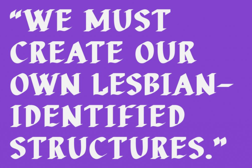
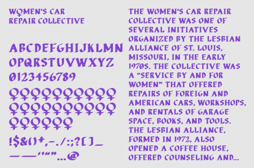
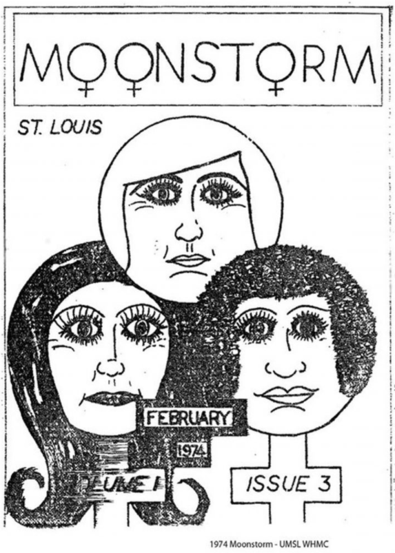
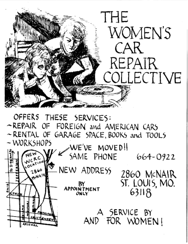
Nat Pyper (the designer of the font) found the Lesbian Alliance in St.Louis, Missouri. The group had a newsletter called Moonstorm and an initiative called the Women’s Car Repair Collective. Pyper repurposed the Venus symbol and the calligraphy used for ephemera to create the font. I really like Nat’s approach to “how to use” the font, here’s what they say this:
“I almost want to say ‘use it for time travel,’” Pyper laughs. “Basically, I’m using these fonts to ferry information from one place to another. As a font, it enables users to write new things, putting this work to use in something new. To me, it’s just important that people use it—that people write with it, and in doing so, continue the work [of the Lesbian Alliance] in this subtle way.”
“Pain” font by Anthony Warnick︎
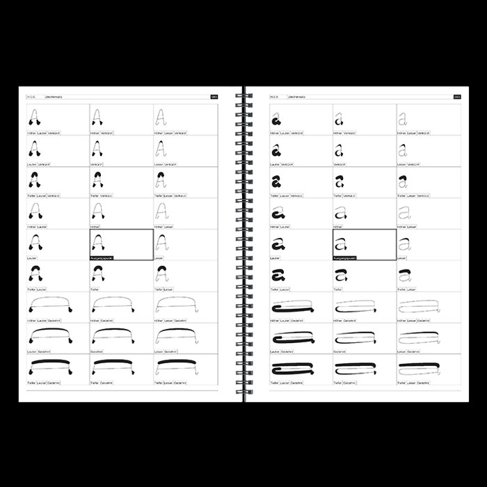
I went to school with Anthony and kinda last minute remembered him explaining this to me. This interview has a pretty indepth explanation of his thoughts behind it and his inspiration. Technically, it uses OpenType in such a way that any word gets replaced with “pain” I know that he wants to set some “classic” books in the typeface and explore meaning in that way. Just don’t have any good visual examples.Ciao by Massimiliano Audretsch︎
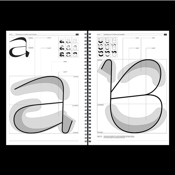
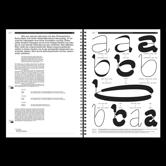
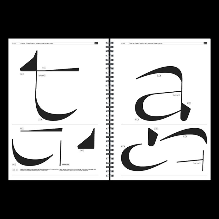
The following things are related things that aren’t fonts or letters but I feel I should mention, some stuff to take a lil ol’ think about.
Ramsey Nasserقلب
قلب (pronounced “alb”) is an Arabic programming language and related art project. It is written from right to left and allows you to do much of the expression you can do with Arabic while programming.
Erased De Kooning Drawing
Not sure if this is doing anything for you but this kinda messed me up the first time I heard about it. Rauschenberg got De Kooning to do a drawing, and then erased it.
Sol Lewitt’s Wall Drawings

︎Back to Typographic Investigations
