Spring 2022
︎SUNY Purchase ︎ (DES3440)Typographic Investigations
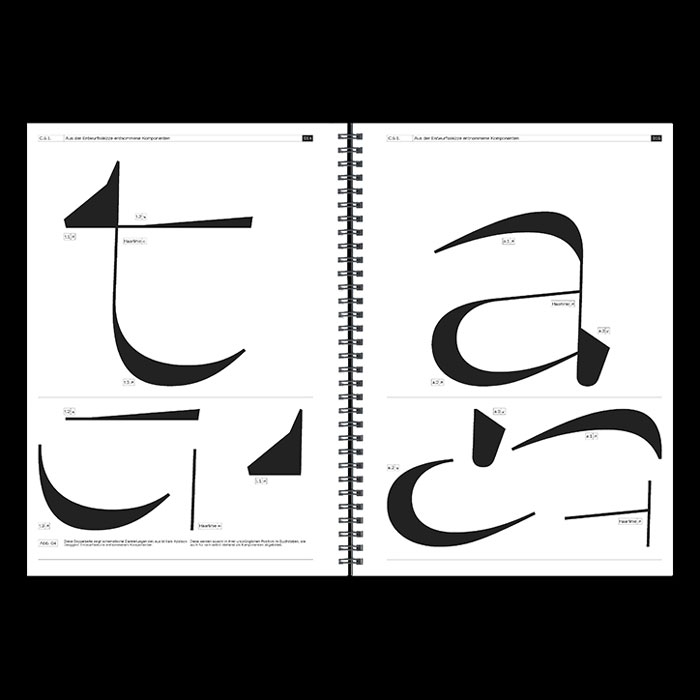
I’m choosing to define “conceptual” fonts as ones where the initial motivation for the creation of said font is not (necessarily) an aesthetic. This can get blurry as ultimately typography will be expressed through some kind of formal means. This is meant, in part, to get your thoughts going for how to approach the final project. Discussion: “Conceptual” typefaces
Gerry︎
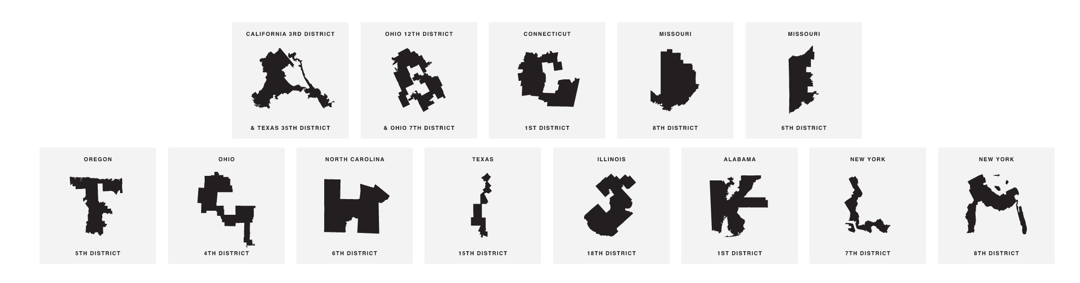
Jerry’s shapes are based on the outlines of congressional districts and is meant to raise awareness about the practice of Gerrymandering; reshaping congressional districts to influence the party distribution and thus the voting outcomes.
Prozac by Jonthan Barnbrook︎

Prozac attempts to simplify the alphabet into 6 shapes that are transformed in various ways to produce all the letters. The name is from the eponymous antidepressant, and apparently is meant to capture the pharmaceutical quality of the typeface.
ZXX by Sang Mun︎
Dead History by P.Scott Makela︎

Fuse by Neville Brody & John Wozencroft︎
(This links to a whole talk, we can watch the whole dingus if you want). This was not dissimilar to a kind of prototypical version of futurefonts. Brody and Wozencroft would comission designers to create fonts based on a theme; i.e. religion. FUSE would be distributed with posters and the fonts on a floppy disc. TBH this is a whole in my knowledge and I’m looking to get the collection soon.“Pain” font by Anthony Warnick︎
I went to school with Anthony and kinda last minute remembered him explaining this to me. This interview has a pretty indepth explanation of his thoughts behind it and his inspiration. Technically, it uses OpenType in such a way that any word gets replaced with “pain” I know that he wants to set some “classic” books in the typeface and explore meaning in that way. Just don’t have any good visual examples.Ciao by Massimiliano Audretsch︎
The following things are related things that aren’t drawings but I feel I should mention, some stuff to take a lil ol’ think about.
Erased De Kooning Drawing
Not sure if this is doing anything for you but this kinda messed me up the first time I heard about it. Rauschenberg got De Kooning to do a drawing, and then erased it.Sol Lewitt’s Wall Drawings

Ramsey Nasserقلب
︎Back to Typographic Investigations