Spring 2022 ︎︎︎ SUNY Purchase College ︎︎︎ (DES3800) Design for Web & Screens
Spiel: Web Aesthetics
Background
In this spiel, we’ll be talking about terms you may or may not have heard of, that relate to popular features of websites and their related navigation. This doesn’t mean that you have to like them or that you are obligated to use them; in fact we’ll talk about pros and cons of all of them. The point here is to familiarize and sensitive yourself to the content that is around you.Discoverability & Feedback
These are the two major concepts that Don Norman (who I will colloquially refer to as “the door guy” from the video shown in the previous class) (Don Norman, with a skinny-ass microphone)
Discoverability is how an object (in this case something on a screen) intimates that it has some sort of interactability. For doors it might be having a handle with a circular component that indicates it must be rotated. For a button on a website it might be that the button is raised, or has a shadow to indicate that it can be pressed.
Feedback is how the object or thing let’s you know that you’ve interacted with it in some meaningful way. In a game it might be the actually avatar of your character moving, or a sound for something getting activated, or a button changing color or brightness.
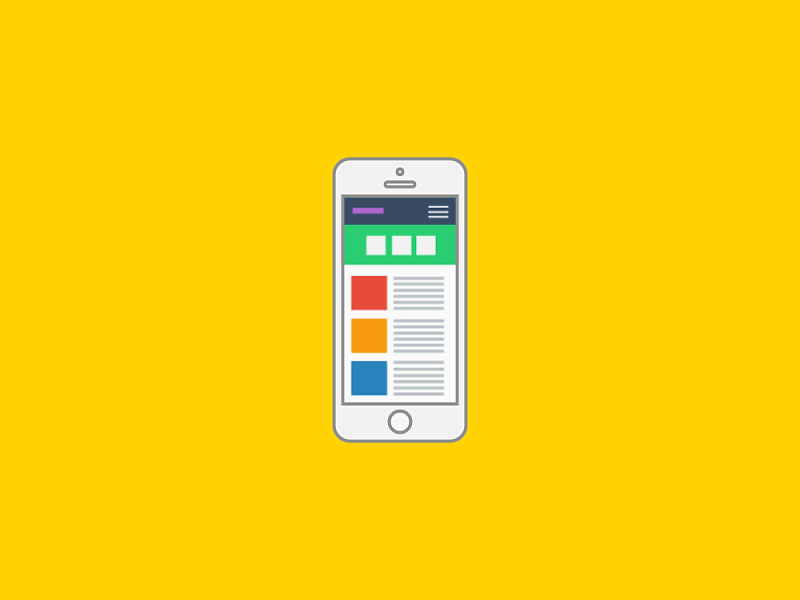
Hamburger Menus
This menu is named because it typically is represented with three lines which looks like a very abstracted hamburger.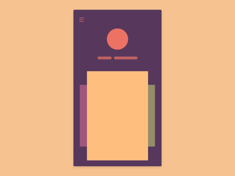
(cool animated simulation of a hamburger menu)
Thes first known appearance of them is in the early 1980’s for the Xerox Star when the idea of having a graphical user interface was a nascent idea. It has become more popular recently because screen real estate is at a premium on mobile screens.
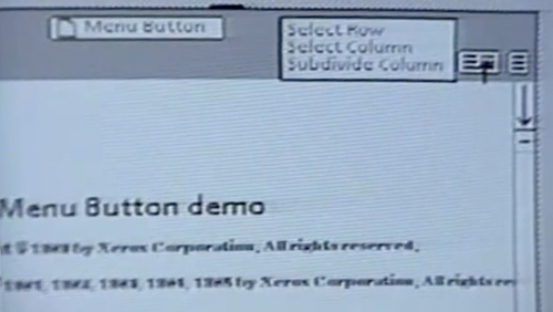 (Xerox Star GUI Hamburger Icon)
However, people using something with a hamburger menu will not know what content is hidden from them (whereas say an app like instagram might have a symbol that hints at what content or service is currently hidden from view).
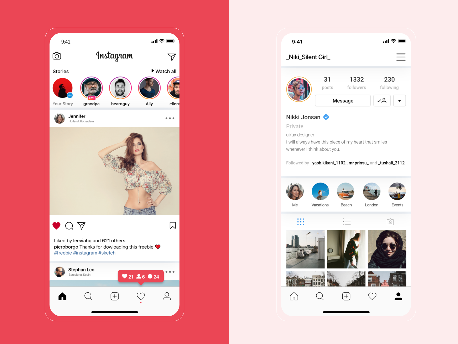
(Instagram screenshots, showing icons on the bottom)
Responsiveness
Animation (by Vadim Gronov) simulating a design for a site in different screen contexts
- There are a number of factors to consider here
-
How someone can interact with the given screen (tapping, keyboard, mouse, pen).
-
What the user on that device has access to (file system, operating system).
-
The physical size of the device (in relation to the human body)
-
The resolution of the screen (and how it might display colors and text)
These different context provide different circumstances that you may need to account for
-
being able to use a camera or microphone
-
making sure buttons have a relationship to the human finger
-
(for a mouse) making sure that elements change when hovered over
-
considering color-blindness
-
considering the readability of text or a given font at a certain magnification
Parallax
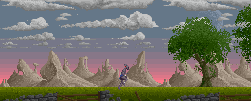
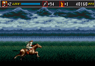

(examples of parallax in older video gaming)
Parallax is largely a thing that is cool. Historically, this was something that older video game and computer systems did in order to create the impression of greater depth. On systems without discrete layering systems this was actually somewhat of a complext technical feat. This might be used in a web site or app to subvert some of the flatness of the screen or make a photo more dynamic.
In web design this term might be used simply for animations that happen while scrolling, not necessarily the illusion of depth.

(a Squarespace template with parallax)