Spring 2023
︎
Purchase College, SUNY ︎(DES2460) DMD 2
SHPIEL:
Principles of Animation
Background
The 12 Principles of Animation were developed by animators at Disney and were devised to help produce more lifelike animation. Please note that these were developed for handdrawn frame-by-frame animation. Some of these principles will not apply, or not apply in the same way for motion graphics in the digital realm.
Squash and Stretch
This principle is basically that physics will cause things become compressed (squash) on impact, or expand (stretch) if they are moving (say falling or flying through the air). A good example is the comparing the characters of Street Fighter in their 2D incarnations (Street Fighter III) vs their 3D incarnations (Street Fighter IV).
(note about digital vs analog)
I see some people attempt to apply this principle with motion graphics, and they deform a drawing with an outline which, to my mind, looks quite bad. This is to say that you can follow the principle but is not inherently a good thing; or you may have to adjust your art or methodolgy (changing your path rather than deforming the whole drawing)
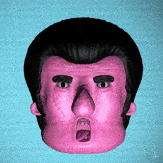
Secondary Action
This is the principle that you can use smaller actions to highlight and add life to a scene. In motion graphics, this might be minimal, but something that can give a lot of energy. An example might be a character’s sunglasses shining in the light. Check the example below and look at the little animations on the characters cheek’s to highlight their embarrassment and effort as well as simply addingc color.
Anticipation
Anticipation is how a character (the typical example), might prepare for a given action. Some are physical, like a character having to crouch before they jump, but also that they might look worried about not being able to jump high enough and they might take a deep breath first. Look at these little guys preparing for a big leap.
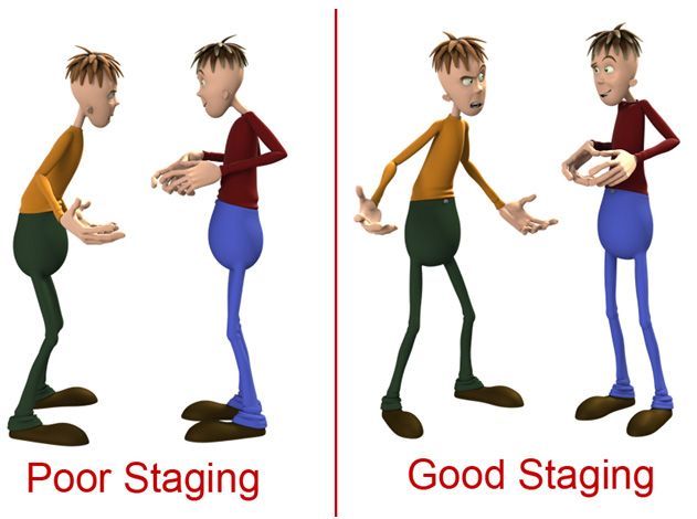
Staging
This is basically composition, as we’ve discussed previously. However, if we’re talking about it within the context of animation, we should consider how the scene amplifies the drama/emotion/narrative of a given scene, and how it relates to the larger animation in question. Another consideration is how the eye shifts its focus over time. Can we link scenes together via a character? How should we construct the background to make the character feel bigger or smaller? If our concerns are economic or we have limited time, ow can we construct the background to reuse elements in a way that doesn’t feel cheap?
Here’s a better example than the gif. Flat compositions are typically associated with comedy (think of how Jackie Chan movies shots are constructed vs. Bruce Lee movies). The characters above are scheming or having some kind of argument, having the camera be slightly below them, and show more of their faces allows the scene to convey more of that tone.
Straight ahead action/pose to pose
This is more of a handdrawn animation principle. When you animate that way, you can either draw each frame one by one in sequence; which would be smoother. The alternative, is to draw your main poses first and then fill in or “inbetween” the remaining frames. This is generally a better plan and leads to a more consistent sense of the character. In motion graphics, this relates more to your plan. Do you want to plan out your main beats and then gradually add more animation, or do you want to build each panel or character in sequence?
Follow through/overlapping action
This has some relationship to secondary action. More directly this relates to the fact that objects, or things moving in physical space have inertia; they want to keep moving when they stop. You might experience this as an object jiggling after it comes to a stop. The secondary action might be that a large object, say a big rubber ball hitting the ground would bounce and jiggle, but it might also make a dust cloud or cause objects in the background to shake.
Slow in/Slow out
This is the principle that organically moving objects will ramp up in speed when they start moving, and then slow down as they come to rest. In After Effects/motion graphics this is called non-linear keyframe interpolation or easing. You can use Easy Ease as we looked at in class, the (free) plug-in called Ease and Wizz or get super high-tech with the graph editor.
Arcs
This principle states that generally, objects (say a cannonball, a frog jumping, etc) tend to move along arcs, or curved path. In After Effects you can change the linearity of a path between keyframes as if it is a path in Illustrator, or animate an object along a path.
Timing
This is one principle, that again, applies more to frame-by-frame animation. More generally it relates to the idea that the amount of frames you use in a given motion has implications. In the example above, if you add more keyframes to the beginning of the first animation it either makes the object look heavier, or can be used to help convey the character is weaker or stronger.
Exaggeration
This is pretty self explanatory; exaggerate stuff. This relates more to frame-by-frame animation when it is easier to deform objects, but in general, exaggerating motion with whatever means you have, woosh lines, easings, scale...use all your tools.
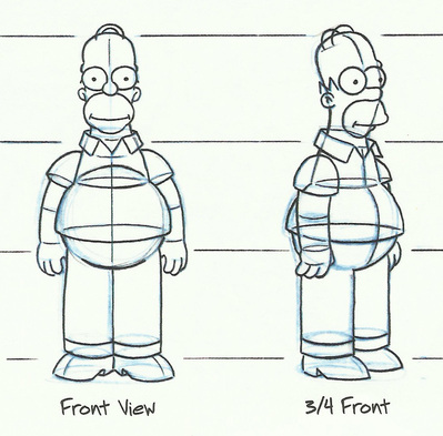
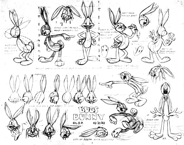
Solid drawing
This has some definite implications for handdrawn animation but is still worth considering for motion graphics. In drawing this is the idea that you give a drawing a sense of volume through form, and orms. You’ll often see characters modeled with primitives like cylinders or spheres to achieve this solidity. Additionally, higher end animations will have shading or cross hatching to convey that solidity. You can tastefully use effects like drop shadow, or textures to create a sense of solidity in your imagery with relative ease.
Appeal
This one is subjective, your characters and objects and animations should be appealing. In terms of practical applications, symmetrically-faced, baby-like characters are generally more sympathetic, and simplifying a character (the “rubber hose” style of Steamboat Willie for example) and increasing the size and readability of their face is also something that helps.