Spring 2023 ︎︎︎ Purchase College, SUNY ︎︎︎ (DES3440) Typographic Investigations
Enter the (DOT) Matrix

Background
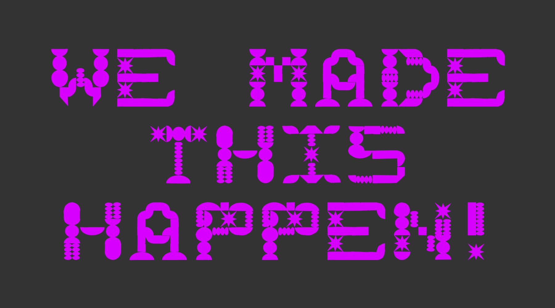
Creating typefaces can be intimidating, arcane, and requires sustained effort on increasingly granular concerns. The goal here is to create a kind of, microcosm of this process that helps to demystify it. Lettering in a “dot matrix” form (here used to mean using a grid of some kind as a basis of creating letterforms is also a (potentially) fun “puzzle” for understanding the minimum “resolution” for readability.
Some Examples
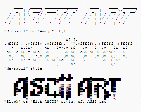
“Cracktros”/Demoscene/ASCII Text
LED Signs
Handjet Printers
Commercial applications like these handjet printers. Fwiw this is what TINY was designed forTypefaces contemporary and historic
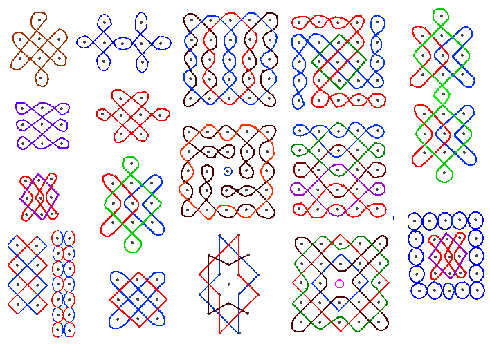
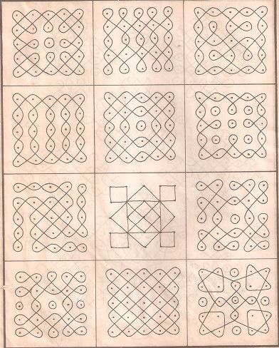
Kolam Patterns
(alternative ways to connect grid points)


Non-rectangular grid examples

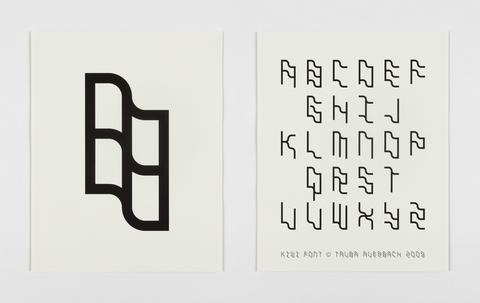
(Some of) Tauba Auerbach’s work

Objective
Make “Dot-Matrix” lettering, a specimen, and 5 “applications.”Final Submission
A folder containing the following:-
A .pdf showing the initial word or phrase used to guide your design process
-
A .pdf showing all glyphs that you have created
-
5 applications of your lettering
-
(these should be at least 11︎17 in. posters but know this the absolute minimum and that they can be anything. A video, a booklet, etc.)
-
A sub-folder containing all process work
Requirements
- You need, at the absolute minimum, the letters for the phrase used to guide your design process. Having more letters does not guarantee a better grade or that your project is inherently better, but allows you or anyone using your letters to get a better sense of the underlying system.
- 11︎17 in. posters are the absolute minimum, “I have satisfied the terms of the assignment” deliverables for the applications.
- You must show the glyphs you created and their corresponding unicode character (ie uppercase A, etc.)
Considerations
-
What is the minimum you’d need to express all the letters in the latin alphabet? If you’re feeling stuck, try creating a 5︎3 grid (squares), and see if you can create a-z with that. Try the same with 5︎4, 5︎5, etc.
- Your guiding word or phrase can be anything. A word or phrase that you like, or think has interesting letters, the name of your lover, your mother, etc. This is in lieu of a pangram
-
What is a grid? Do not simply fill in a bunch of squares as your final
-
An application should, at least be an 11︎17 in. poster, but is intentionally vague in order to facilitate creativity. I expect that you will go beyond this.
Grading
-
20% ︎︎︎Deliverables (as in, is everything submitted)
-
20% ︎︎︎ Concept (and its relationship to guiding phrase)
-
20% ︎︎︎ Process
-
40% ︎︎︎Final Work for Critique
No Shuriken Mode Challenges
(Please note that, doing these do not guarantee a better grade or extra credit by any fixed or demonstrable amount, but if you’re doing or approaching these things, you’re probably doing well. The point is that, like not using shurikens in Shadow Dancer, it is more difficult, and increases your proximity to the material. All this being said don’t hurt yourself and consider your other assignments and mental and physical health. Additionally, if you are not feeling challenged by the class or an assignment, and these suggestions are not sufficient for you, please le me know.)Relevant Dates
- 01/31/2023 ︎︎︎Introduction
-
02/06/2023 ︎︎︎Pinup of initial sketches & discussion of initial word choices
-
02/13/2023 ︎︎︎Check-in
-
02/20/2023 ︎︎︎ Final Critique & Writing Assignment
-
02/27/2023 ︎︎︎ Writing Review
︎Back to Typographic Investigations