Spring 2023 ︎︎︎ Purchase College, SUNY ︎︎︎ (DES3440) Typographic Investigations
project:
project:
Make a dang typeface
(not quick)
![]()
![]()
![]()


Background
Okay, so here’s the project, you have to make a font. That’s really it. Along the way you’ll get more familiarity with the process, look at other students’ work and we’ll of course be talking about historical models, examples, etc. I also want to administer this project in order for people to get more time to work on other things that didn’t get fleshed out all the way.Please note this class is called Typographic Investigations and not Typographic Absolute Demonstration of Existing Mastery. Please be ready to share half-baked ideas, sketches, overtly “bad” work or things you think are “ugly” or better yet, to reframe your conception of what is ugly or not.
Objective
Extend a previous project (namely the “dot matrix” project or a calligraphy style that you enjoyed). Extend this to create a complete alphabet of at least case (ie uppercase or lowercase). You may want to extend something that is not explicitly a typeface that you make in Glyphs or FontForge. If that is the case, let me know. ︎or ︎
You can create an entirely new alphabet from a TypeCooker experiment for example.
Goals
- Reflect that you are/have been paying attention to the formal and technical components necessary for type design and that you can (potentially) apply our calligraphic explorations.
- Gain greater familiarity with critiquing, discussing, and observing type.
Final Submission
- If you’re creating a font with an .otf/.tff of your font file(s) the font must contain, at absolute minimum:
- A-Z (uppercase) or a-z (lowercase)
- .,;:’”?! (punctuation)
- 0-9 (numerals)
- 10 “applications” (poster, animation, projection, poems, love letters, etc.)
- I will not set specific terms for this in terms of scale, temporal length, complexity. It should reflect a semesters worth of investment.
- Please also consider, pairing with other, existing typefaces, your calligraphy and display versus text.
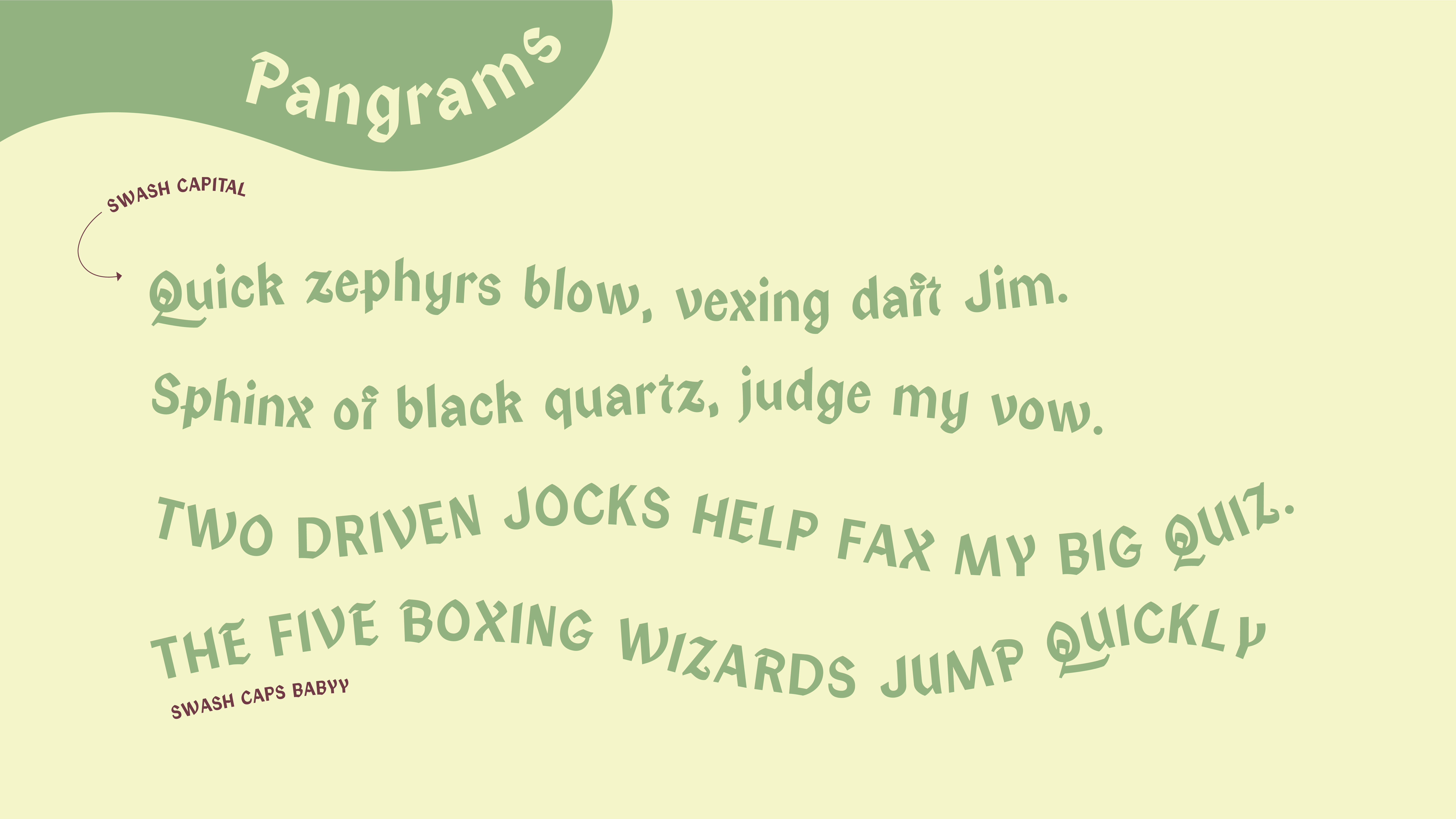
- 11in.︎17in. .PDF showing 5 pangrams of your choice
- 11in.︎17in. .PDF out showing the complete character set (multiple pages if necessary)
- “spec sheets” printed for marking up and process critiques (to be used at various times throughout the process, provided for you).
- a folder containing all process work, your progress, intial drawings, iterations, etc.
Dates
04/04/2023︎Introduction!
-
04/11/2023︎Review project ideas
I may need to approve your idea if it is not explicitly a font. 04/25/2023 ︎Show ‘n’ Tell of project status
Several students will be selected semi-randomly to discuss the status of their project to the class.-
05/02/2023 ︎Project check-in, collective review
05/09/2023 ︎Final reviews
Considerations
- The power of family ︎︎︎ A typeface is a group or collection of stylistically related letters; a font being one specific iteration of that stylistic decision making; Arial is the typeface, Arial Narrow is the font. When you have multiple fonts together they form a family. This family can be bespoke, disparate, subjective, or clearly related and evolved from each other. These are choices you have agency over.
- Completeness ︎Although you should aim to make your applications appear as resolved as possible, don’t feel you need to have a complete typeface (ie bold, italic, etc), be ready to show your work in progress.
- Time︎This is meant for a number of reasons. Firstly, this project intersects with when Senior Projects may start to get hairy. It’s also meant to apply to the idea that you have to sustain small amounts of effort over a given time.
- Form as a function of freakiness︎ Don’t hesitate to do some carefully explored bubble letters, some reverse stress type thing, or other alternative forms.
- Paths of acceptable lesser resistance︎There’s nothing wrong with taking your calligraphy, scanning it and expanding from there.
- Medium is not...digital ︎ You can retrace your letters, expand them in drawings, cut them into potatoes...etc.
Grading Rubric
-
60% ︎︎︎ The type itself
The volume iteration, the amount of characters, attention to detail. -
40% ︎︎︎ The applications
For a combination of the execution, creativity, breadth, and thoughtfulness of the applications (each ten points).
“No Shuriken Mode” Suggestions
(the basic point here is “add more stuff” but also every bullet here has a parenthetical “or start”)- Create an italic/slanted/oblique version
- Add alternates (swashes, two-story g, etc.)
- Add alternative weights (lighter/heavier, etc)
- Add diacritics (é, è, ë, ę, ē, etc.)
- Add ligatures (ff,fl, etc.)
- Add another character set (Cyrillic, Honguel, etc)
- Go wild with applications: a related app design or prototype, 3D-printing, screen printed on shirts, risograph’d, embroidered.
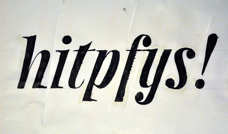
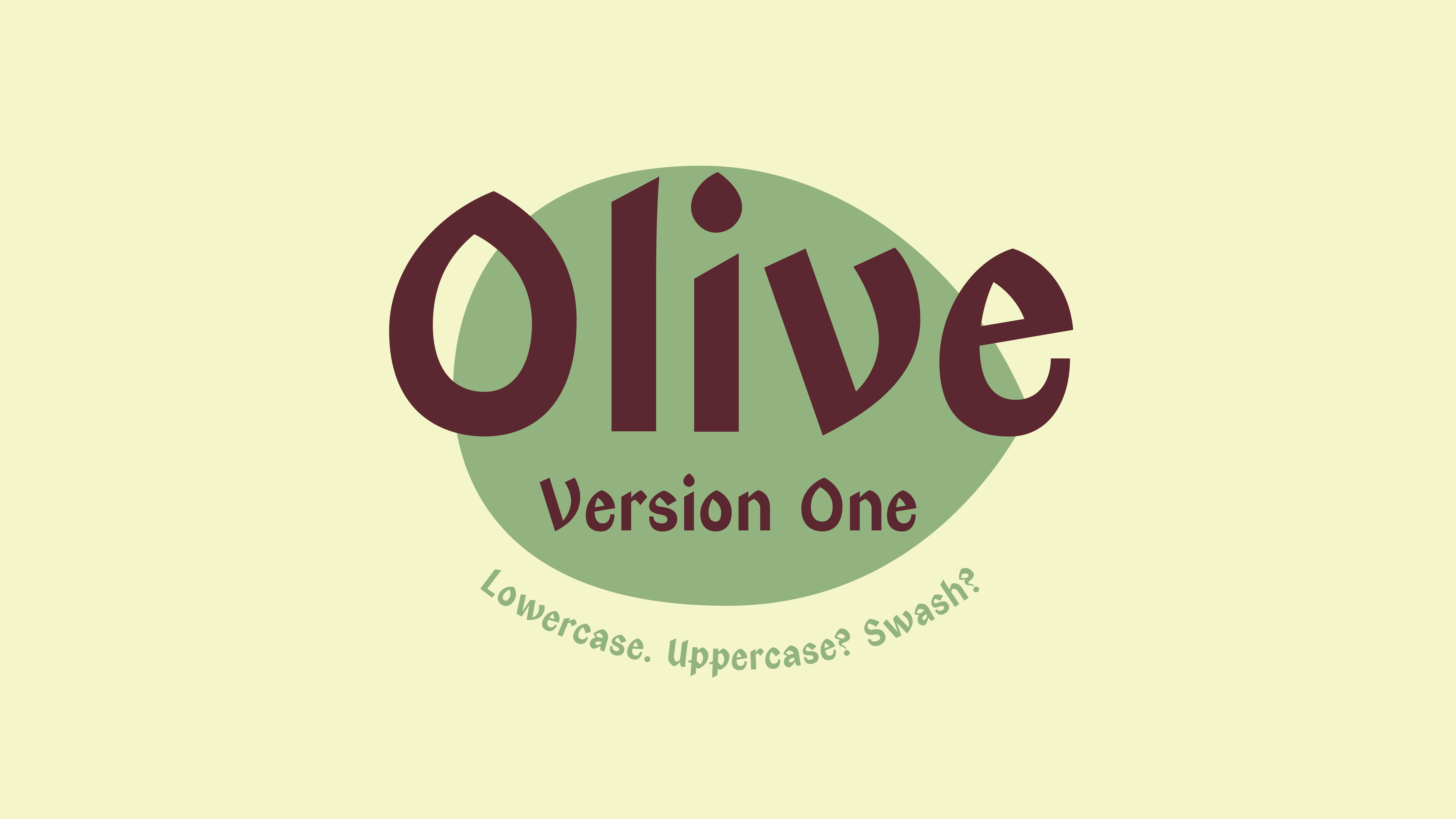
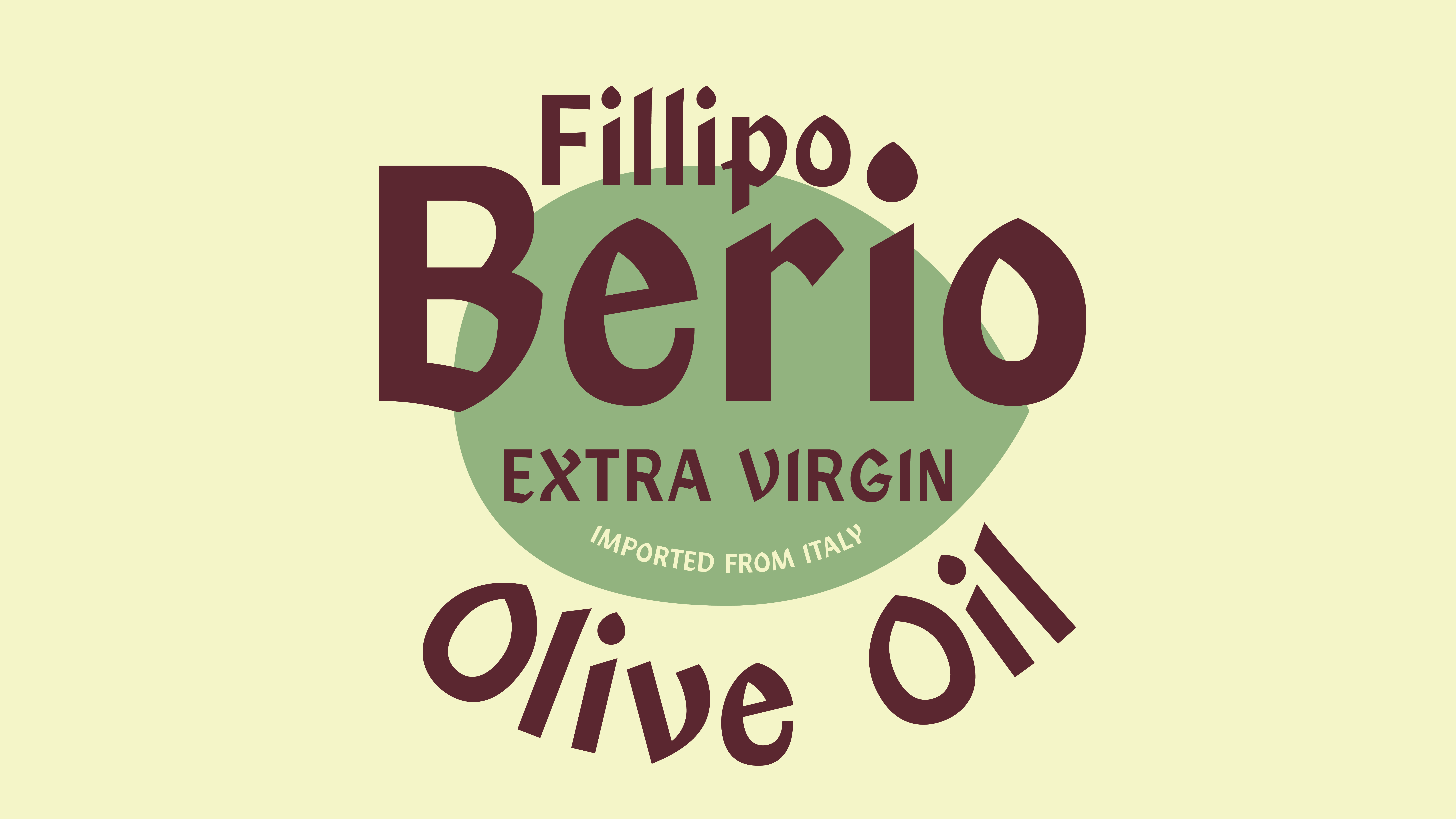
Student work examples
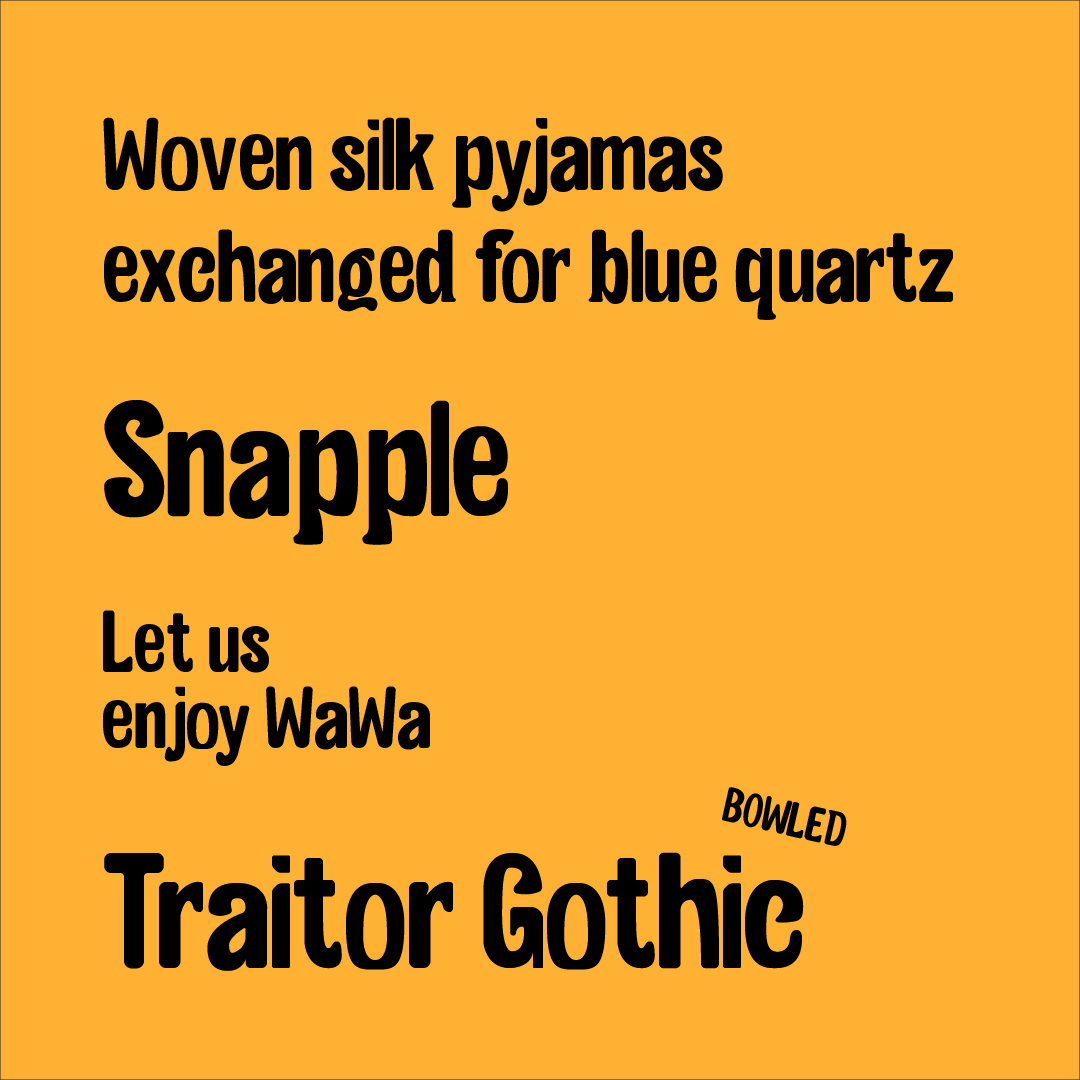
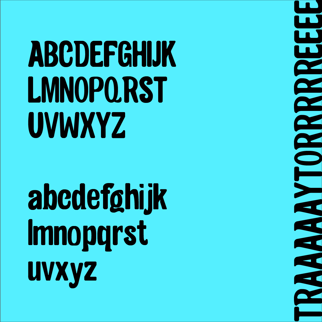
(please click to expand examples and also know that the work doesn’t necessarily reflect the exact terms of the current iteration of the project)Lima Bean by Karishma Patel


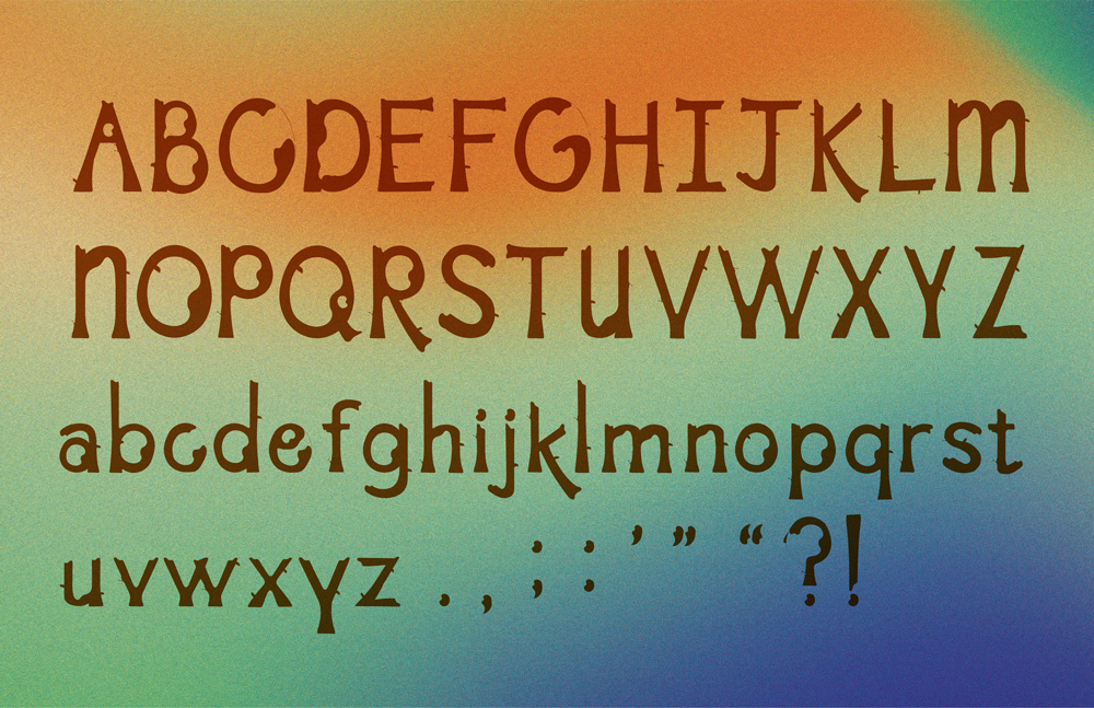


No Crying in Baseball by Jake Lorenzo


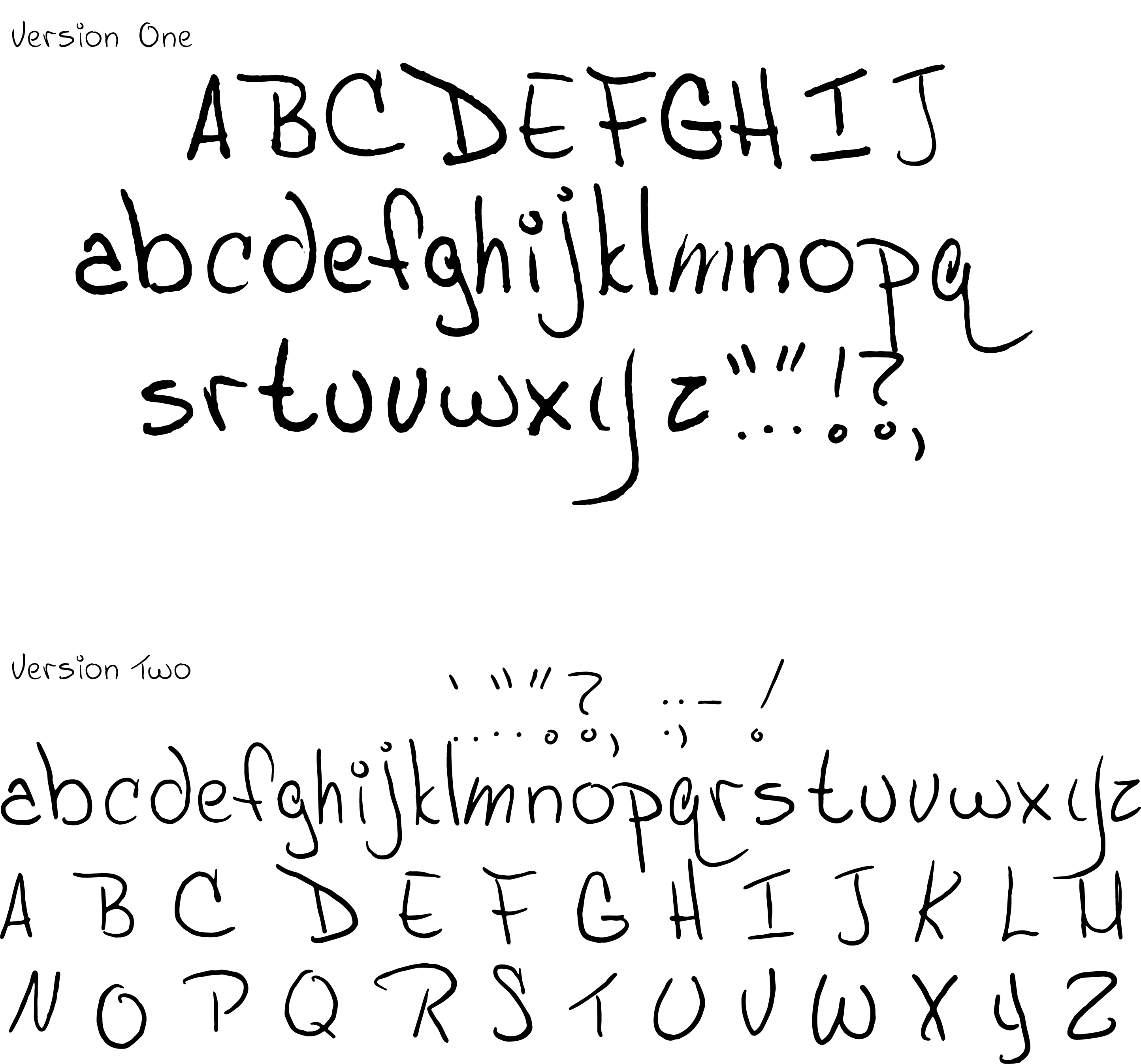
Buffoonery by Jordan Huynh

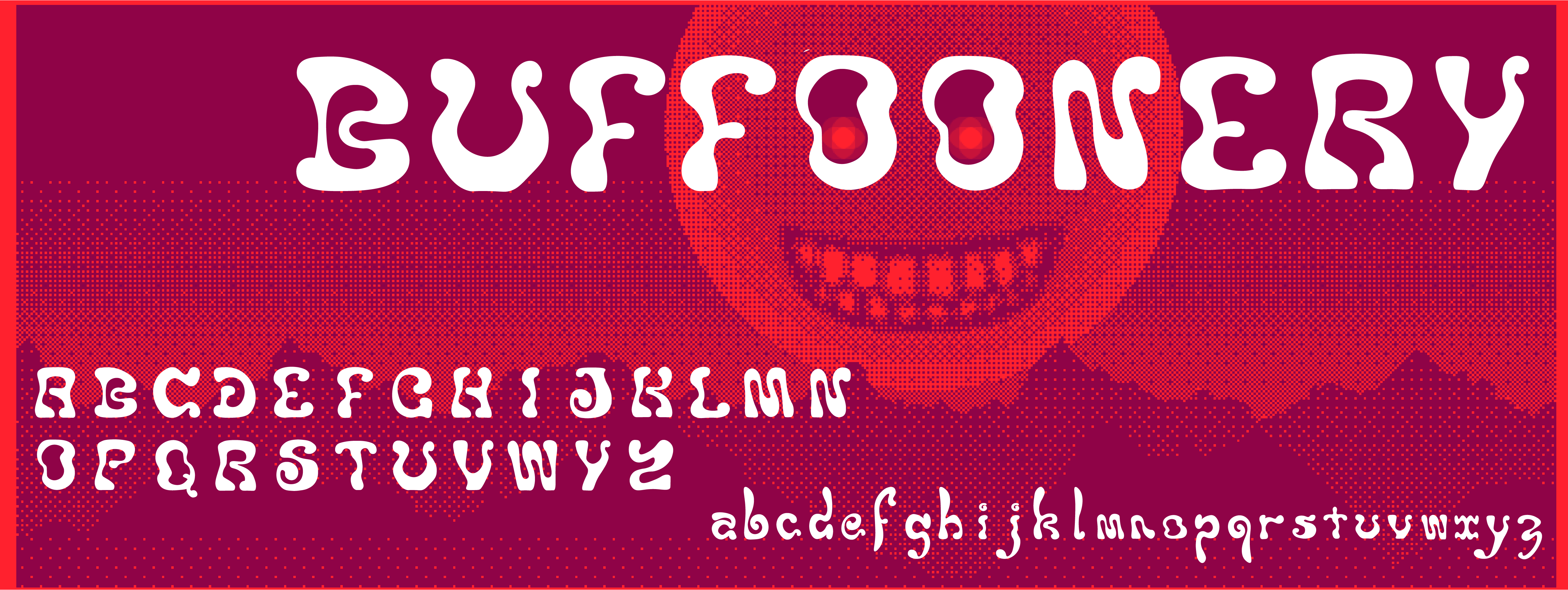

Serifing by Malachai Marzolf

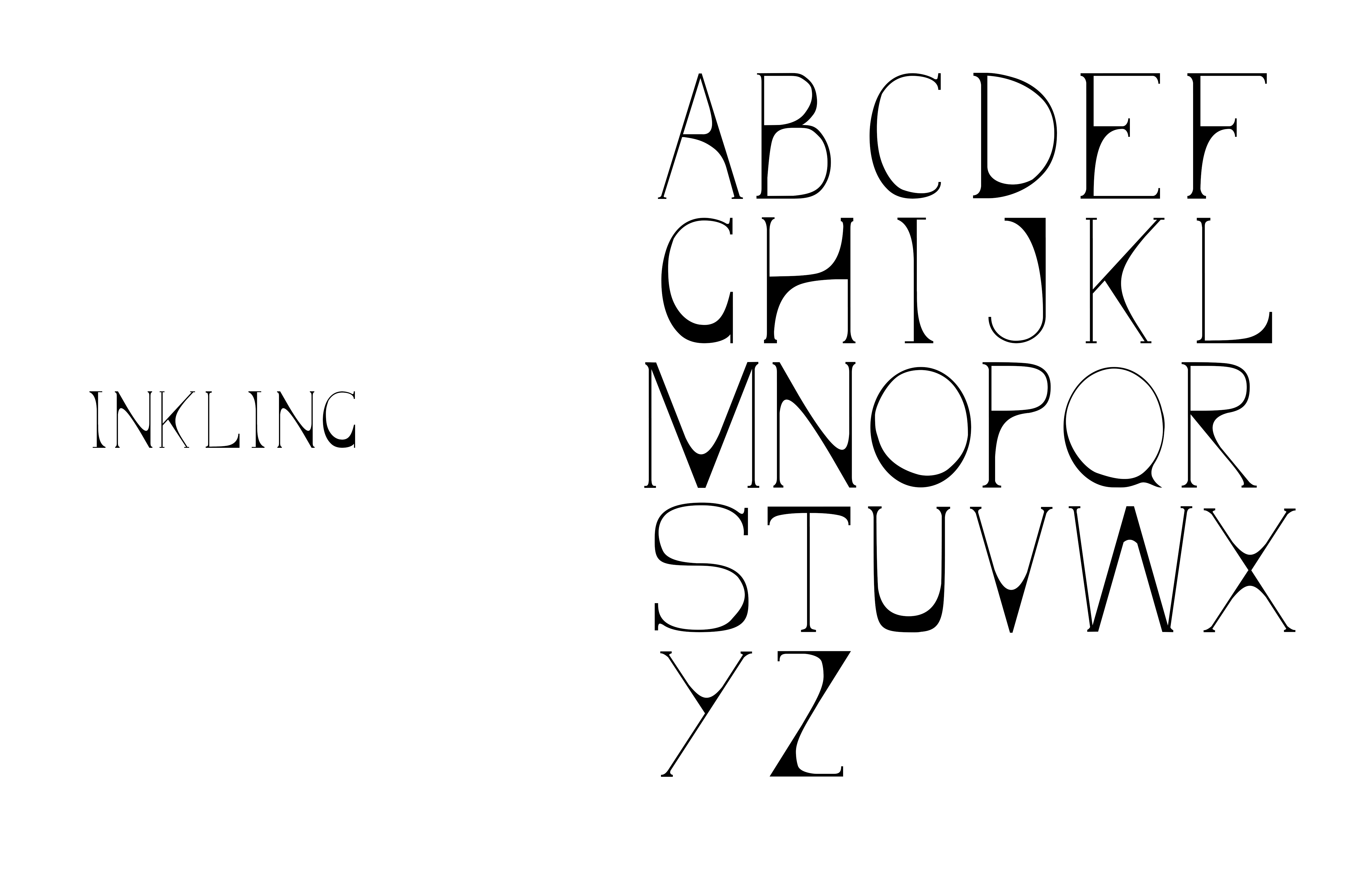

Olive by Gwen Corbett
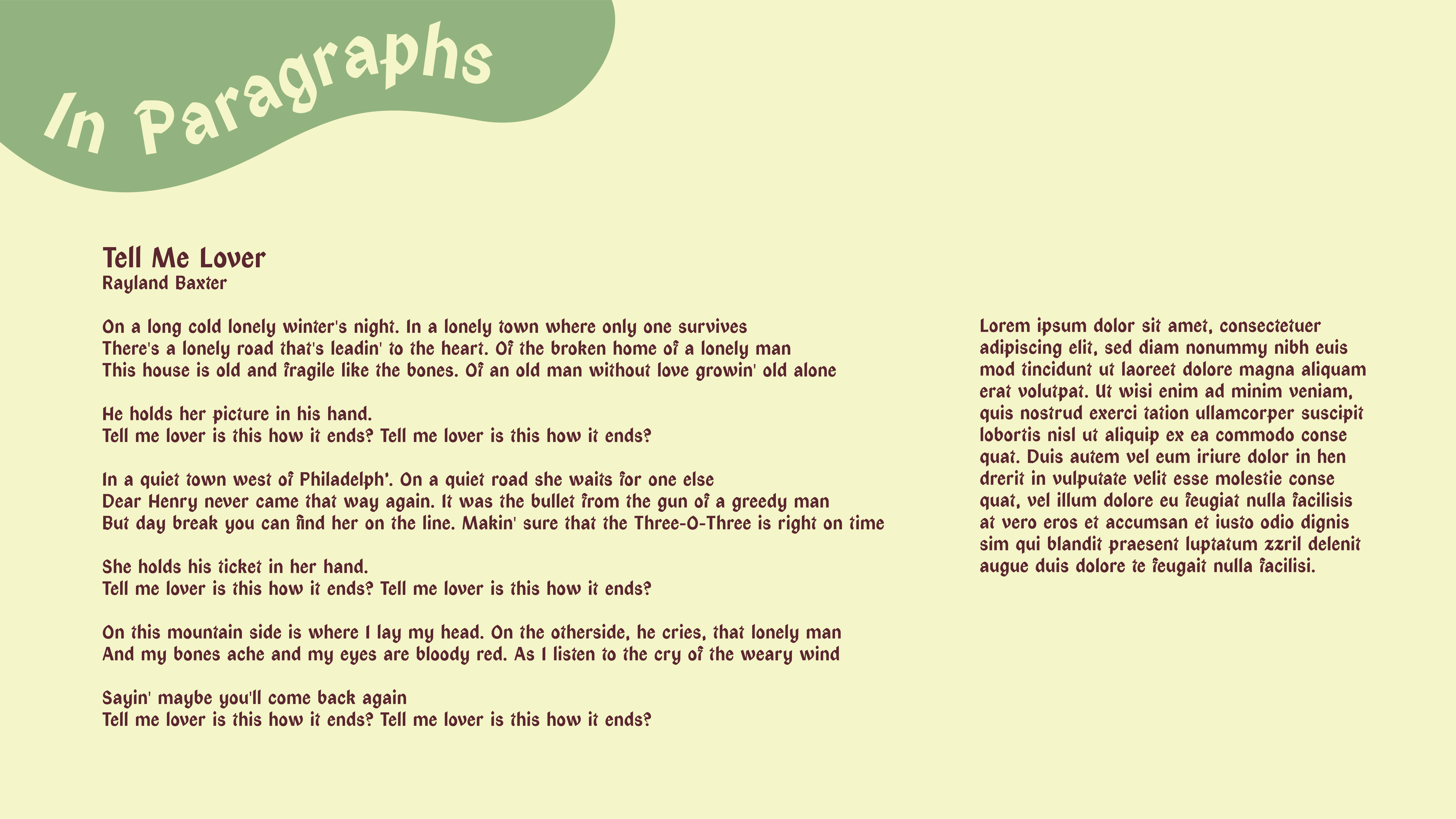

Limey/Traitor Gothic by John Bradford


︎Back to Typographic Investigations