SUNY Purchase︎ (DES3800) Design for Web & Screens
UI: Affordances & Signifiers
First a Review & Discussion
I may or may not have discussed this before in class, but Magic: The Gathering is the best game, and possibly one of the best things ever made by human beings ever. Full stop. That being said, it’s also complex in a way that is hard to convey succinctly on a screen. I was catching up with a recent Magic tournament and noticed they changed the overlays. Let’s talk about these in relation to what we talked about last week (mapping).Affordances
Here’s Don Norman explaining affordancesThe key takeaway here is affordances are relational, that is to say they are not inherent properties. They depend on the relationship between the particular user and the object. The cylinder in the video, for example would not afford sitting to a disabled person in a wheelchair. A doorknob does not afford turning to a person without a hand. Similarly, that same door doesn’t afford turning in the same way for a toddler without developed motor skills.
Here’s another video specifically on doors related to affordances
Signifiers
If you look up “affordances” as it relates to web-related interaction design you’ll probably see it used rather loosely. Don Norman talks about another concept called signifiers; borrowed itself rather loosely from semiotics. Something can be an affordance and a signifier. So what is a signifier? It is something that let’s you know an affordance exists. This may be because the affordance is invisible. A sign like this one: 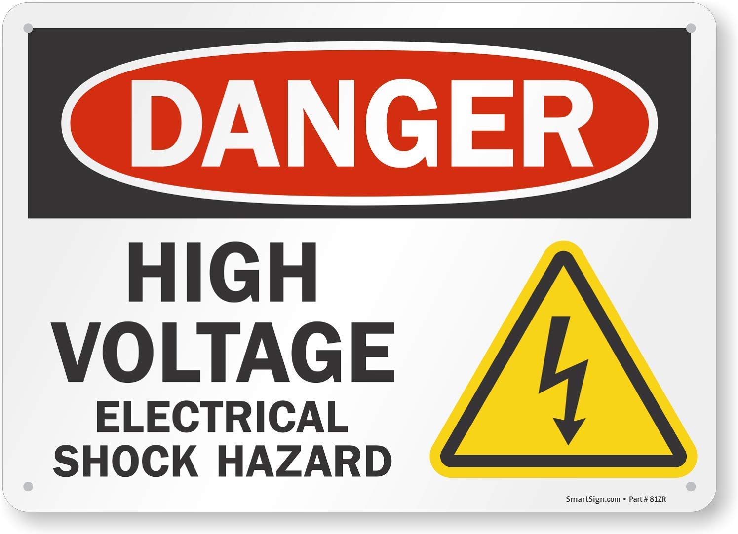
let’s you know that the wires near it are charged with invisible electricity (an affordance you cannot see).
Another clearer, more visible, example is a door with a push bar:

The push bar is an affordance that the door can be pushed, however adding a label which says push is a signifier for that affordance. A subltler signifier might be a doorknob shaped like the negative space of your hand, it doesn’t necessarily provide a greater ultimate affordance (opening the door), but it does give a less direct and lingquistic signification of the interaction.

Typically with graphic user interfaces you will be adding signifiers, as the physical object will not be there to create an actual affordance.
Here are some common signifiers for mobile interfaces.
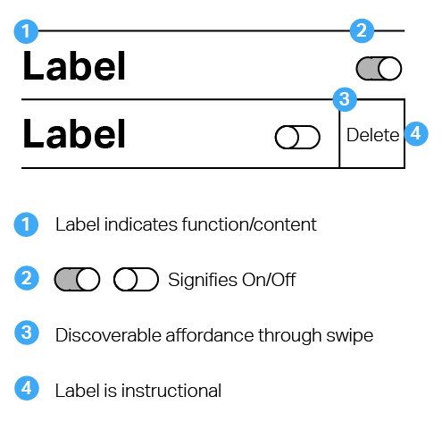

Note that this and the other UI concepts will intersect. The sliding switch will map to a direction that makes sense for the given action and give feedback by changing color based on an accepted cultural or precedent-based system.
Further reading/sources
It’s not you, it’s the interface by Ben Olson︎The Design of Everyday Things by Don Norman︎
︎Back to Design for Web & Screens