SUNY Purchase︎(DES 3800) Design for Web & Screens
UI: Mapping
Background
With user interfaces, one of the primary things we are trying to do is take an idea, concept, company, product, museum, whathaveyou and translate that thing it into a designed form. That process is called mapping. 
Interfaces bridge the Gulf of Execution and the Gulf of Evaluation. That is to say, the effectiveness of this mapping can help us understand what state the underlying styem currently is in, and how the system is utilized.
The stove example
Let’s discuss, which of the following stoves below is better, and why?

no peekin! It’s not a trick question!
So here’s the reality. Both of these are technically fine. Presumably, both of these stoves work. You touch the knob, it does the thing. So what’s wrong? The mapping. The left image is better because the buttons are mapped visually to approximate the location of each burner.
One sign that you may be doing something “wrong” is the sensation that you need to add something; an indicator ( “CLICK HERE!”) in order to increase clarity. For the right example, you’d have to add distinct labels to each knob to make it clear how the location “maps” to the actual stove. Think of the different stovetops in different houses or apartments you’ve lived in. How many of them did you accidentally turn on the wrong burner multiple times? How were the knobs and corresponding burners arranged?
Implementing mapping
Generally, a successful user interface will not have to tell you to click it. A marketing person may want you to expand the size or “loudness” of a call to action button, but you’ll have to decide how much to fight them on that and how much it serves the design in question. If you have to create an extra illustration, instruction or visual element to explain the functionality of your system, consider how it might be changed or simplified. You can use different ways to map the spectrum of data you have to your design, like color. In this example data is organized by color. Although colors can be culturally loaded, the color of the menus on a given page give some indication of “where” the user is on the site.

You can also use metaphor. This can be quite subtle. Generally we understand up to be “more.” iOS takes advantage of this for setting your screen brightness from the lock screen.There is no direct relation between “up” and brightness, but the system has connected those two notions (up = “more” & screen brightness) for us.

We also have familiarity with sliding switches in iOS from our everyday experiences with actual, physical sliding switches. To highlight color again in the Western world we generally understand “green” to mean “go” or imply something has positively changed.

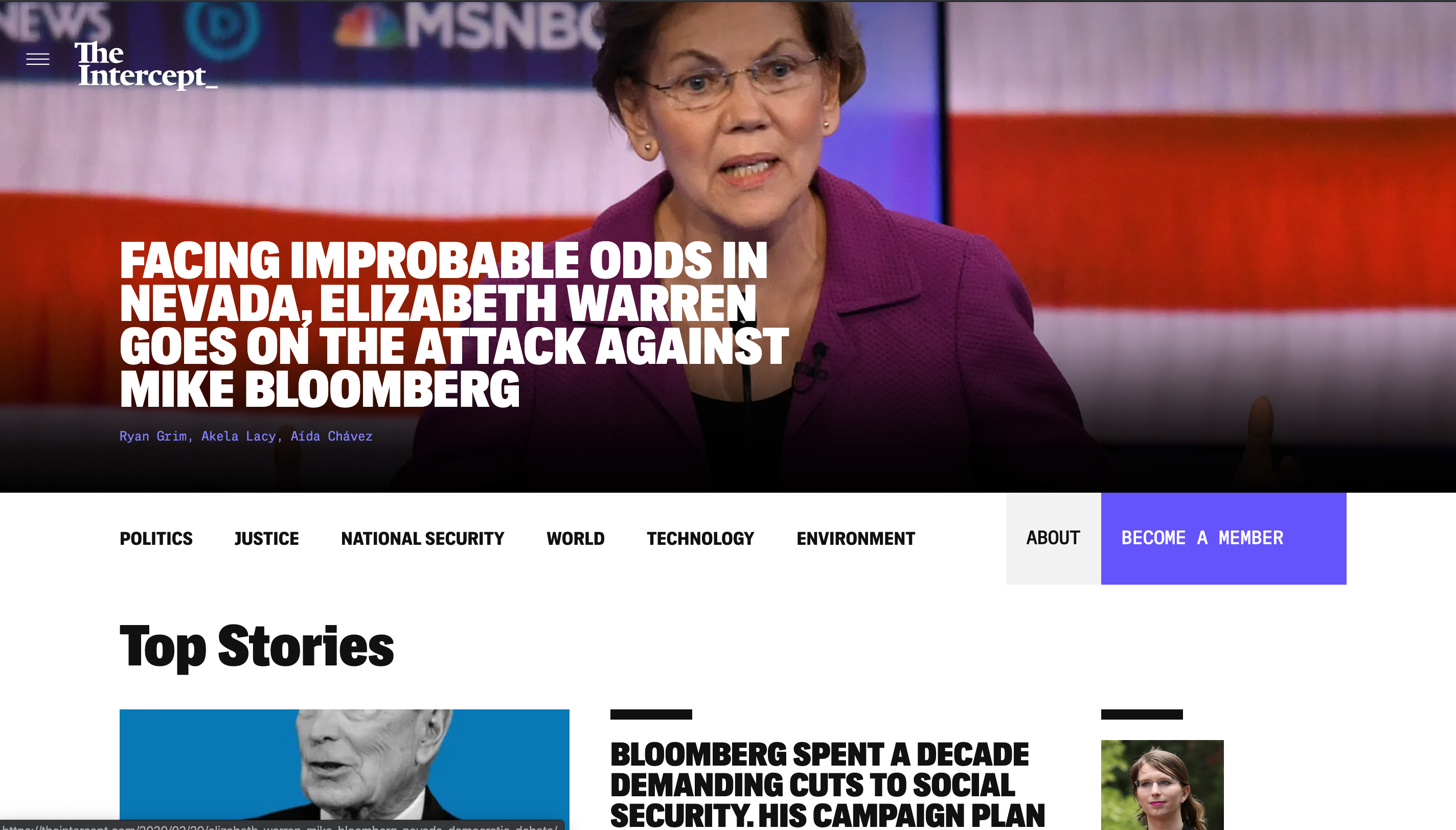
Historical precedent is also a factor to consider. The New York Times homepage might technically be better served if it looked more like...say the Intercept’s (seen below, not meant to be a political or partisan statement or endorsement of either website ︎). That is to say, one might find the experience of scrolling through bigger type and imagery more immersive, engaging, or informative. However, The New York Times has 100+ years of being The New York Times; 100+ years of people unfurling it over a morning coffee, reading it on the subway and trying to fold it enough to not hit someone, paying for it at the newspaper stand while waiting for the train to arrive on their commute to work. Those are experiences that the homepage effectively pays homage to by referencing, in some way, the layout of the physical newspaper.

Don’t skeu it up, too much...or too little
We mentioned iOS earlier. One of the design concepts that they latched onto heavily early on was something called skeumorphism. This is the principle by which, at least with screen-based-interfaces, the virtual thing resembles the actual thing. Here are some examples. 

Skeumorphism should be ornamental. That is to say the dimensionality of Windows 95 buttons and forms are technically not skeumorphic, but their physicality plays a very powerful role in alerting users to an implied functionality. The “sunken in” form fields allude to the idea the user can “enter” those form fields, and the raised buttons, imply they can be depressed.

Skeumorphism is typically placed in opposition to more contemporary flat design, which is more en vogue at the time of this writing; however it presents its own issues. A particularly egregious example is Windows 8’s new “start menu” in an attempt to unify the PC and tablet interfaces they created the system below. Are these buttons? Do they open applications? folders? both? Are any of these applications already open? Should I be pressing these items? Dragging them? The lack of confidence in this design is further reinforced by the fact they have gone towards a system that is closer to the Windows 95 Start menu + Cortana’s Spotlight-esque functionality for Windows 10.

Further Reading/Sources
- Apple Software Philosophy – Skeuomorphic Design︎
- Nielsen Norman Group︎Flat Design: Its Origins, Its Problems, and Why Flat 2.0 Is Better for Users︎
- Nielsen Norman Group︎Natural Mappings︎
︎Back to Design for Web & Screens