Fall 2020 CUNY ︎︎︎ Queens College ︎︎︎ (ARTS241) Design 1
Project:
Posters from Memes
Background
The
Custom “Memes” project︎ was taken a bit too literally. There needs to a greater, and more careful examination of imagemaking as well as word and image relationships. Additionally, the Fontstructs need to done a bit more thoughtfully. I’m using this quick project in order re-interpret some of that work.Objective
Take content from your Custom “Memes” project︎ and use that to create several posters. Requirements
- Do not use pre-existing fonts. ︎︎︎Use your own Fontstruct fonts from Custom “Memes” project︎ or other ones from the class.
- Create a custom font with at least four letters. ︎︎︎ If you are using Fontstruct, Do not simply do your letters at one block wide and use all square blocks. Make your letter at least 3 blocks wide in the vertical strokes so that you create a higher “resolution” letter forms. Use this as a title for your poster. (If you want to use a different tool like calligraphr that’s fine).
- Only black and white. ︎︎︎ No color.
- Use only your own imagery/drawings ︎︎︎ No Google Images.
Final Submission
- 24 in. ︎ 36 in. poster as a .PDF, .PNG or .JPG at 150dpi please note project files like .PSD, .AI, or .INDD will not be accepted or graded.
- (at least) 1 new Fontstruct font/lettering with at least 4 letters (see requirements above), submitted as a .TTF.
-
Folder with all sketches and process work
Considerations
-
Negative space ︎︎︎This is the space that is not occupied by your text or imagery. The space around it . Give your images room to breathe, let flat colors do their thing. Think about the composition, and how it flows.
-
Type size ︎︎︎This poster should be viewable from afar. Consider what content you want viewable from faraway and which should be viewable close. If you think in terms of a movie poster, the title is typically viewable from far away.
![]()
- Treat/filter/alter images and text ︎︎︎Use the resources below if you are not familiar, and ask if there’s something you’re trying to do that you are not sure.

Relevant Dates
09/22/2020 ︎︎︎ Introduction
09/25/2020 ︎︎︎ Upload progress!
- 10/06/2020 ︎︎︎ Critique!
-
10/13/2020 ︎︎︎ Re-submit
Resources
Below are some tutorials that are relatively easy to do that will help you compensate for low resolution images, increase visual interest, or just look “cool.” These are things that I don’t think everyone will want to do so I will not make everyone go through a tutorial. If you look at any of these and are confused, please don’t hesitate to communicate with me about it.
︎
These are just suggestions, please use your curiosity and creativity to look for other options for filtering images and text.
︎
︎
These are just suggestions, please use your curiosity and creativity to look for other options for filtering images and text.
︎
Bitmapping images ︎︎︎ This is one technique that I think is especially useful if you have low resolution photographs you want to make “bigger” besides simply looking “cool.”
Texturing/distressing fonts ︎︎︎ If you’re not into the blockiness of Fontstruct, this is an option for you. Also might help images not appear so flat, especially if you started in Illustrator.
Halftone patterns ︎︎︎ another option for changing the texture of text and breaking up potential blockiness in Fontstruct.
Applying layer styles ︎︎︎ Here’s one “cool” thing you can do with the “Bevel & Emboss” layer style. There are a whole plethora of layer styles to explore.
Blending modes ︎︎︎ Blending modes effect how different layers talk to each other, when they are on top of or below each other. Here’s one effect you can achieve through the use of blending modes.
Collage ︎︎︎ An option you have with your images, as I’m assuming they will probably not simple
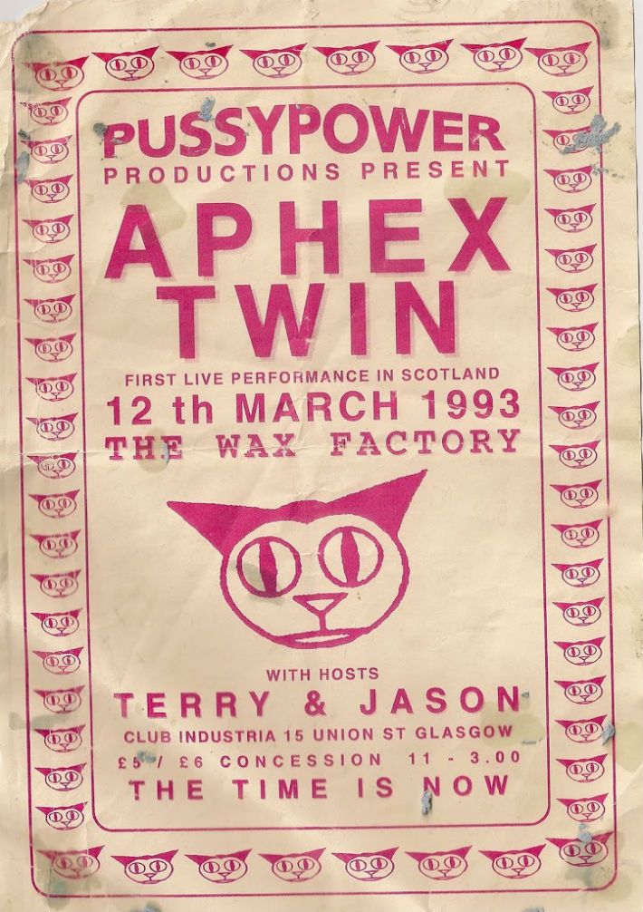
Examples
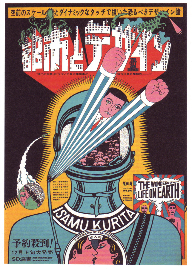
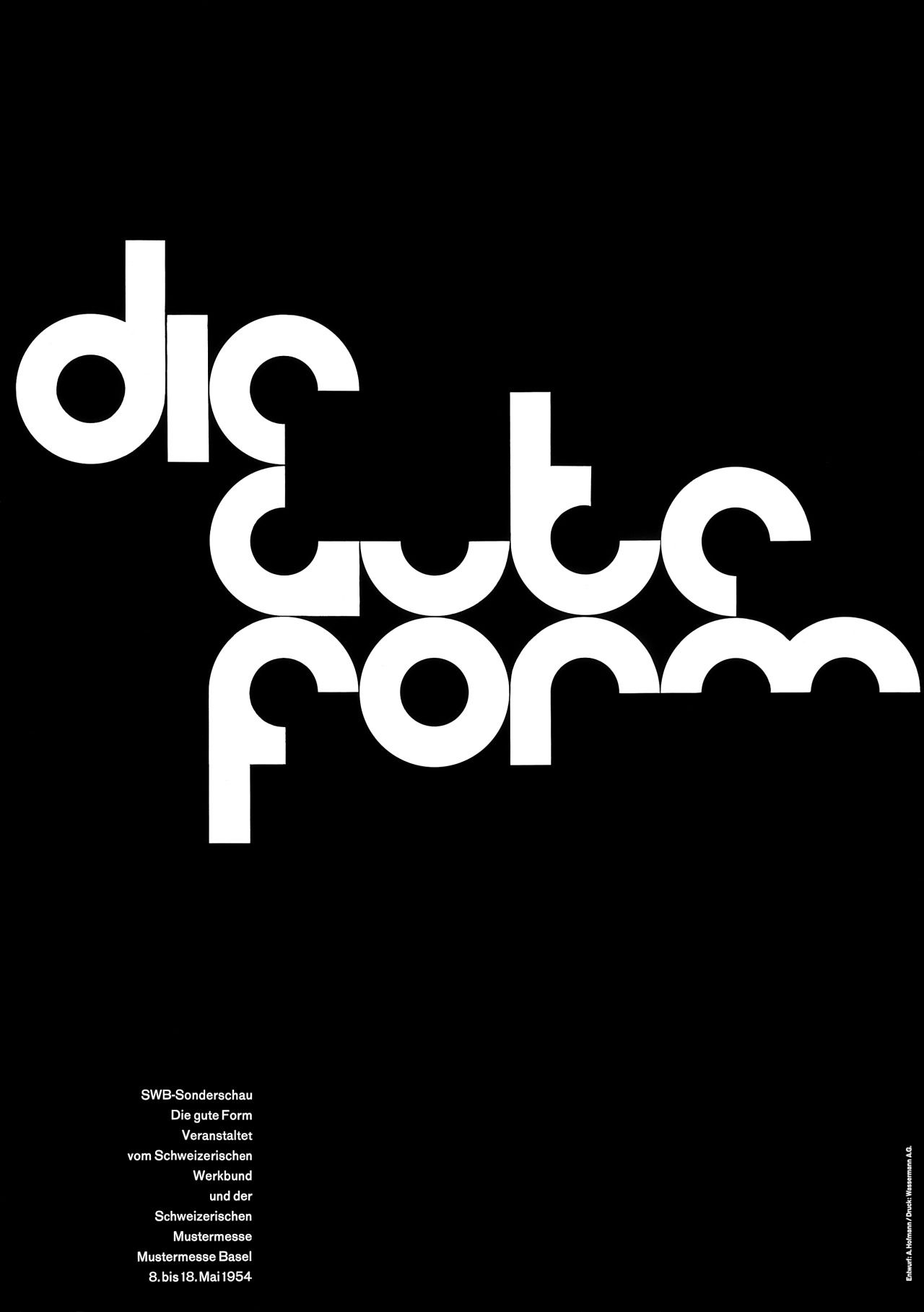
Please also refer to the Poster history page︎ and “Meme” feedback︎ pages for more examples and ideas.Design-related︎︎︎

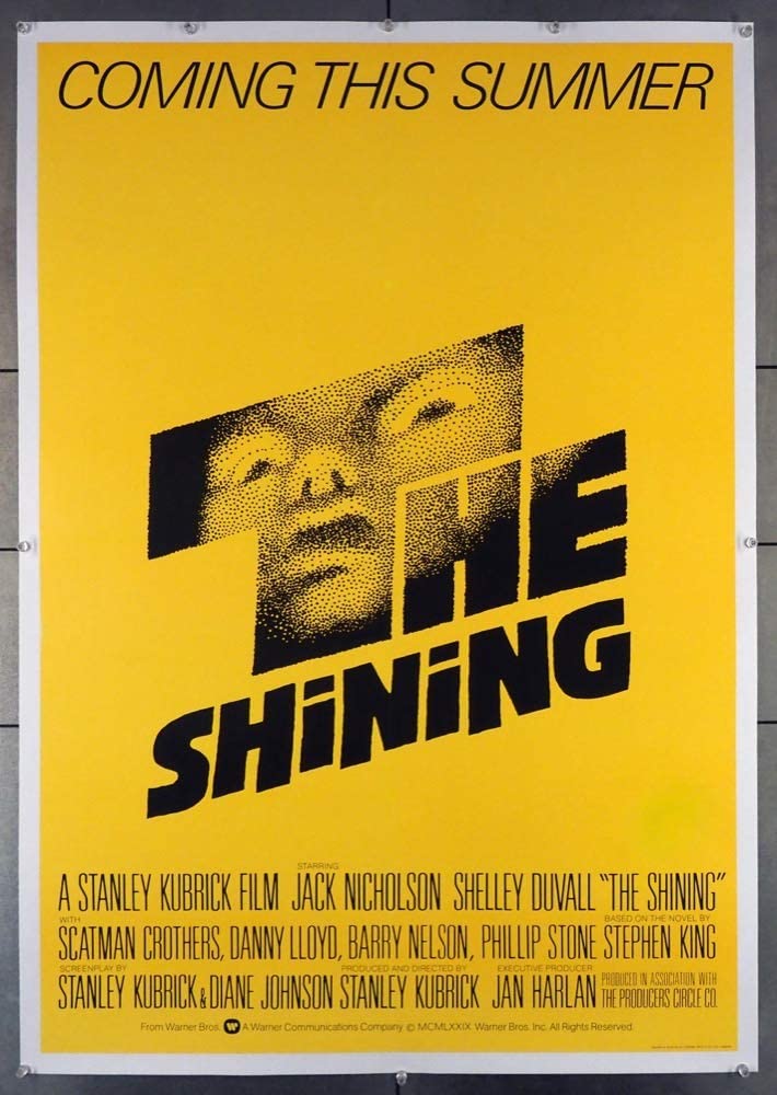
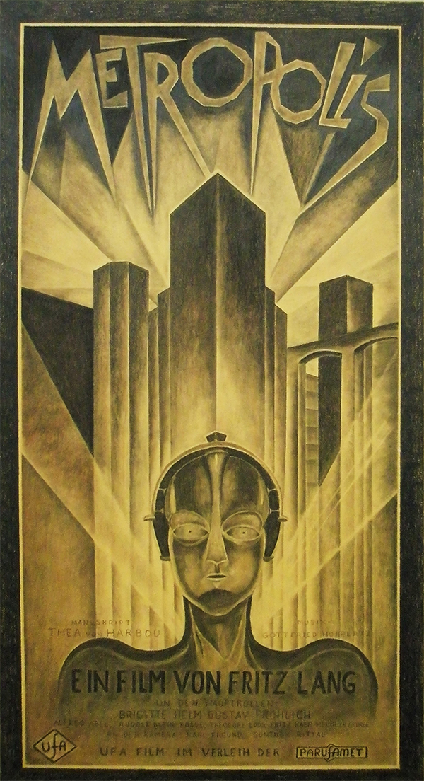
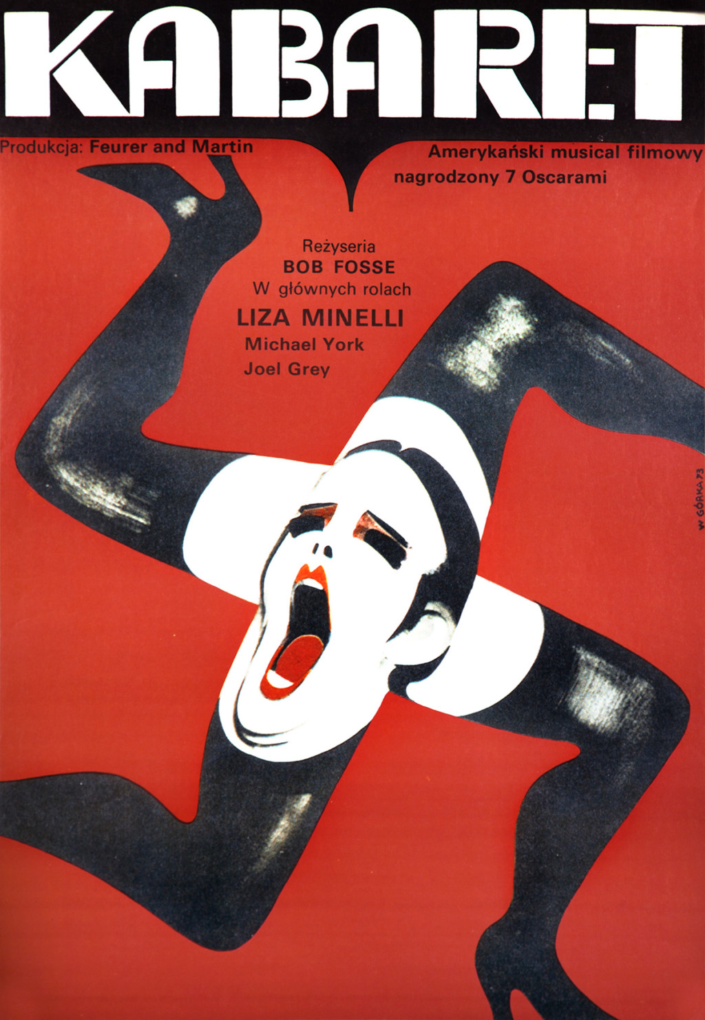
Film ︎︎︎

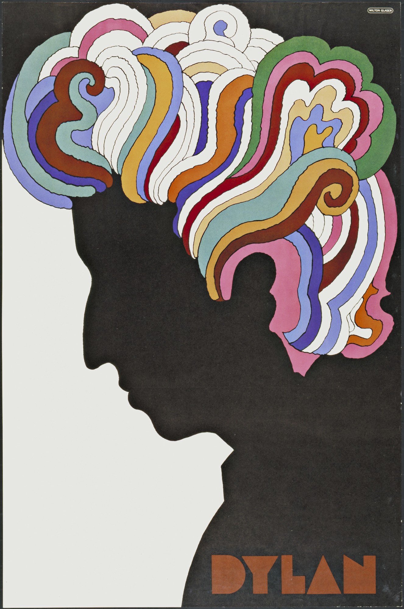
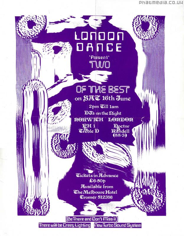
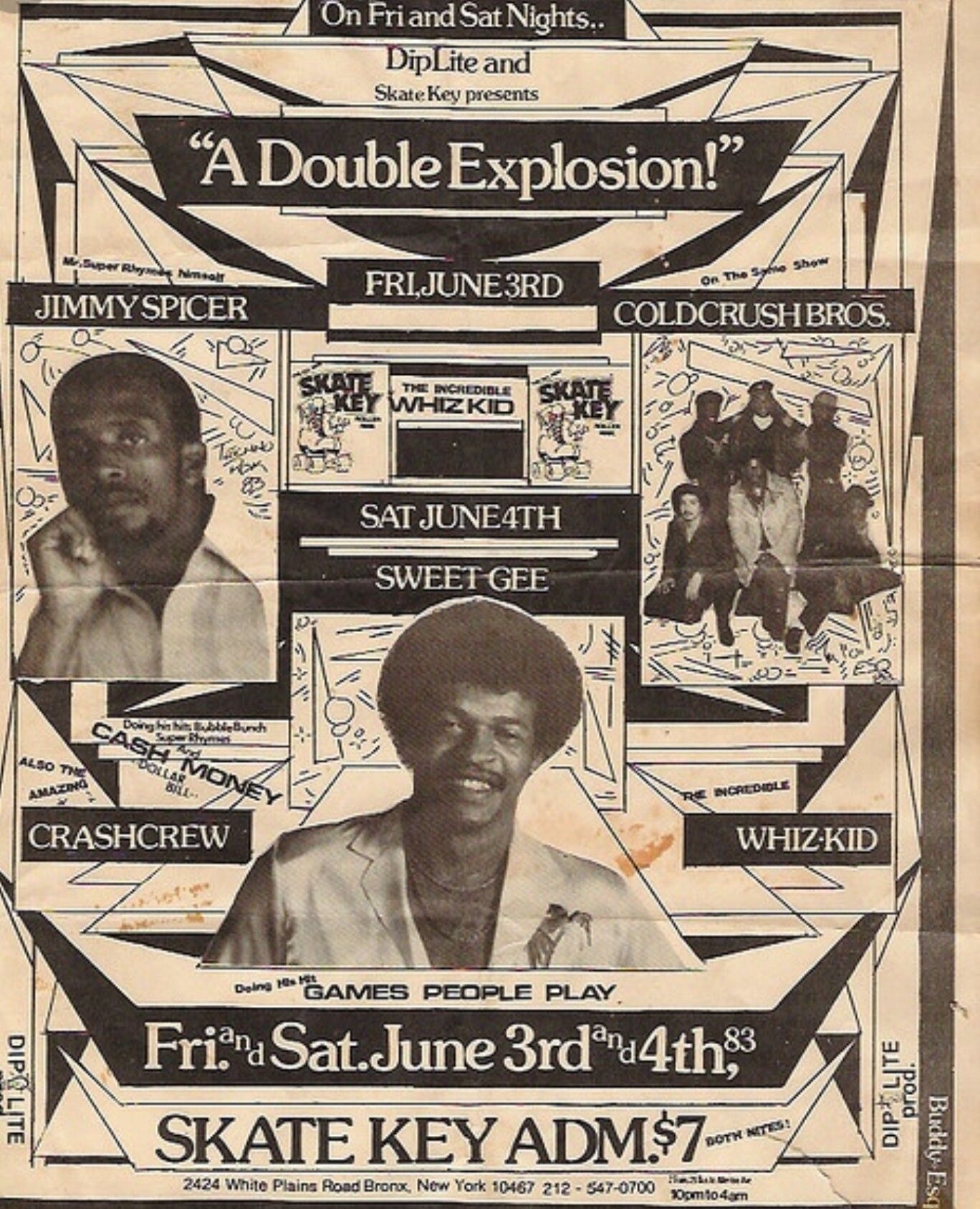
Music/Concerts ︎︎︎

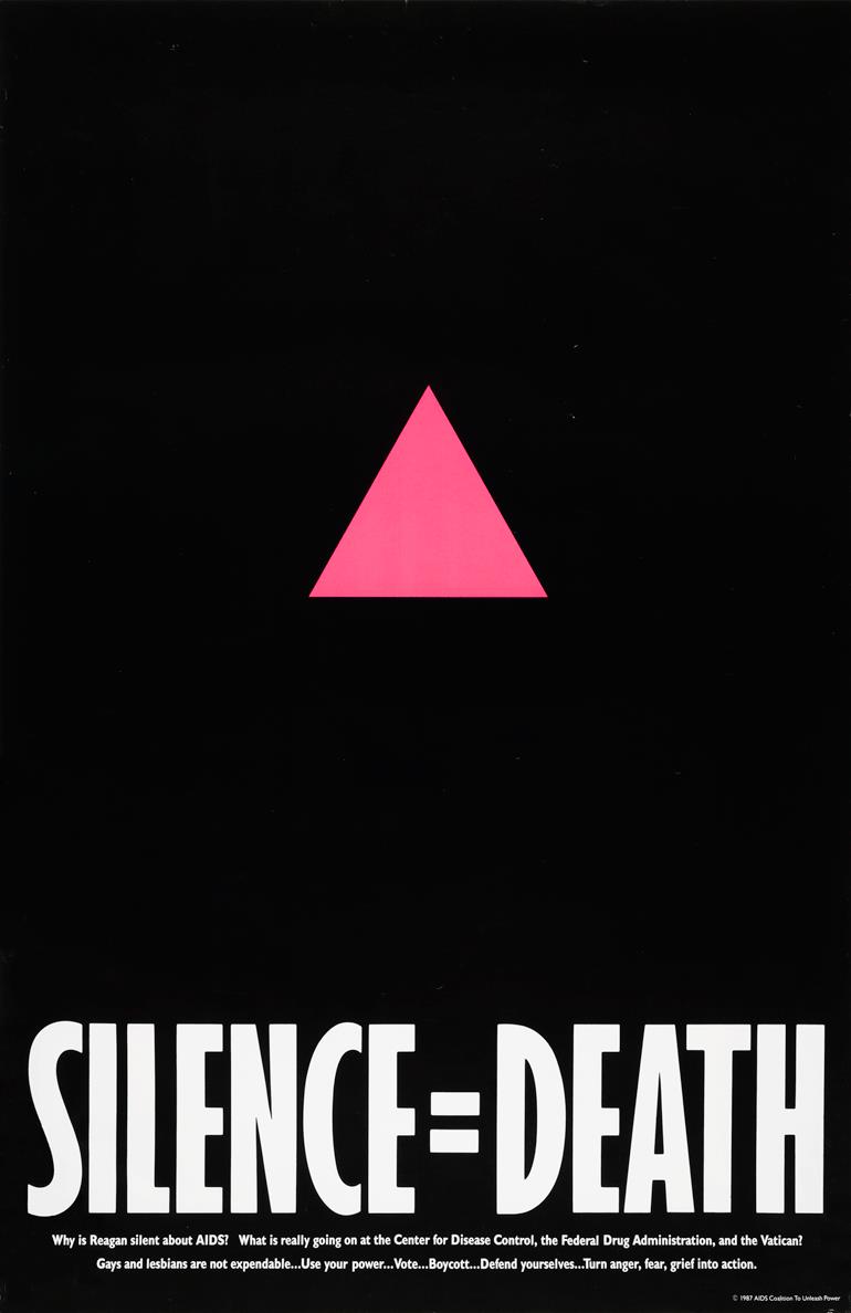
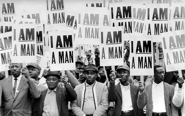
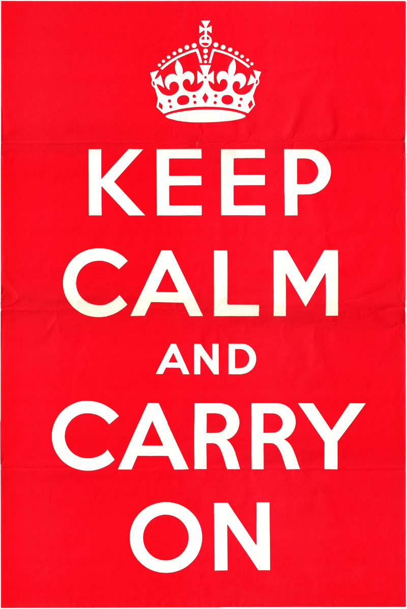
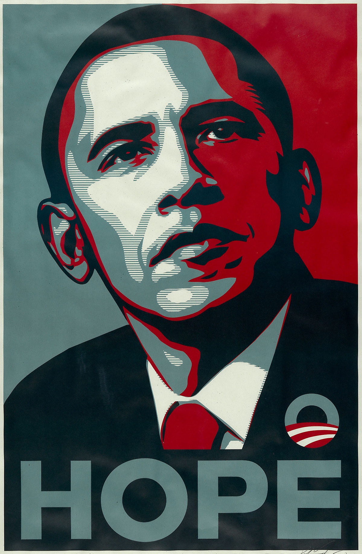
Politics ︎︎︎