Fall 2020 ︎︎︎SUNY Purchase ︎︎︎(DES3510) Word & Image 3
Logo & Arrow
(Long-term Brand pt.2)
![]()
![]()
![]()

Background
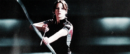
I chose this piece for two reasons: semiotics and tension. Your logo is a sign) that should point (like an arrow...GET IT?) to the “meaning” of your proposed company. In semiotics, this logo is the signifier (significant below) and the collection of services/ products/ values your proposed brand represents is the signified (signifie below).

This is again, not unlike the Michael Beirut video I keep mentioning; semiotics is just a more historically rooted theoretical justification for the ideas Beirut mentions.
The second reason for choosing that performance piece as a jumping off point for this part of the project is tension. The image of Marina Abramovic and Ulay with the bow and arrow is arresting, and tense because of the possibility it implies. It implies movement, danger. We understand, to some extent, the weight and give of the bow, the potential power of the arrow, the weight of her leaning. It is “animated” while being expressly still. Your logo should ultimately do this.
Overview
Create the logomark and logotype for your proposed brand. Also distill from the previous step, a set of five values (adjectives) for your brand. Requirements
-
Make sure you display your logotype and logomark in black and white. Note that we’ll focus more attention on color and the surrounding typographic systrem in the next step, but don’t take this as indication that you “can’t” consider those things. That being said, focus on the logo independent of color.
- Do not use the following typefaces in your .PDF for any titling or text you might include: Futura, Gill Sans, Helvetica, or system default typefaces (for both Mac & Windows).
Final Submission
- Your .PDF from the previous step amended with 5 adjectives that indicate the values of your brand.
- A .PDF featuring the following:
- your final logomark
- your final logotype
- A graphic indicating one or more of the following:
- A potential spacing system around the logomark.
- The geometric “logic” of the logomark (ie an indication of the underlying circles which compose the symbol).
- The derivation, of more iconic forms which combine to create the logo.
- The visual relationship between the mark and the logotype.
- Rationale for spacing/kerning between characters in your logotype.
- At least 4 different lock-ups of your logo.
- A “waterfall” of (at least) your logotype.
- A folder containing process documentation, previous versions and iterations, sketching, notes and mindmaps.
No Shuriken Mode Challenges
(Please note that, doing these do not guarantee a better grade or extra credit by any fixed or demonstrable amount, but if you’re doing or approaching these things, you’re probably doing well. The point is that, like not using shurikens in Shadow Dancer, it is more difficult, and increases your proximity to the material. All this being said don’t hurt yourself and consider your other assignments and mental and physical health. Additionally, if you are not feeling challenged by the class or an assignment, and these suggestions are not sufficient for you, please le me know.)- Create a more dynamic logo system similar to the MIT Media Lab’s branding system (this is the old one, the newer one also uses the same grid). If you do this, please provide examples for different “extremes” of the system.
- Create an animated “bumper” for your logo. Make it at least 5 seconds long and render as an .MP4 at 1080p (let me know if you need help rendering). It should also have some kind of sound design or music.
- Use the visual language of the logo to create (or start) a series of icons for common things you might want to represent, or just things that exude the brand values. For example, an email envelope, a wifi signal, or an ice cream cone. The NY Life brand guideline is a good example of this.
Considerations
- Stay true to your values ︎︎︎ Use your value adjective/ descriptors as a way to focus the logo that you make. As you’re working on your mark and logotype, keep your values and demographics on hand and see how they reflect. I’m always available for feedback but if you’re unsure about what direction to take this should help guide you.
- Research, but don’t get lost ︎︎︎ If your brand is in a space that has similar companies you can look to make sure to examine the cultural and aesthetic space you want to inhabit. For example how do ride sharing apps look and why might that be (if your brand was a ride sharing app). That being said, don’t get overly focused, or focused to a fault on what other people are doing. I would suggest actually researching something unrelated to designing graphics. For example if it makes conceptual sense for your logo to be based on a strawberry that you research something related to agricultural history and the strawberry.
- Start strategizing your document ︎︎︎Basically the end product of these exercises will be a more robust version of the brand guidelines we are creating for the Stochastic Company project + a collection of your process. I would use these .PDF’s to start thinking through what you’d like your design to look like.
Relevant Dates
10/05/2020 ︎︎︎Introduction
10/12/2020 ︎︎︎ Start!
We will not review your progress here in class, as we’ll be critiquing the Stochastic Company project. By this point you should have done extensive sketching and have started applying that sketching to a digitized form. You should have five to ten versions that relate to two to three directions.10/19/2020 ︎︎︎ Review
We’ll select ~5 people to volunteer and talk about their work and check in on progress. Output 20 versions of your logo and upload for this class. Scheduling an independent meeting if your work is not discussed in class is highly encouraged.10/26/2020 ︎︎︎ Pare down
Based on feedback your receive, pare down and adjust your designs based on feedback.11/02/2020 ︎︎︎Final logo candidate
upload your candidate for your final design before this class.
︎Back to Word & Image 3