Fall 2021 ︎︎︎ CUNY Queens College ︎︎︎ (DESN241) Design 1
Project:
Shapely letter(s)


Background
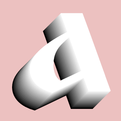
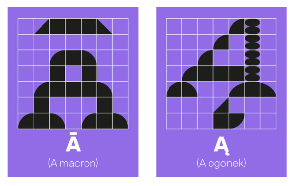
In the past when I’ve taught this class, I’ve started with something closer to a poster assignment; combining type and images and this time I am trying to take a step back and concentrate more on letters.The focus is this. Words are images. That is to say, typography is not just the substrate through which the meaning of words flows, they are forms. Form and content are linked. Letters can be pretty, ugly, thick, thin, shy, loud, big, small and both work with and against the content they communicate.
For this you’ll use no existing fonts at first, you’ll construct letters of your own design and then eventually compile them into different compositions and eventually add other type to them.
Objective(s)
- Gain a greater familiarity with the relationship between form and content through examining specific letters.
- Gain a greater experiential understanding of composition, hierarchy, and formal exploration.
- Gain increased experience with iterating on your ideas and working through them.
Final submission
- A folder containing all your sketches, ideas, abandoned directions, photographs, scans, and research (where applicable).
- You may want to separate your work by each milestone (letters
- A .PNG or .JPG of each letter of your chosen word, in their final form.
- 3 .PNG or .JPGs of your final compositions with your letters.
- 3 .PNG or .JPGs of an image that is (at least) 11 in. by 17 in. (at 150 to 300DPI) of your final poster (combining your letters with existing type).
Requirements
Note that failure to meet these requirements will result in a 0 for this assignment. I’m deadass here.- Until the final portion of the assignment, you cannot have any other existing typefaces or fonts in the assignment.
-
For the official final submissions, you cannot use any color, only black, white and shades of gray.
- For the offical final submission, there can be no additional imagery (drawings or photography)
- When you are allowed to use existing type you are not allowed to use any system default fonts (Windows or Mac) and you are not allowed to use Gil Sans.
No Shuriken Mode Challenges(Please note that, doing these do not guarantee a better grade or extra credit by any fixed or demonstrable amount, but if you’re doing or approaching these things, you’re probably doing well. The point is that, like not using shurikens in Shadow Dancer, it is more difficult, and increases your proximity to the material. All this being said don’t hurt yourself and consider your other assignments and mental and physical health. Additionally, if you are not feeling challenged by the class or an assignment, and these suggestions are not sufficient for you, please le me know.)
- Use a technology like Fontstruct to expand your forms into a complete usable upper and lower case font.
-
Take your 2D words and expand them into 3D in a program like Adobe Dimension
-
After your black & white/ “image-less” versions are done, create ones with your own illustrations or photography and see how they change the composition, weight and how the lettering can relate to the imagery and other type to create a harmonious whole.
Grading Rubric
- 25% ︎︎︎ Effort & Interrogation
︎︎︎
This is not simply time you apply to the project. How many versions did you sketch out? What related technologies or ideas did you research in your process? How detailed and clear are your sketches and process - 25% ︎︎︎ Craft & Execution︎︎︎ Are your scanned drawings of letters clean? Are the edges evenly spaced?
- 25% ︎︎︎ Strength of Compositions ︎︎︎ How do you lead the viewer around your final posters? Is the level of dynamism intentional and controlled? How consistent are your final pieces?
-
25%
︎︎︎
Thoughtfullness of Approach
︎︎︎
How much do your visuals relate to the concept or idea your word speaks to?
Inspirations
W Type Foundry X New Latin Wave Collaborative Font

Relevant Dates
09/14/2021 ︎︎︎Introduction!
For next week,- Select a word that is at least 4 letters and not more than 6. Ideally it is not a proper noun (but can be) and it is a “real”/pre-existing word. Your letters should include at least one capital. Try to select one with interesting and challenging letter combinations some examples are (EGYPT, LOVE, HATE, LILY, TORCH, BLOCKS). Please note, I may ask you to choose a new word if the letter combination is not “good” or everyone chooses “LOVE” somehow.
-
Using drawings, collage, or Adobe Illustrator use only simple shapes (ellipses, rectangles, polygons) construct at least 3 versions of your chosen word.
09/21/2021︎︎︎Review Lettering & Word Choices
For next week,-
Revise your letters, as per the feedback discussed in class.
-
Start arranging your letters into posters that are at least 11 in. by 17 in. Play with elements like, scale, position, composition, etc.
-
For next week, have at least 3 different posters for your chosen word.
09/28/2021 ︎︎︎ Review posters of Lettering
For next week,- Revise your letters, and compositions per feedback from class.
-
Add text to your posters as if your word is the title of a theatrical performance. This is the additional text you must add:
- October 15th - 18th, 2021
- 8:00PM
-
The Public Theater
-
Directed by Lucio Fulci
-
Written by Biagio Proietti
- Visit https://publictheater.org/ for tickets and information
- You can use any font except system default fonts in Windows and Mac, and you cannot use Gill Sans.
- Consider hierarchy as per our class discussion.
10/05/2021 ︎︎︎Review posters with Type
For next week,- Complete work on this project and upload it to the spreadsheet by 10/11/2021. If you are in Group #1 (you’ll receive an email before next class), you will get time to work on your project based on feedback and if you’re in Group #2 you will have time to refine before the discussion. But you must have your work uploaded regardless.
-
Refine your work to one final poster that you share for class. If you work on different posters in the interest of finalizing your project save any of that work to your project folder.
-
Keep everything we have talked about in mind: Hierarchy, Composition, and think about type pairing.