02. Uncial Majuscule
Introduction
Today we will work on uncial forms. These are drawn with a much shallower pen angle (20 degrees). My thinking was that this will be helpful for the lefties in the class.
Background (Historical)
The proportions of Roman Capitals that we drew previously were based on the Trajan Inscription. This was made with carved stone. The forms we will be seeing today were developed to increase the clarity and speed of writing in roughly the 2nd to 4th centuries as writing on parchment became more en vogue, and the tools came closer to how we are writing today (a quill pen).
A notable example is the Book of Kells (around 800 CE).
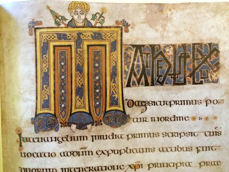
(from Thought.co)Book of Kells, 8th C Irish manuscript. Patrick Lordan/Flickr/CC BY 2.0
Note that this is considered a "majuscule" which is roughly comparable to uppercase lettering. That is to say, majuscules are typically the same height without much variation via ascenders or descenders. This distinction is "uppercase" originates from lead type, when there actually was an upper case containing different letterforms. In other words all words were written with these forms. Capital letters being part of one font was not standardized until printing required some kind of standardization, and later miniscule forms had increasingly varied forms (larger ascenders and descenders) that made them more distinct.
Part of why this distinction is important is that the forms we will draw are closer to what might be described from a contemporary perspective as "small caps" or "unicase."
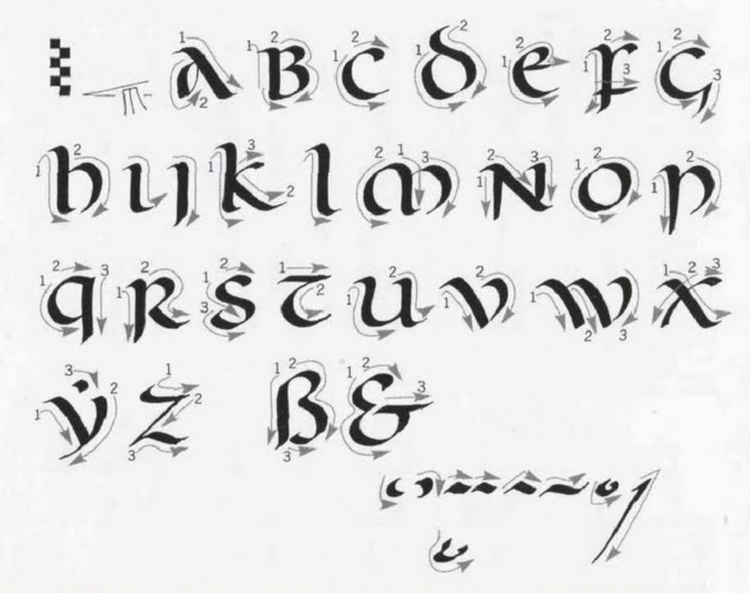
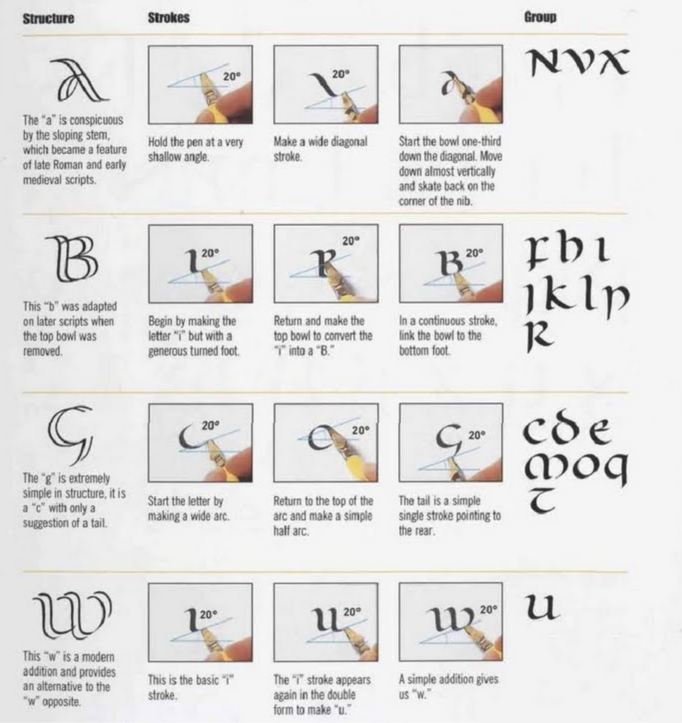
Guide
- Hold your pen at 20 degrees (closer to flat)
- Our forms will be six nib-widths high
- The below guide is from The Calligrapher's Bible pg.56
You might find these videos helpful. The forms and proportions are slightly different, but it should be helpful to see her drawing the letters in real time:
For Homework
Digitize (in this instance I mean scan) and print one phrase (could be lyrics, a pangram, etc.) as a poster that is at least 11in. by 17in. A pangram would be most educational, though I understand if it is helpful to write lyrics or a quote you find resonant. Focus on finding the best letters and identifying how they might pair with other (existing) typography.