04. Type walk for [ˈɜːrkəl]
Introduction
This next project is called [ˈɜːrkəl] (pronounced like Steve Urkel's last name). It is based on how my son initially pronounced “circle”. Without the facility to pronounce the “s” sound, he used the sounds he was able to reproduce. In effect, he:
- Took something from the external world
- Understood what it was (to whatever degree he could).
- Used his then-current linguistic skillset to reproduce the sound that distinguished that thing as unique.
For this project, you will do something similar, except with found lettering/typography. In order to start this project, you will do a “type walk” and find potential candidates for the source of your project.
What You Will Do
- Identify a place
- Take photos of signage and/or lettering
- Identify striking elements of the lettering/typography
- Redraw a letterform present in the signage.
- Draw a new letterform not present in the signage.
- Use these drawings as reference for the same letters digitaly.
- Repeat this process (at least) 3 times.
- Print the results.
What You Will Do (in more detail)
First, identify a place. → For example, the loop goes to Port Chester, which anecdotally from my experience, seems like a better source for found lettering or typography. You might also find a stop on the Metro North you have not been to before (Hartsdale, Scarsdale, etc.), or a nearby town like Rye, or New Rochelle. Going as a team or small group is fine.
Although, I would strongly advocate for "touching grass", so to speak, in this context, completing this via Google Street View is also totally fine. If you do so, take advantage of unique features like, being able to look at old captures. You might also consider looking up locations for historical photos of the same facade. You might also use Google Street View in order visit a location that you cannot access physically (i.e. Indonesia).
I would also be prepared the eventualities that you will either be unsuccessful in your attempt, and need to try again somewhere else or different streets in the same area. Additionally, if this approaches "fun" for you, you may find yourself more sensitive to interesting lettering/typography in other contexts.
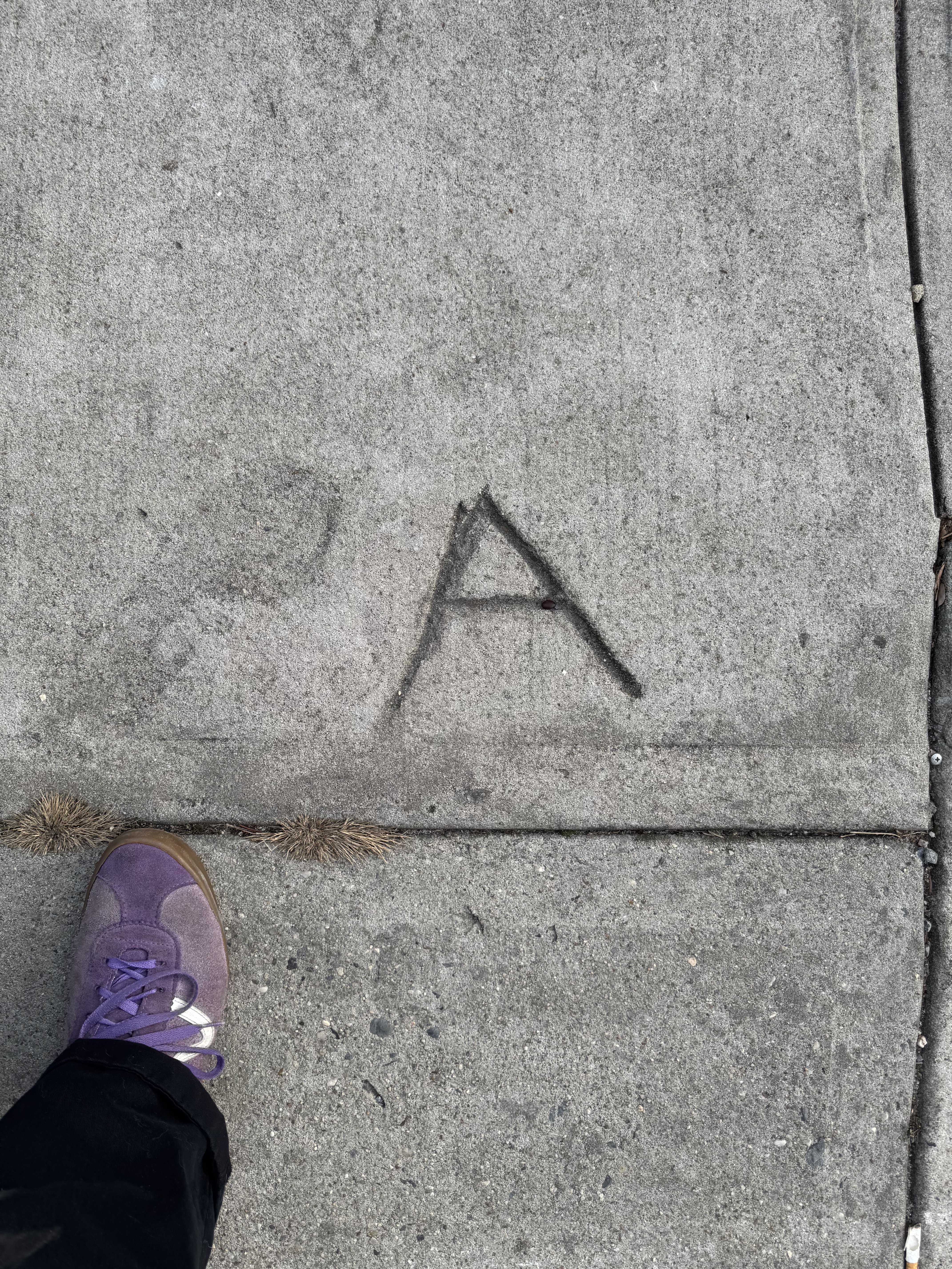
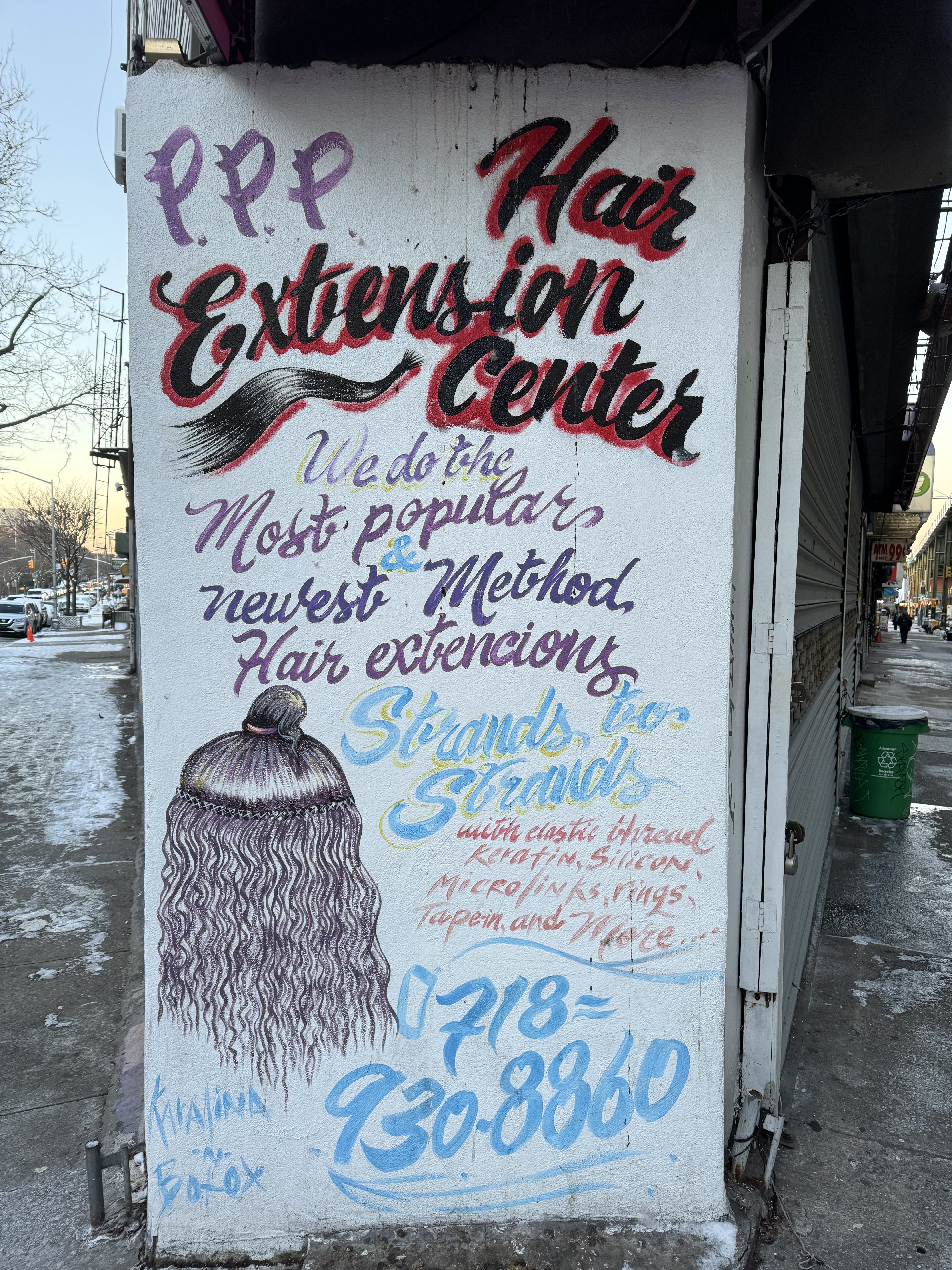
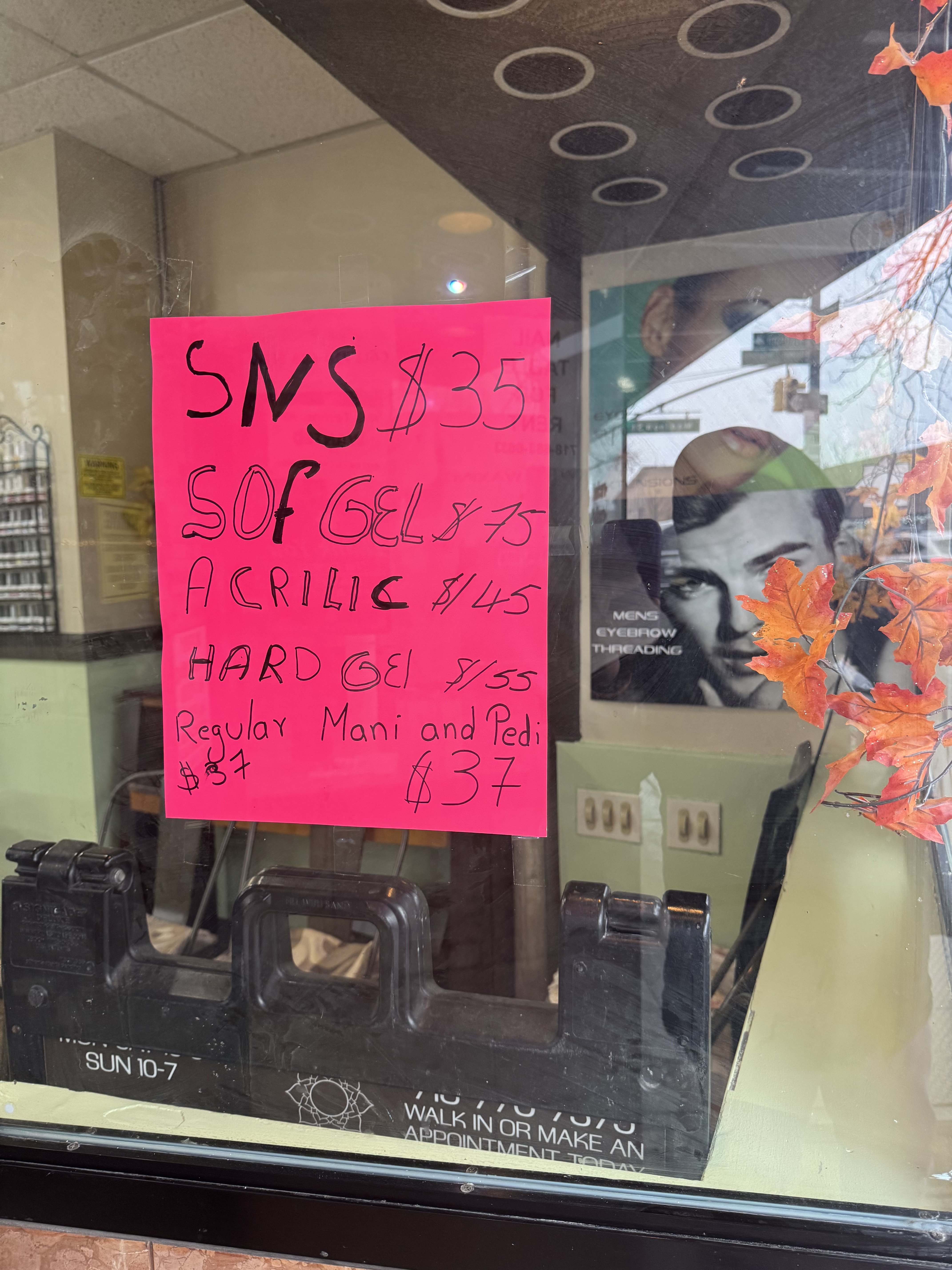
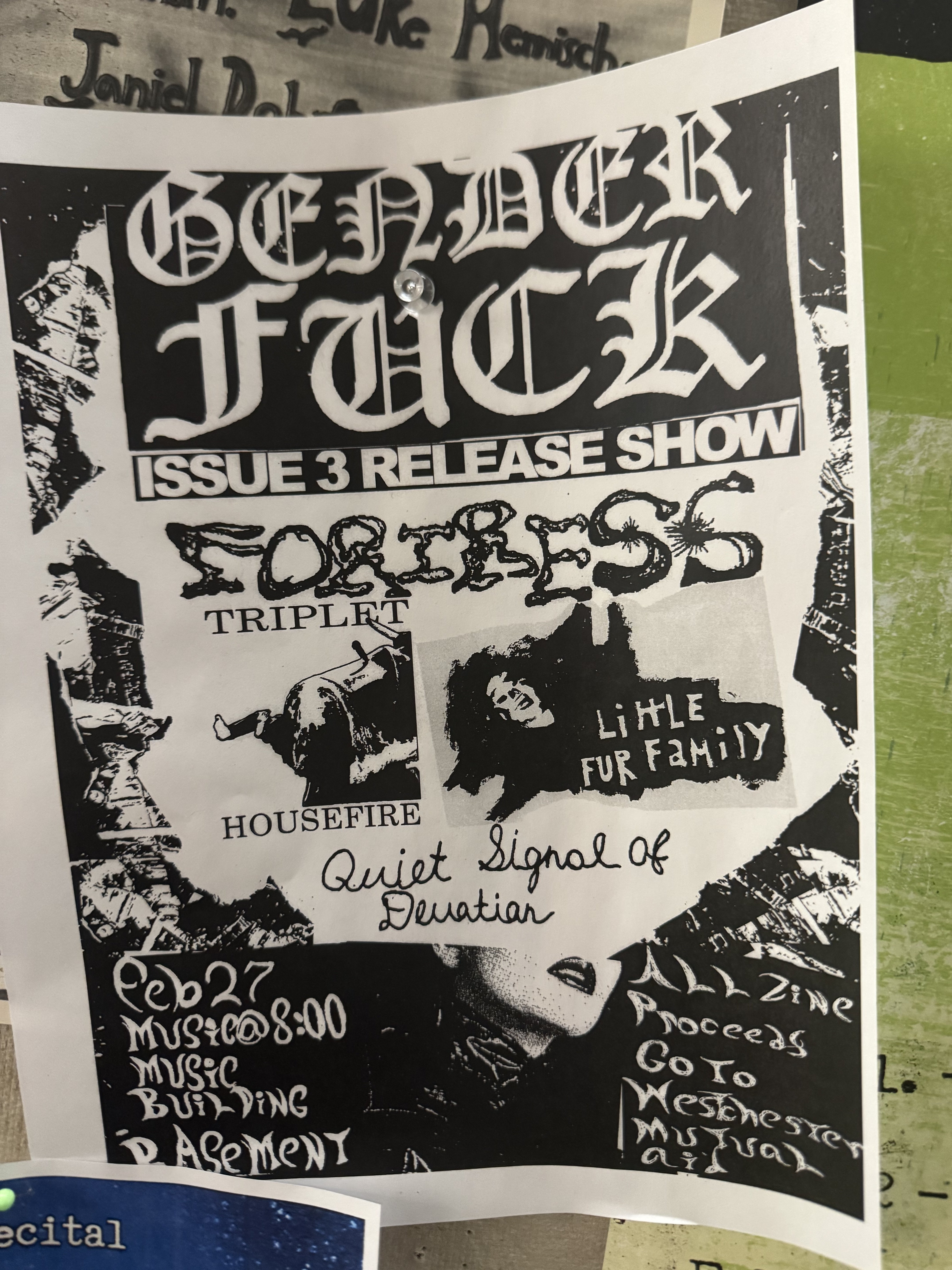
Second, take photos of signage and lettering. → While on your walk, take (at least) 20 photos of found typography or lettering. Try to take the image from as close to front on as you can. Seek out type that is not simply,
Third, identify what is striking about the lettering or typography → When you are back from your walk, take each of the images, and make a separate copy of each of the images on which you annotate the aspects of the letterforms that are striking, interesting, or otherwise intriguing. You can do this via PhotoShop, ProCreate, printing and then drawing in Sharpie on top. Make sure your writing is clear to another human, who is external to you.
Redraw a letterform present in the signage → From your source image, take one of the letter forms and re-draw it, at least 8 inches tall (i.e. on an 8.5in. x 11in. sheet of paper)
Redraw a letterform not present in the signage → Take a letterform that is not present in your source image, and draw it at the same scale. Keep in mind what forms are present in your original source image, and how other letters might look with those parts. You might want to consider how other forms, or shapes, that are not present in your source image might play out and still be consistent with the source image's visual quality.
Redraw a letterform not present in the signage → Keep the same scale and attempt to, as closely as possible match elements like curves, vertical strokes, serifs, etc. You may want to use tracing paper and a light table to do this. Printmaking has one.
Use these drawings as a reference for drawing digitally → Use these images to create those letters digitally. Keep the same scale and adjust the baseline, x-height, ascender, and descender if necessary.
Deliverables (for 03/17/2026)
- (at least) 20 photos from a "type walk"
- Copies of those photos annotated indicating what is striking or interesting about the signage/type/lettering visible in them.
- 3 * (scanned) re-drawing of letterform from your final source.
- 3 * (scanned) drawing of letterform not present in your final source.
- a .ttf or .otf file with (at least) the six letterforms above.
- a 11in. x 17in. print out showing each of the letters.
What to Print and Pin Up Next Week
- 3 photos from your "type walk"
- The photo of your final candidate source, annotated.
- The 6 (six) drawings of letters, either scanned or the original image.
- The 11in. x 17in. image of all your current letters.
What Things "Count" for this Project?
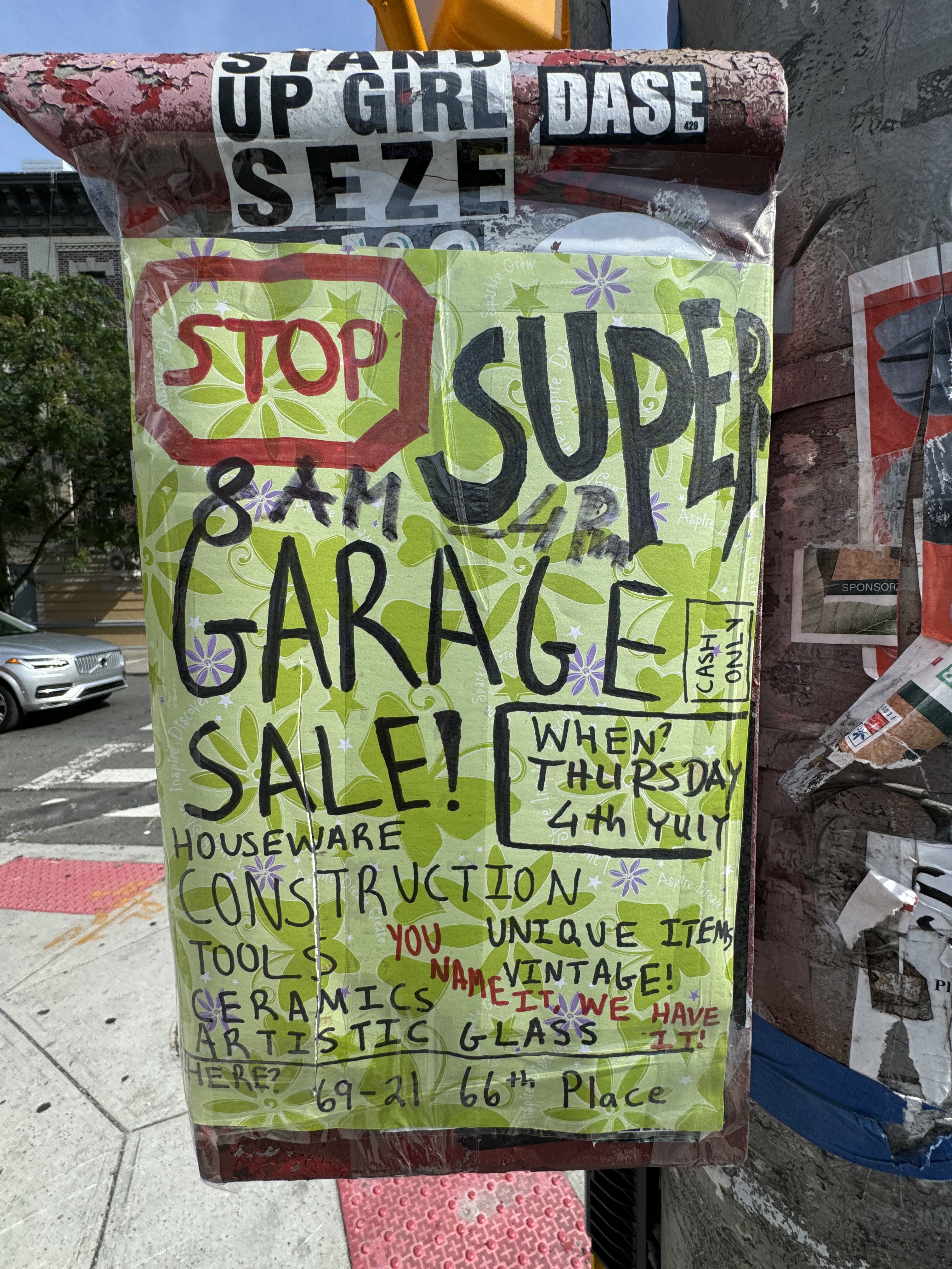
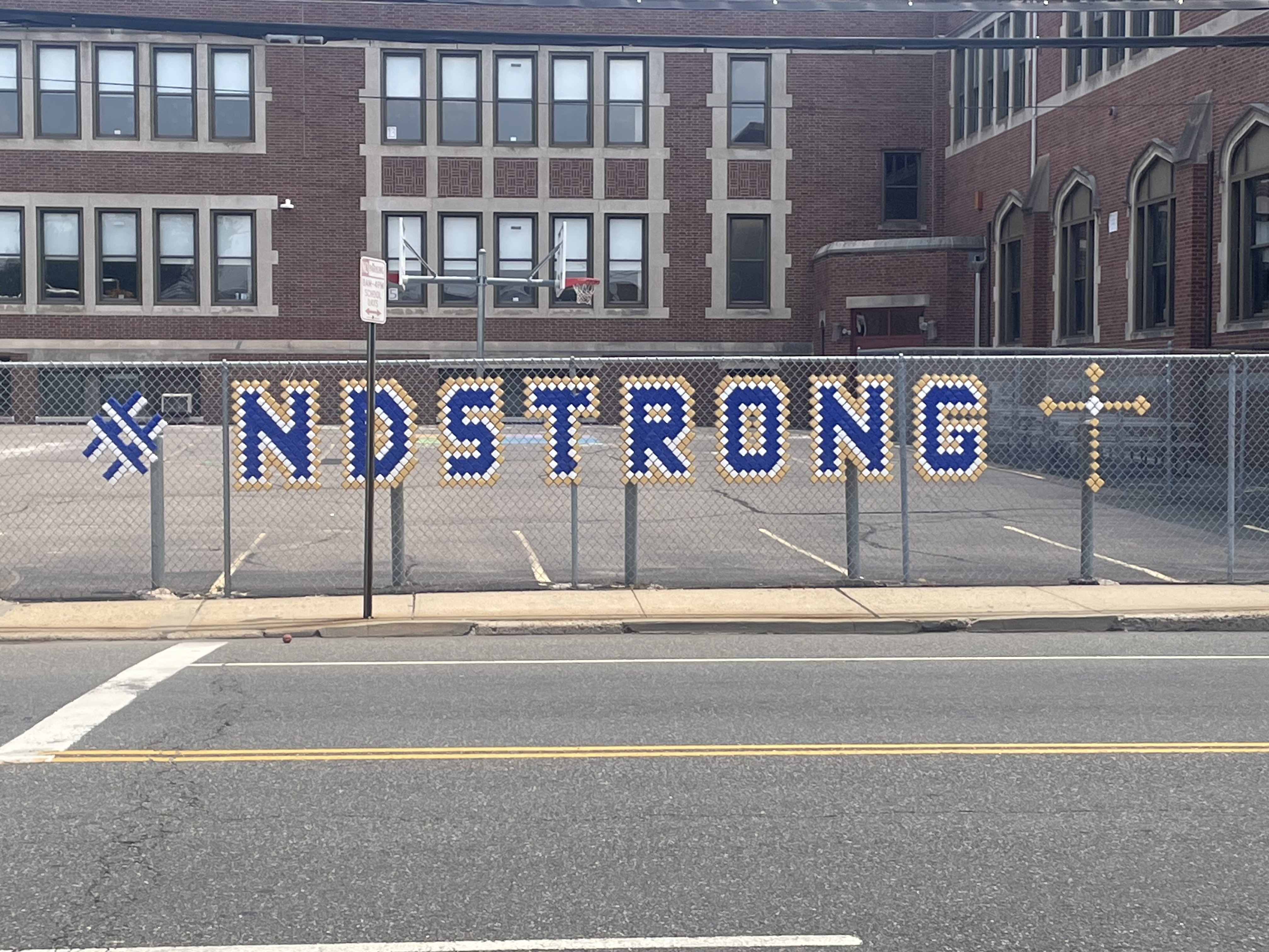
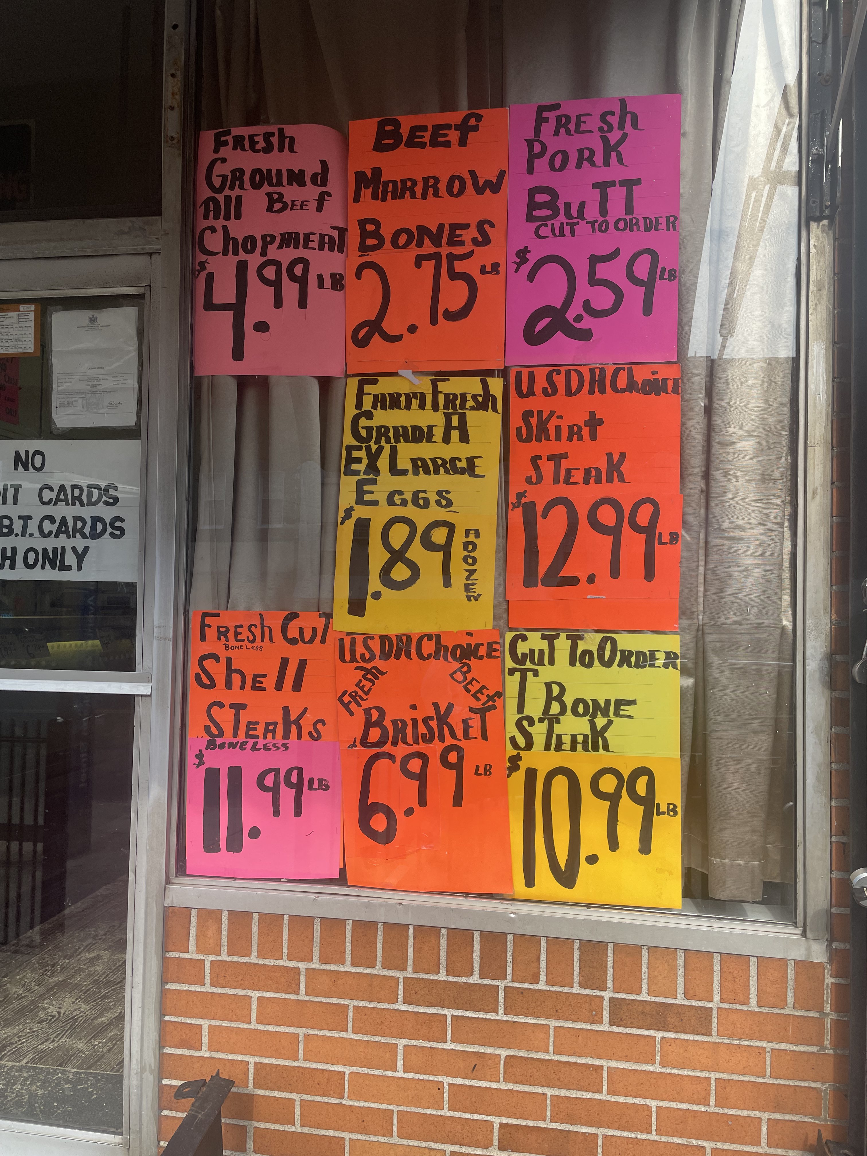
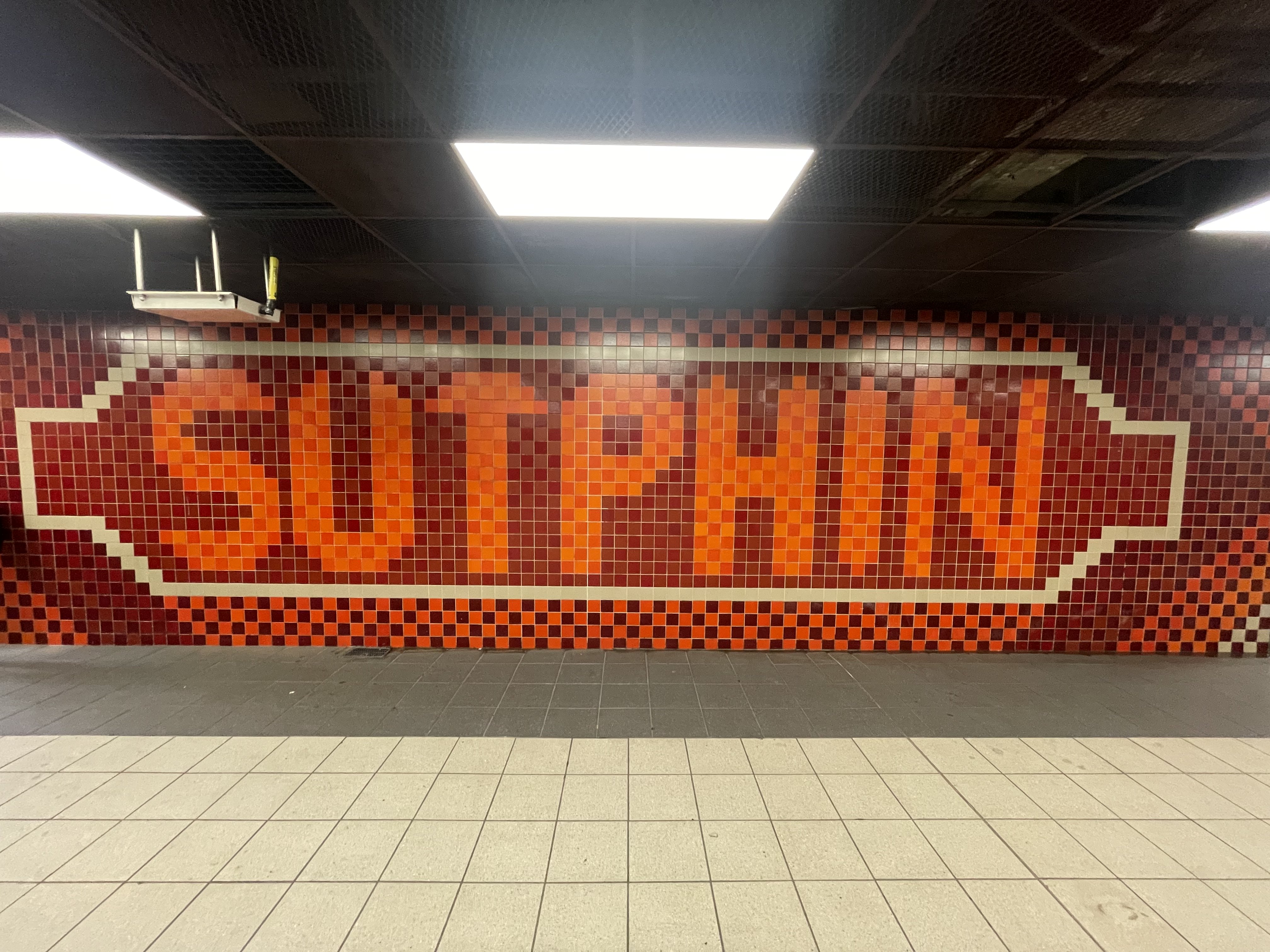
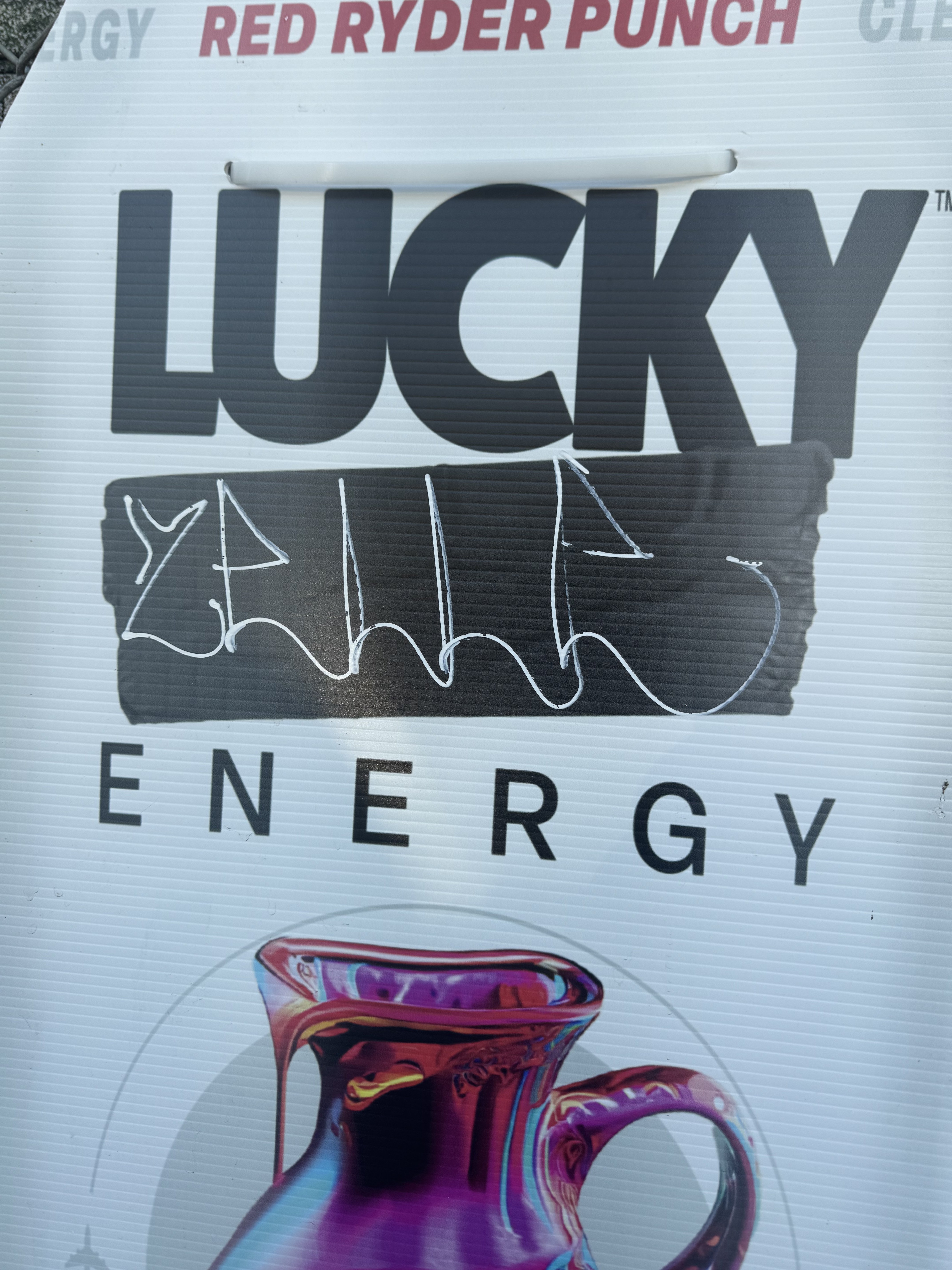
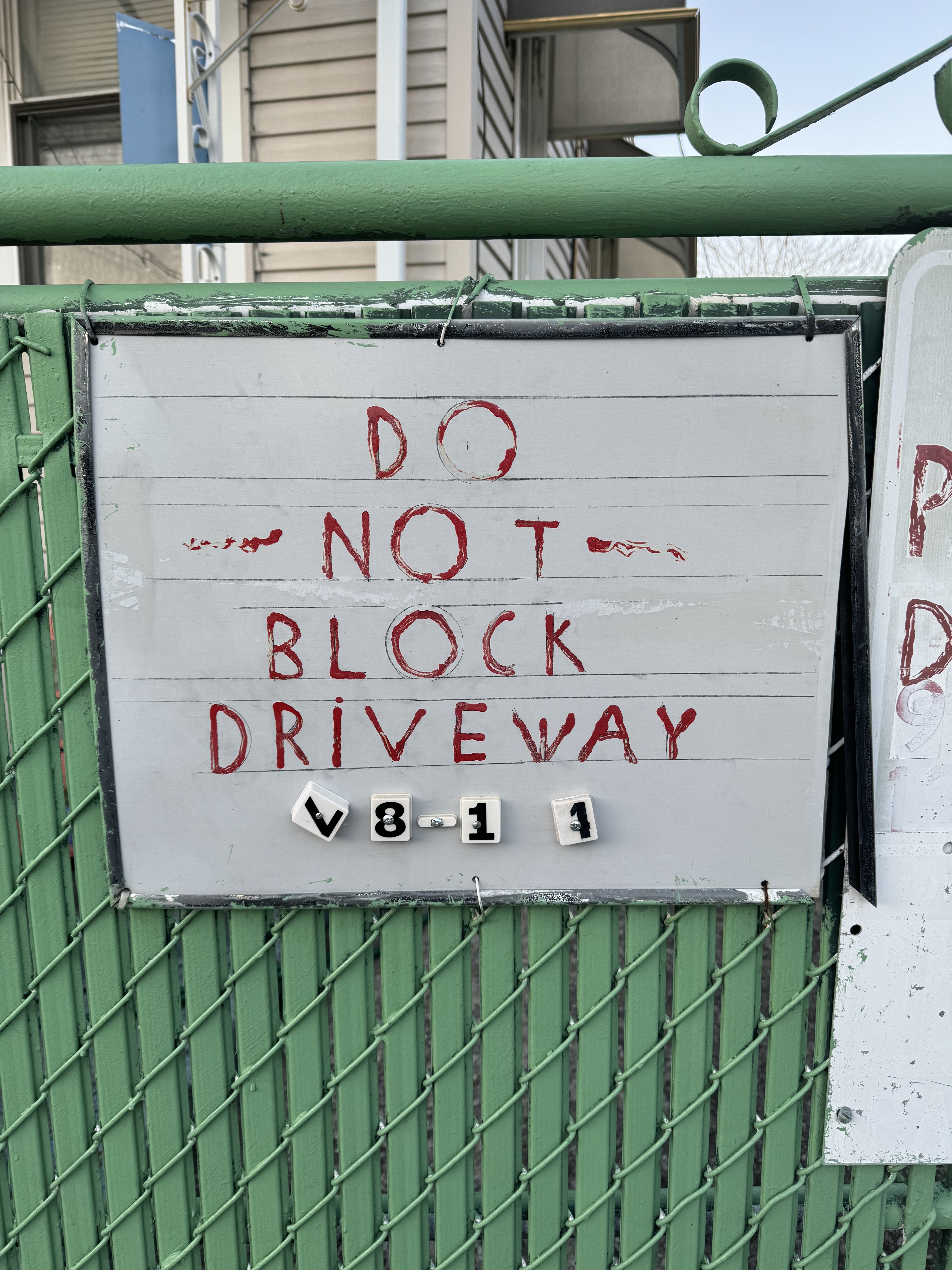
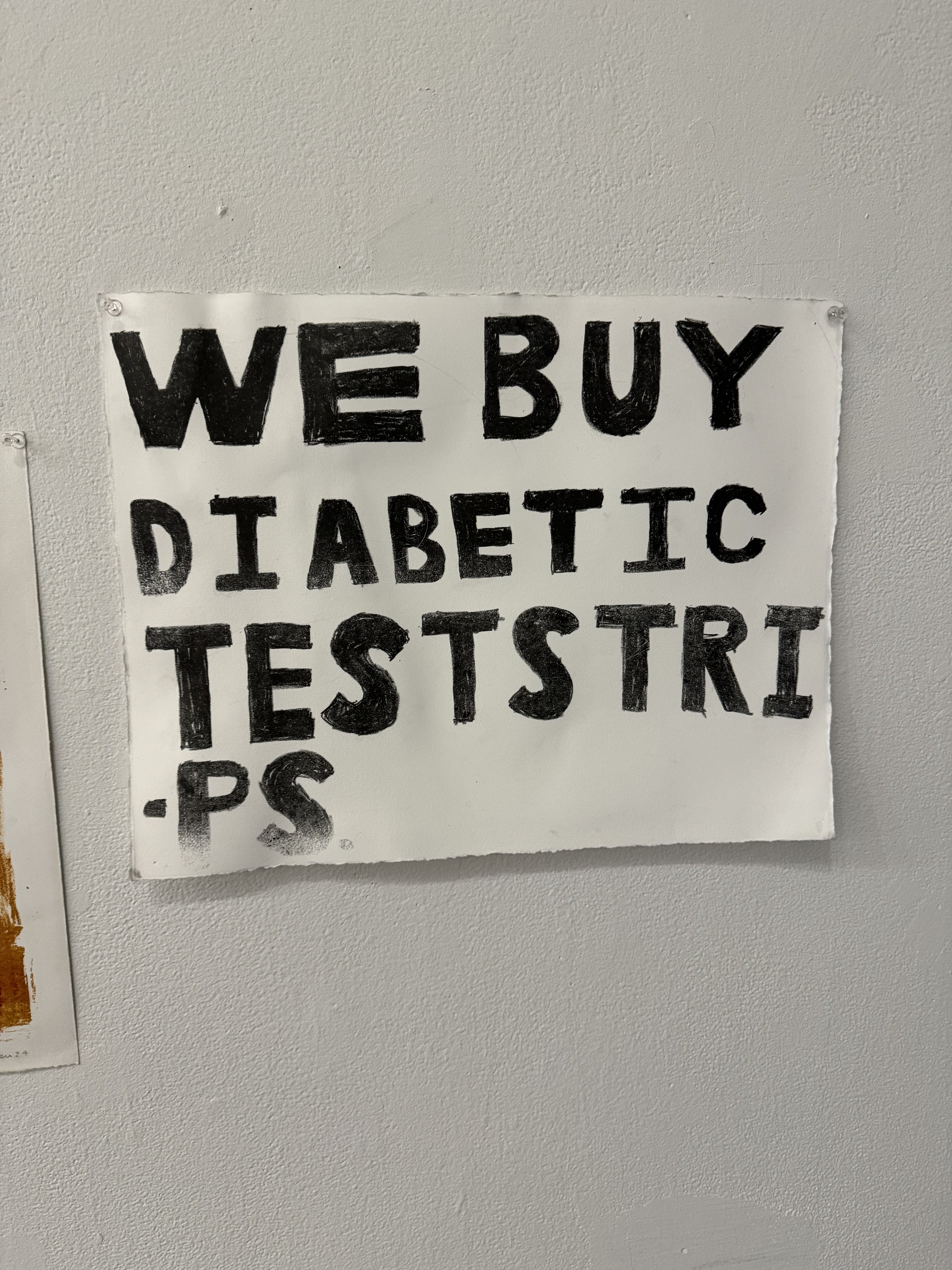
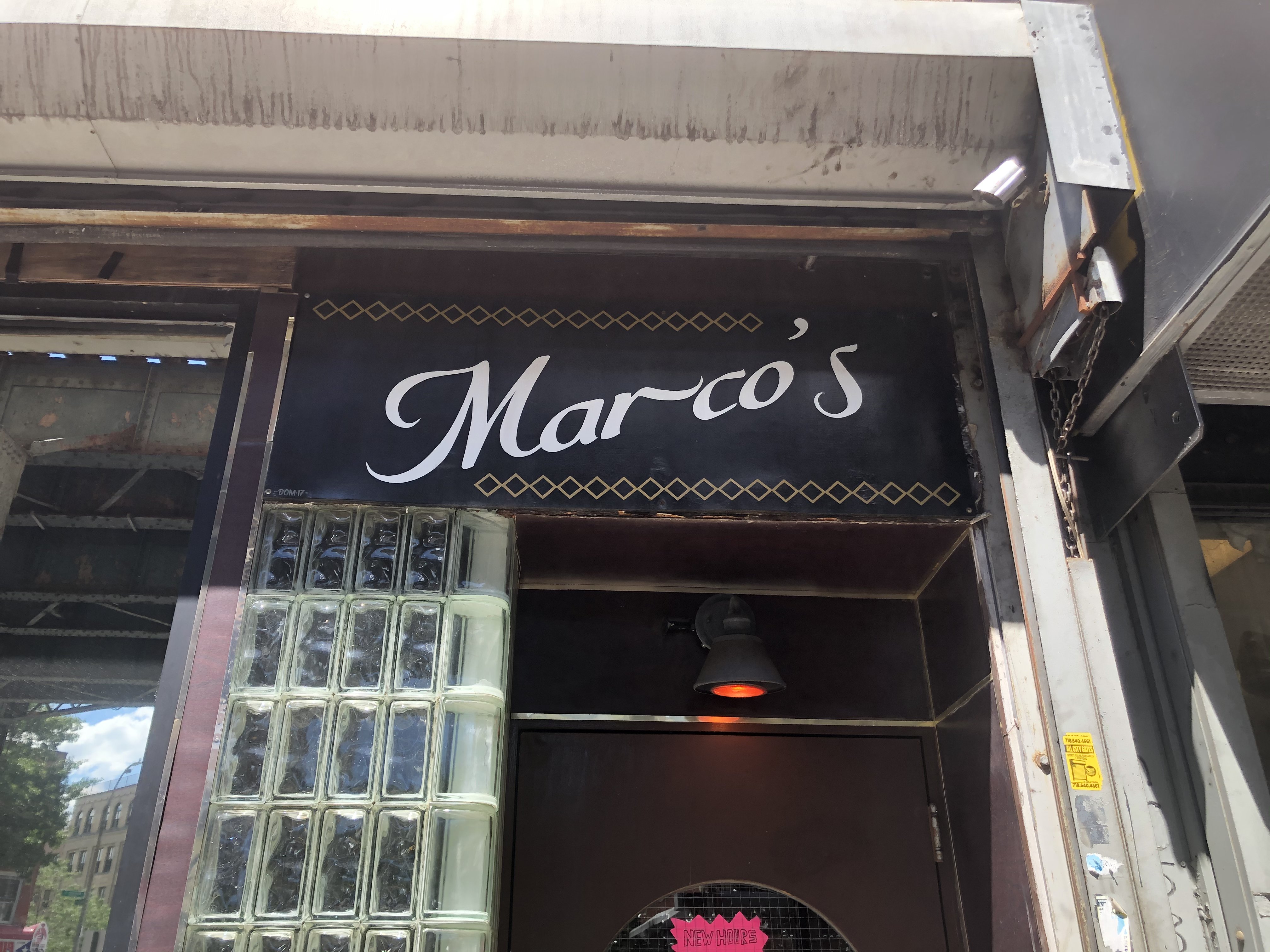
You should seek out examples that are not simply a poster with Helvetica on it. This is not a judgment of Helvetica in and of itself, but by this I mean, you should seek out examples that are not finished, existing fonts. That being said you may find some interesting examples that do involve pre-existing type in some way. Here are some examples for clarity.
- Handdrawn "bubble" letters in a poster.
- Lettering created with a stencilm which may itself be based on a source like Arial.
- Copperplate Gothic printed in vinyl, but the vinyl is old and peeling off.
- Cooper Black, but with the physical limitations of vacuform lettering.
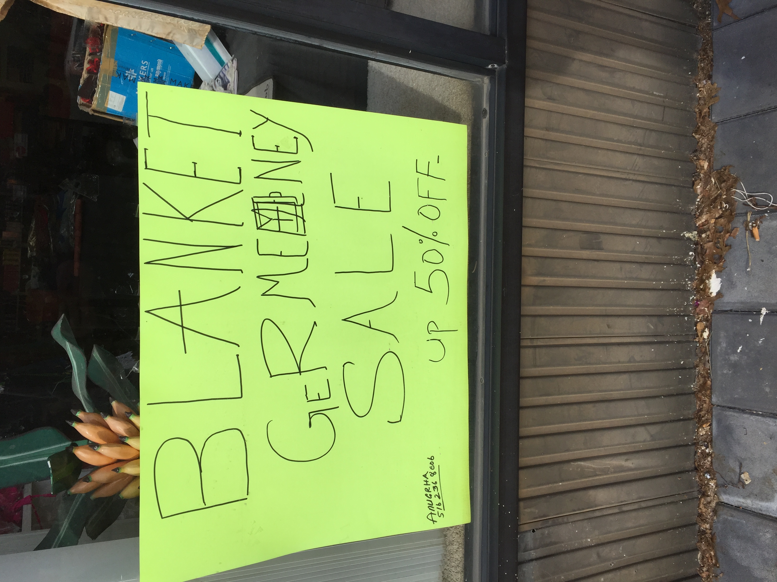
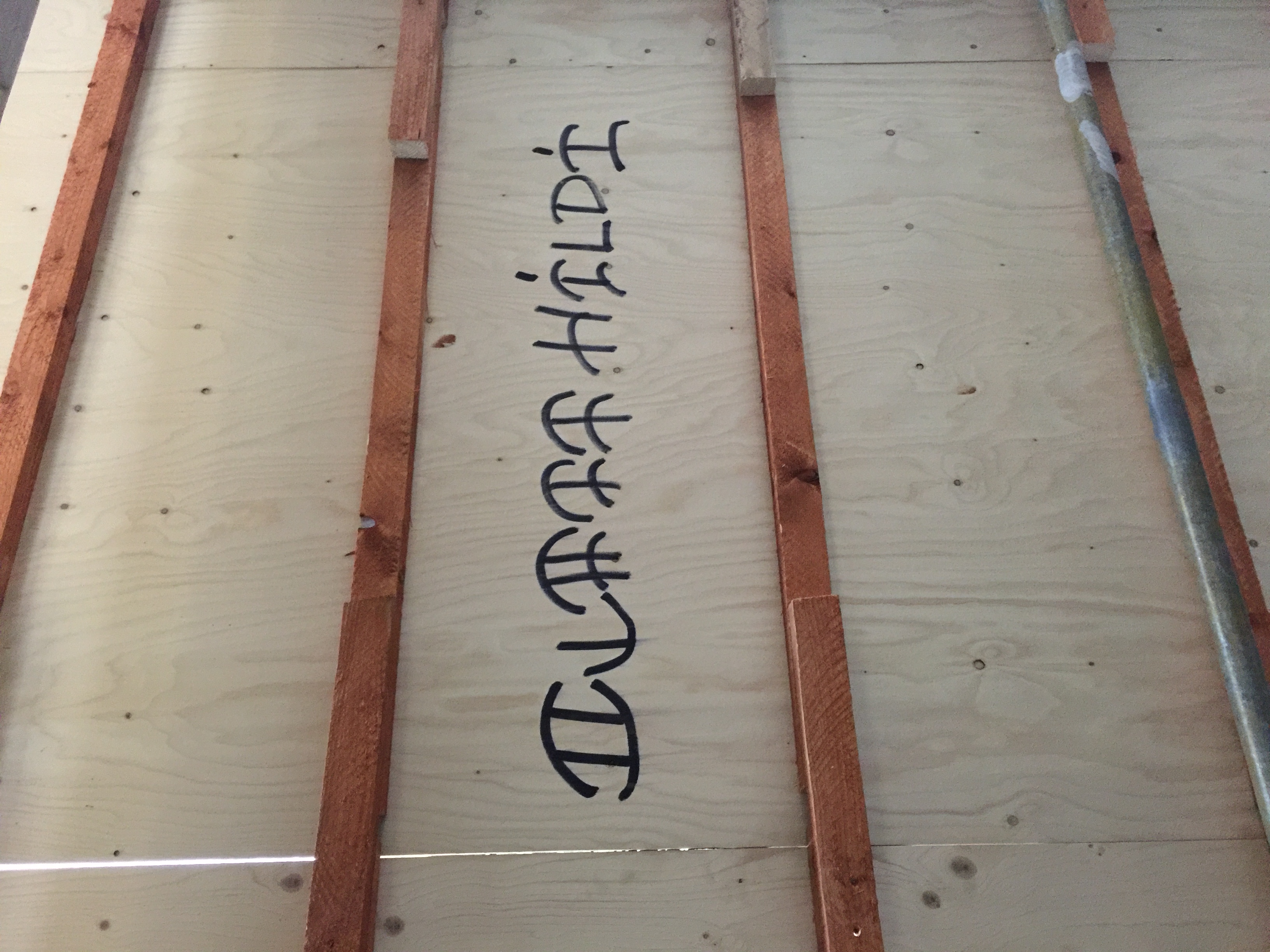
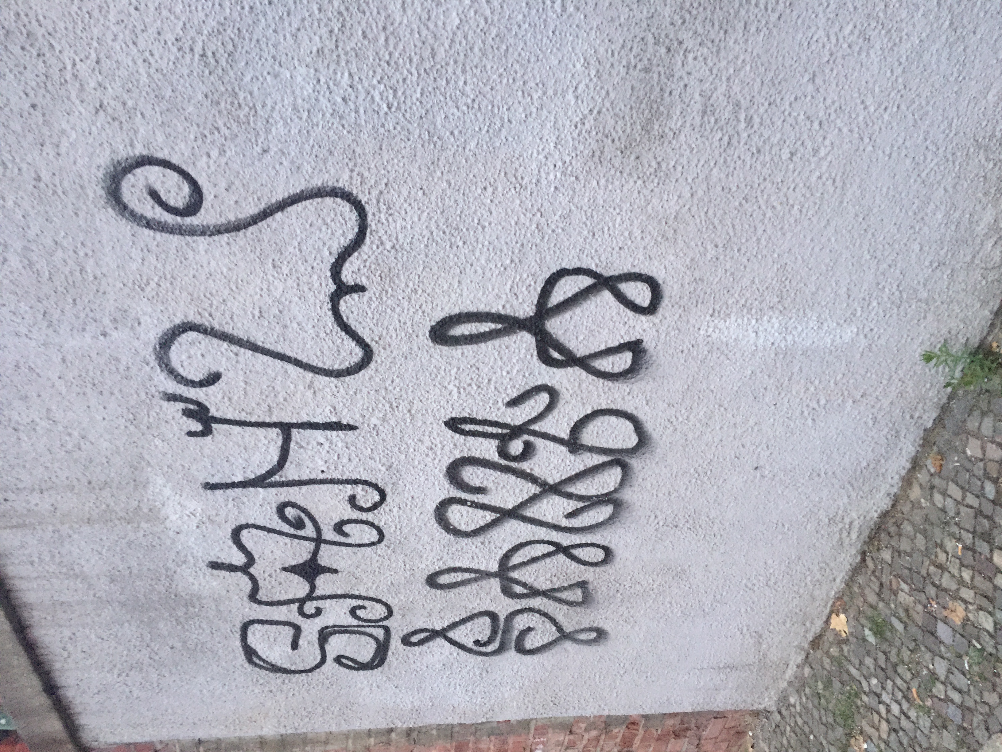
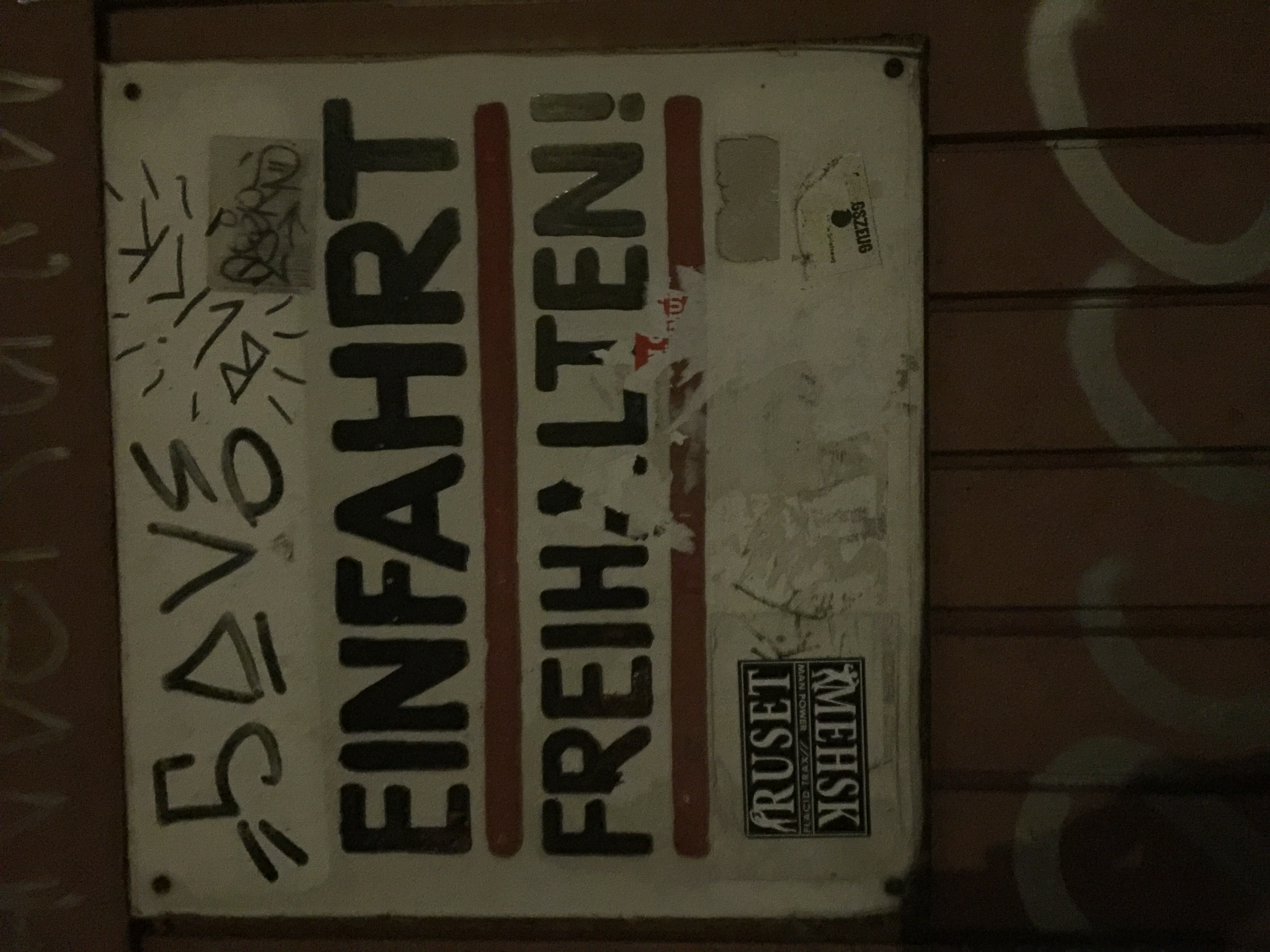
Examples of Found Typography/Lettering (Personal)


Resources
pictures of Old NYC, mostly buildings, but you may find some old lettering/type vernacular typography, IG
How to Access old Street View camptures in Google Maps (from Unpacked Technologies on YouTube)