03. Ligatures and Contextual Alternates
Introduction
For creating your work in class, you'll probably need to make characters interact with each other in different ways when placed in proximity to each other. There are several ways to do this, but they include what are called ligatures and contextual alternates.
What is a ligature?
A ligature is a way of turning several glyphs into one. That's all it is.
Why is a ligature?
The reasons you would do this are myriad. The most common is for readability. That is to say, when certain characters are next to each other it might make sense for some them to be converted to For creating your work in class, you'll probably need to make characters interact with each other in different ways when placed in proximity to each other. There are several ways to do this, however, what we'll focus on today is ligatures and contextual alternates.
What is a ligature?
A ligature is simply a way to take multiple glyphs or characters, and convert them into one new glyph. That's all.
Why is a ligature?
The most common reason we would do this, is in order to make certain groups of characters more readable when next to each other and increase the evenness of the texture of a given passage of text. The term for this is a standard ligature one you'd want to include, as a designer as part of the base function of your font or typeface. Common examples for English are:
- fi → (ascender of the lowercase f intersecting with the dot of the i)
- ff → (the crossbar of the f and ascender creating an undesirable gap)
- fl → (ascer)
Some ligatures have actually become their own characters
- & → the ampersand used to be a ligature for e and t, and in some typefaces, looks more clearly like those characters.
- ß → the eszett or German "sharp s" originated from combining characters that looked like f and z forming the basis for the shape. In translation, or when the glyph is not available, it is often written as ss.
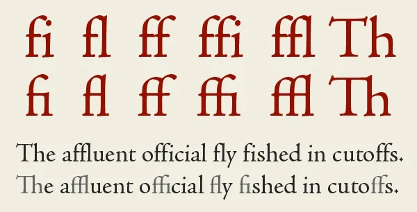
 (examples of standard ligatures, from Creative Pro)
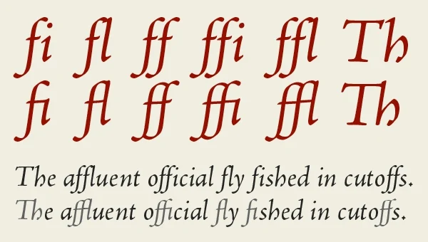
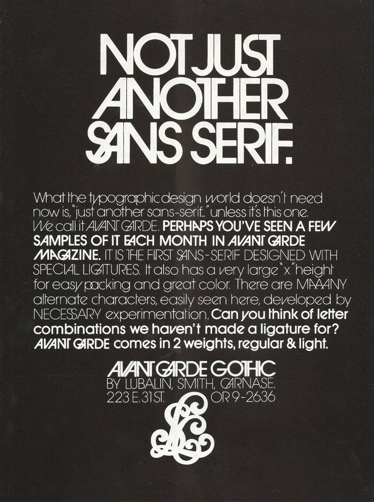
The other is a discretionary ligature, this is one that can be used, at the discretion of the designer, and is, more than likely as a stylistic option. A good example of this is something like Avant Garde Gothic. Which has a ton of ligatures, however they are atypical in terms of readability, but are designed for interesting combinations.
How is a ligature?
In Glyphs
In Glyphs you create a ligature by creating a new glyph, and then naming the characters you'd like to combine, with underscores inbetween. For example, a ligature for lowercase f and i would be "f_i". In Glyphs, you can see this combination when typing with the text tool. And it should appear when using the font in Illustrator, InDesign, etc.
In Fontra
In Fontra, things are ever-so-slightly more complicated; as with most things (remember it is free though :)).
- Create the new glyph called, in this case, f_i
- Go to Font → Font Info → Features
- You should see, on the right side of the page, an area to enter text.
feature liga
{
    sub f i by f_i;
} liga;
(What this means)
Here we want a ligature so we type liga and then we want to substitute f and i with f_i so we type that as sub f i by f_i. If you wanted to instead create a discretionary ligature you'd type dlig instead of liga.
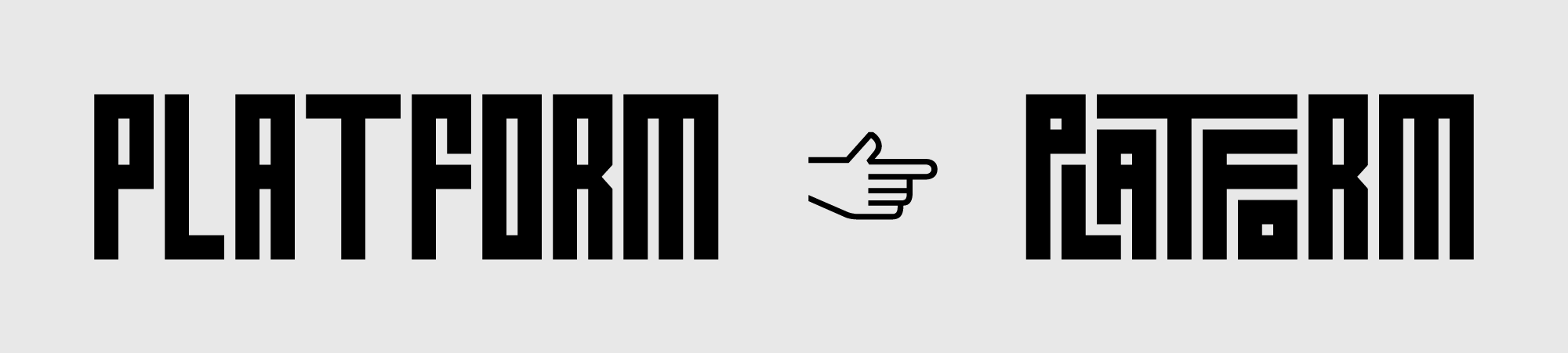
What are Contextual Alternates?
Contextual alternates are a way of substituting characters in more specific ways (i.e. based on the surrounding context), that might require a glyph to change in some way that cannot be solved by kerning or setting the sidebearings.
Why is a Contextual Alternate?
A practical example of when you'd want to use a contextual alternate, is to change only one glyph when you have a specific set of characters in a sequence. For example, if you have a script with an o and an r next to eachother, you might want the r to connect to the curve that ends the o, and not start from the baseline. You'd do that with a contextual alternate, that only changes the o.
An example that is closer to aesthetic, or stylistic, is to use it to create a more dynamic handwritten font, you are able to cycle through different sets of characters to create a less static looking distressed or handwritten font.
How is a Contextual Alternate?
(both examples here assume that, given the sequence "o r," you want to substitute the glyph r, with one called "r.alt")
In Glyphs
- Go to Font Info (small i in the top of the window)
- Go to Features, and press "+" and then look for "calt Contextual Altnernates"
- In the window, you'd type:
sub o r' by r.alt
In Fontra
- Go to Font → Font Info → Features
- In the window type the following
feature calt
{
    sub o r' by r.alt
}calt;
In both cases, the main code sub o r' by r.alt means, if type o r, replace the r (this is what the mark next to r does) with r.alt.
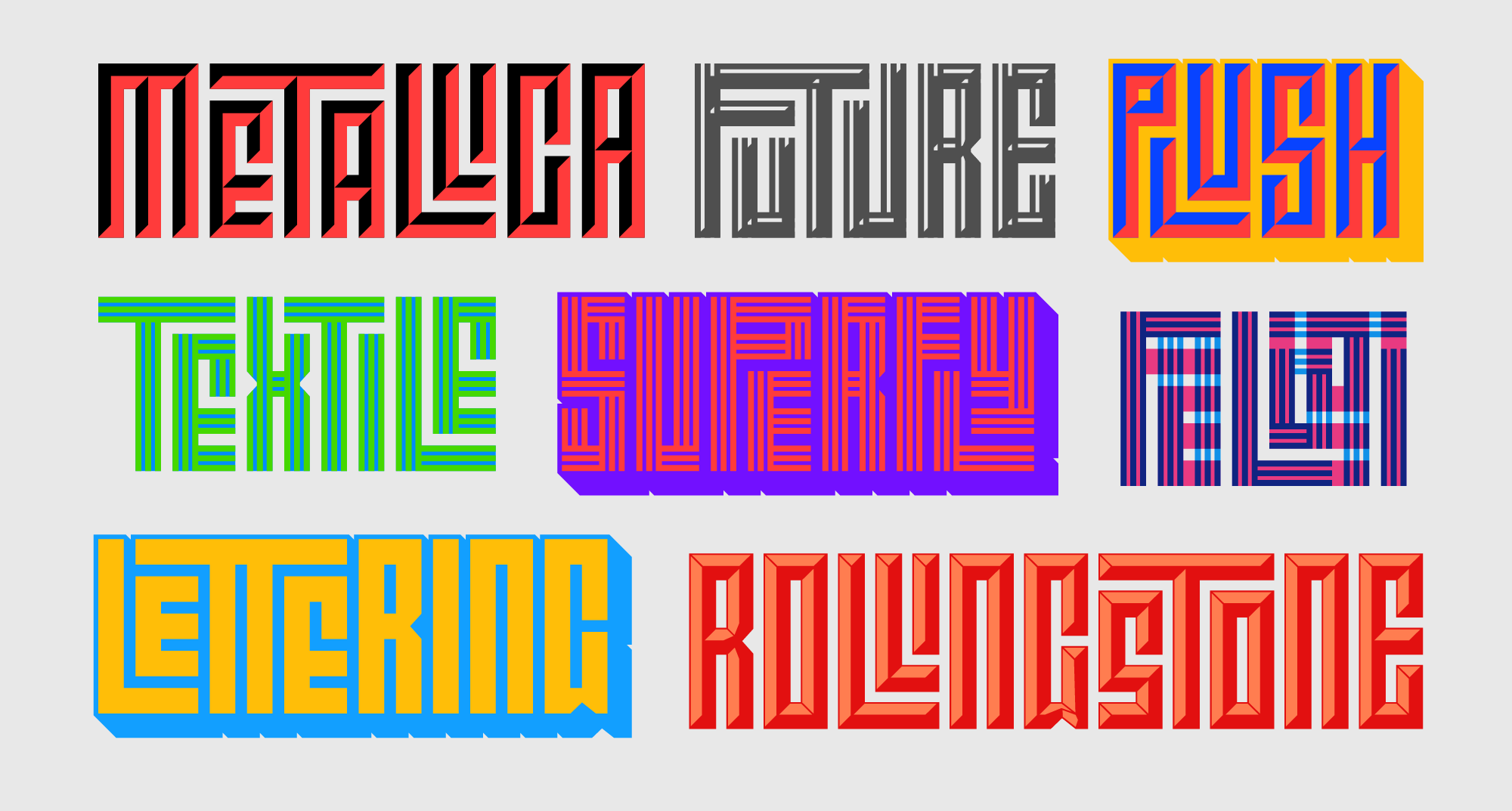
Other Examples of Ligatures / Contextual Alternates
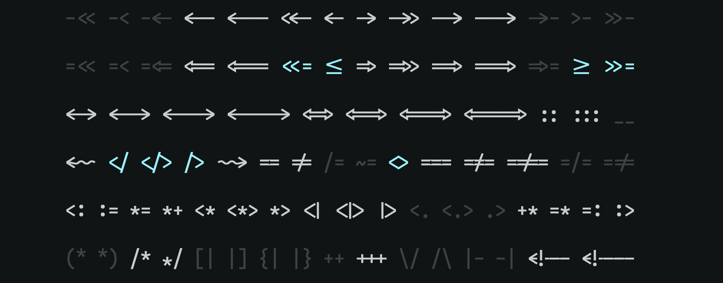
Iosevka by Renzhi Li↗
Iosevka is a typeface designed with programming in mind, and has several ligatures designed to make code more readable that would be extremely uncommon in written English (like => becoming one new glyph)
Calcula by Shiva Nallaperumal
Typotheque Article about Calcula, and the process of creating its ligatures↗

 I've mentioned this, I believe before, talking about how it has a specific grid was used to produce a complex set of ligatures.
Checker by Shinntype
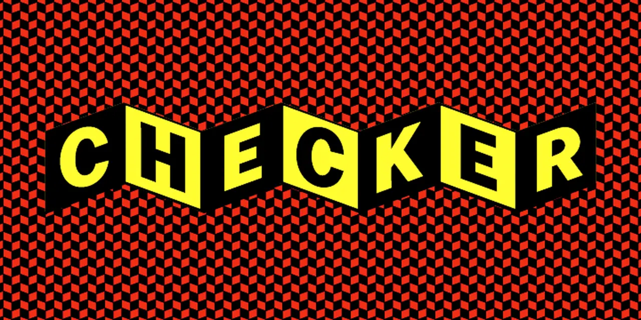 Checker is an example of using Contextual Alternates to create a very specific checkered patterned (modeled after the Cinerama logo)
Liza Pro by Underware
Link to Underware website page breaking down the design process↗

Is a script font with many features to make it look organic like simulating being "out of ink" in character sequences, maximizing the crossbar of the lowercase t across multiple characters, varying the version of the same character in a given word, and maximizing the swoop of descenders for decoration.
Corsair by Rosetta Type


Corsair is a handwritten type face with glyph cycling to make it look more organic as well as wordmarks (and, no.) that ties to a tradition of sign painting.
LiebeHiede by Ulrike Rausch
Ulrike Rausch's page on LiebeHiede↗
LiebeHiede is a handwriting font that uses both color technology and contextual alternates to achieve a more realistic handwriting effect. In this video around 13:27 you can see her typing in with the font.
Resources
- TypeNetwork page on Contextual Alternates↗
- Glyphs website page on ligatures↗
- Glyphs website page on more standard Contextual Alternates↗
- Glyphs website page on advanced Contextual Alternates↗ (This one has a good demonstration of how you can cycle through character sets in order to simulate "organic-ness" or less deterministicness)
- I love typography page on interesting uses of contextual alternates↗
- Creativepro page on Standard vs Discretionary Ligatures↗