Spring 2021
︎
SUNY Purchase ︎ (DES3440)Typographic Investigations
spiel:
spiel:
Vernacular inspiration
Background
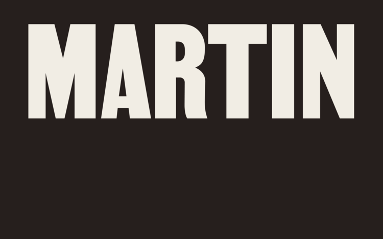
As you are thinking about what you want to do for your final project, you may be wondering ways to find inspiration. We’ve talked about fonts that have a direct concept behind their formal components and we’ve talked about the role of contrast and stress in influencing the style of a font. Today we’ll talk about a common method for type design and that is creating a font from a direct sample found, in the “wild.”Martin by Vocal Type Co.︎
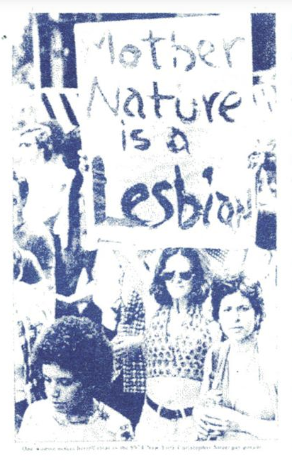
Vocal Type makes typefaces based on protest signage. A really cool element of their work is that they go through the story and history of the events that inspired the typeface rather go right to the capitalistic component.
Template Gothic by Barry Deck (Emigre)︎


Template Gothic used to be ubiquitous in the 90’s. It was literally designed in 1990. It just just has that energy and the vernacular inspiration of the work was more novel at the time. It was based on a sign at Barry Deck’s laundromat, though Ed Fella has refuted that is the only inspiration. I believe he’s argued that the generic “template” lettering Ed Fella used in his drawings was also an inspiration.
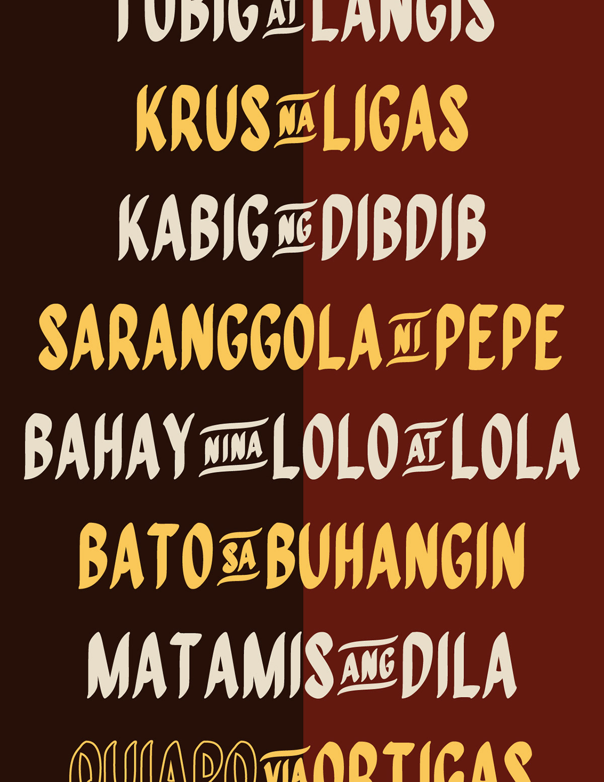
Quiapo by Aaron Amar︎


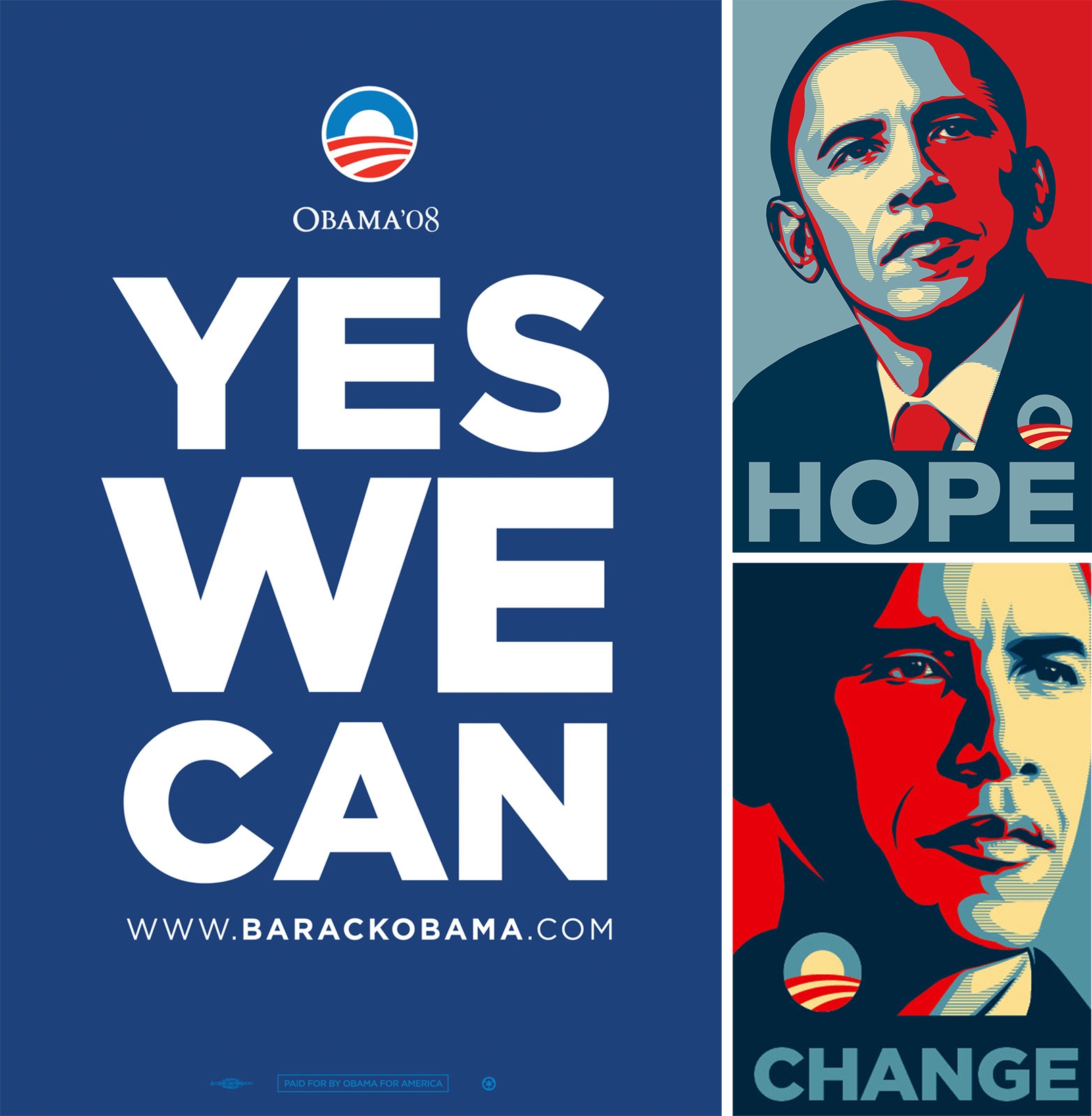
Gotham by H&FJ︎
You’ve seen Gotham in Obama’s campaign, packaging, signage. It’s everywhere. It’s one of James Edmondson’s “greatest hits” of geometric sans serifs

John Roshel LinkedIn Learning video︎
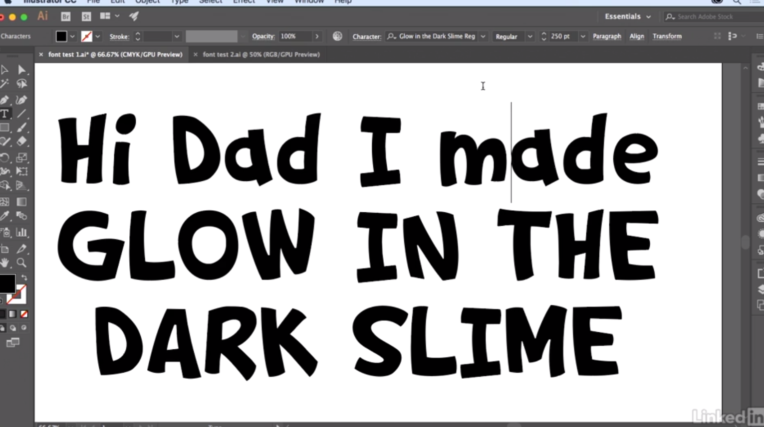
John Roshel, who has done custom type work for games like Clash of Clans has a great set of lessons on LinkedIn Learning where he takes lettering drawn by his son and slowly refines it and modifies to the consistency of work that he typically does.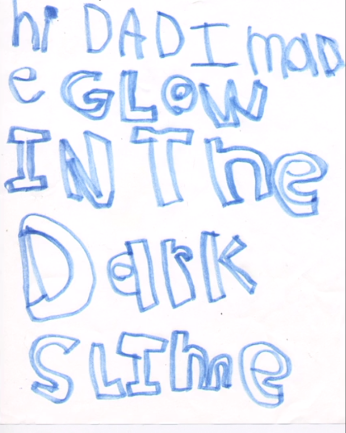
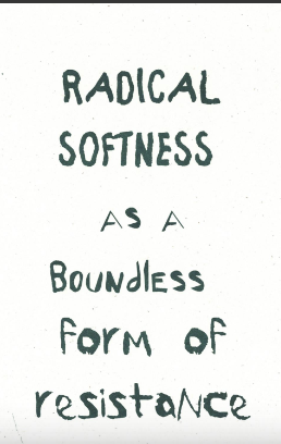
“Radical Softness” font by genderfail︎
Vernacular Typography︎
If you can’t take a walk or go outside, or just don’t have interesting stuff by you (or signage you find inspiring) there’s a great website called Vernacular Typography where you can find photos of type “in the wild”︎Back to Typographic Investigations